Archive for March, 2012

color, redux

Saturday, March 3rd, 2012

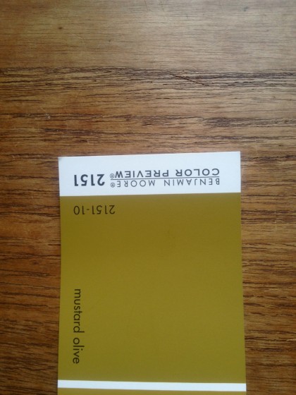
So I showed you colors for downstairs yesterday. What I didn’t mention is that I’ve been obsessing over this Mustard Olive shade for a few years. Something about it resonates with me right now….

benjamin moore mustard olive


Most of the time it looks olive, as above. In the sun, it tends more toward mustard…

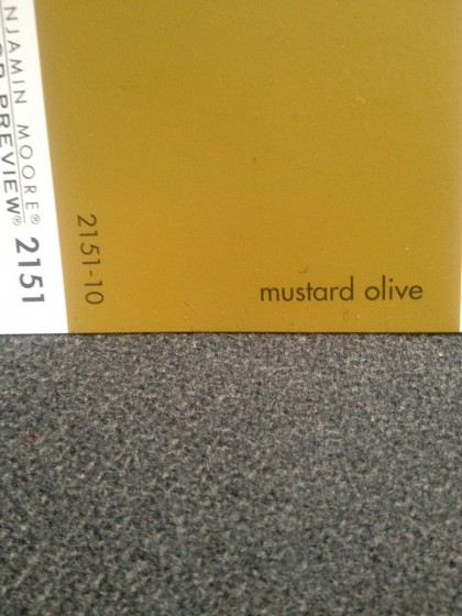
mustard olive by benjamin moore against my couch fabric


Either way. I dig it. The downstairs won’t get much, if any, direct light, so the paint should read as olive.

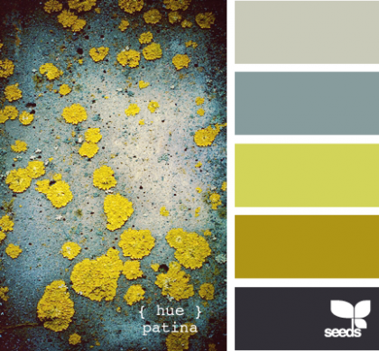
I’ve been stockpiling images I as color inspiration for a few years and I noticed I’ve bookmarked this color A LOT — like this image that’s been sitting on my desktop since last summer. There’s the color, fourth color chip down…

hue patina | design-seeds.com

hue patina | design-seeds.com


And this:

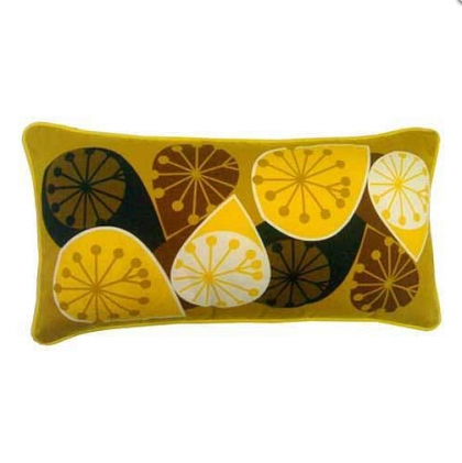
seville cushion by michelle mason | notonthehighstreet.com

seville cushion by michelle mason | notonthehighstreet.com


And this:

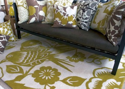
hand-tufted lovebirds rug by thomas paul | outblush.com

hand-tufted lovebirds rug by thomas paul | outblush.com


See how great it looks with bluish grey and white and dark brown on the far right there

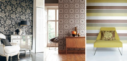
midbec striped wallpaper | trendenser.se

midbec striped wallpaper | trendenser.se


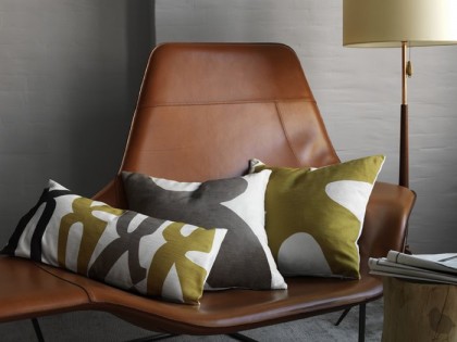
Love these linen pillows — these are from a few years ago, so don’t bother to hunt for them…

dwell studio paloma pillow in saffron | absolutematerialist.com

dwell studio paloma pillow in saffron | absolutematerialist.com


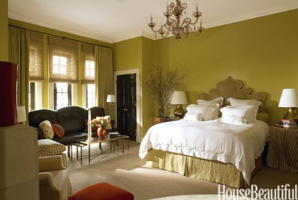
This color has been popping up more recently in House Beautiful’s Green Issue, March ’12. How about this bedroom?

chicago townhouse bedroom by alessandra-branca | housebeautiful.com

chicago townhouse bedroom by alessandra-branca | housebeautiful.com


Not my style, but I lurve the color!

color for downstairs

Friday, March 2nd, 2012

It’s taken a few days to switch over, but I have now made the full switch from Mountain Time…

back from colorado


… to Remodel Time:

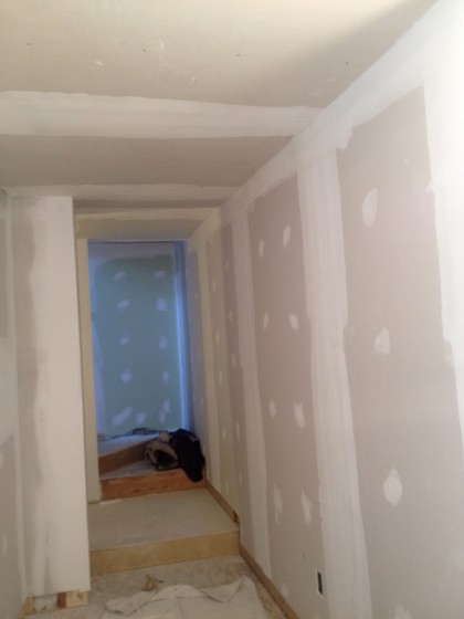
walls finally plastered


Yep, we got plastered. Completely plastered. And now it’s time for the cherry on top: paint!

First, the bathroom. We carried the tiles over to Benjamin Moore and matched up a white to coordinate…
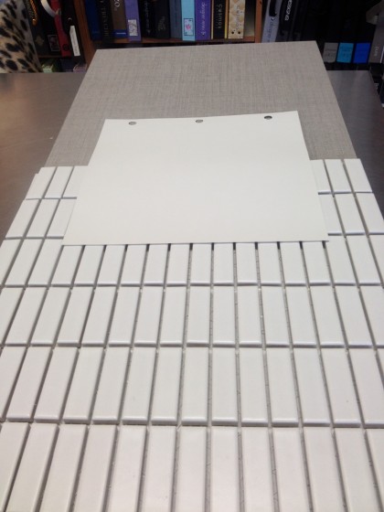
paint to match the tile


As you can see, the white tile isn’t a crisp white, it has a lot of grey in it. So we opted for a white with soft grey undertones: Classic Grey in Natura Zero VOC, Eggshell Finish. On top is Ann Sacks Texere in Dove, 12″ x 24″ plank tiles — for the floor. On bottom is Ann Sacks Savoy Stacked Brick Mosaic in Chalk, 5/8″ x 1-7/8″ — for the walls.

Had to choose grout for the tile too…
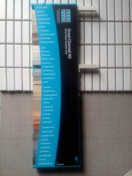
choosing grout for the tile


The only other real “color” in the bathroom will be the walnut built-ins. Spa-like but modern and spare.

Unlike the upstairs which is really all about the view, the downstairs is darker, with fewer windows. Because this will be the cushy, flop-on-the-couch entertainment area, I want it to accentuate the coziness, so white didn’t make sense.

I also want to bring some of the outside in so that it’s not so starkly different from the upstairs. Therefore, natural, neutral colors. This is what will go on the walls…
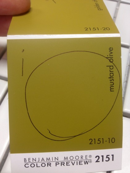
benjamin moore mustard olive


I know, I know, Mustard Olive looks like an “off” color, doesn’t it? But because it’s a shade of green with a lot of gold in it, it’s warm without being too dark. There’s not a whole lot of natural light down there, so it won’t read as bright most of the day.

It will look good next to our dark walnut built-ins and the cork that will be on the floors and ceiling (we kept that pale to bounce more light around)…
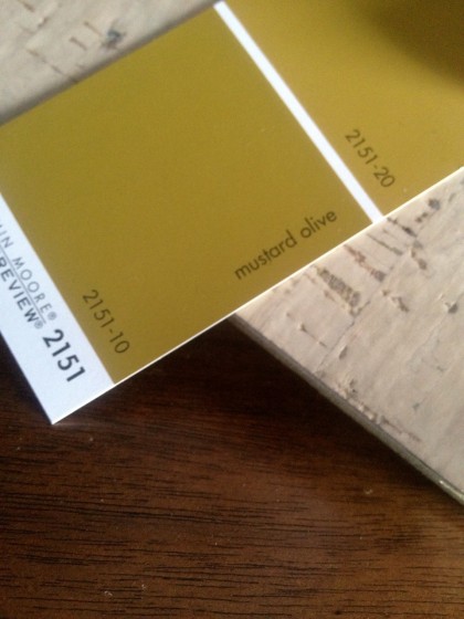
paint and cork and walnut


You’re still not convinced? I could tell. Here it is against more stuff. I like how it looks with grey…
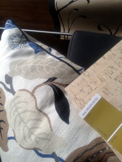
paint against more stuff


That’s Cavern Blackbird wallpaper in Kraft (yes, same paper I put up before), the charcoal wool of our Libre sectional, and one of the pillows we like to plump up while watching AdventureTime.

Don’t worry, when it’s all said and done it will look great. Or else.