Posts Tagged ‘flooring’

what’s underfoot

Thursday, October 20th, 2011

After a week of posts from Mr. Bettridge on the downstairs progress, we might just be caught up! Take it away, David…

—————————————————————————————————-

To make the downstairs more comfortable (and cheaper to heat) in the winter, we decided to insulate the floor slab. Our house scientist wanted 2” of foam, but we didn’t think we could afford to give up that much headroom, so we decided to use 1” instead.

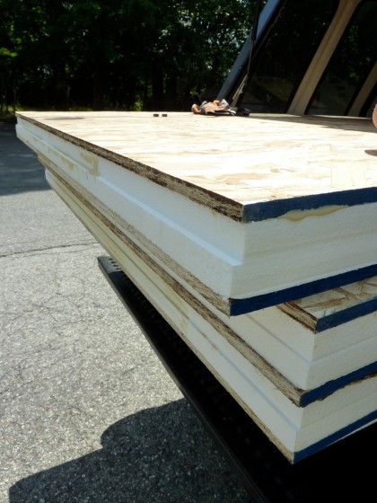
Then we became concerned that the foam alone might not be enough — its 20 psi load rating isn’t high enough to properly support furniture and whatnot. So we had local Branch River Plastics make us a bunch of these panels…

floor insulation panels


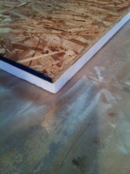
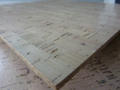
It’s the same EPS (styrofoam) we used at 3” thick to insulate the foundation walls, only these are made of 1/2” thick 4’ x 8’ OSB (oriented strand board) glued to 1” EPS….

floor insulation


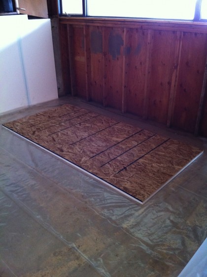
The non-formaldehyde, non-outgassing OSB spreads out the weight of people and stuff on top of it and provides a nice stable surface for the finish floor to rest on…

floor insulation detail


Underneath the foam is 6 mil plastic that acts as a vapor barrier, keeping moisture out of the floor system. Even in its not-quite-completed state, the basement is down to 45% humidity which is great.

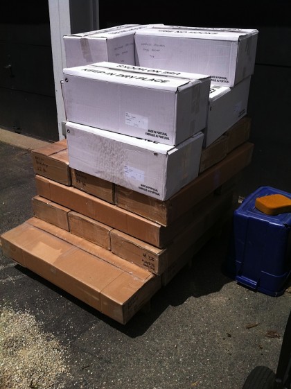
Eventually — well, soon — the cork floor planks will be installed over the top of the insulation panels. Until then, they wait…

cork tiles waiting in the driveway


Luckily, they’re no longer waiting in the driveway.

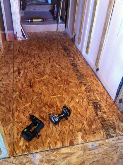
The last piece of sub-floor went in twice because of the leak in the foundation wall. On the right you can see the 6 mil vapor barrier coming out from under the sub-floor and up the wall. It got sealed to the 3” foam with non-hardening sealant (in that big caulking gun on the step)…

underflooring in front of steps


Give me a few more days and I’ll show you how we’re prepping the bathroom floor in a slightly different way.

hmm… not so floored

Wednesday, May 5th, 2010

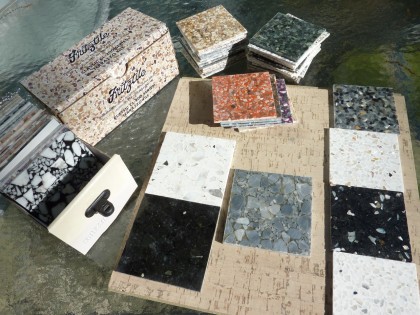
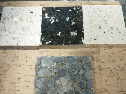
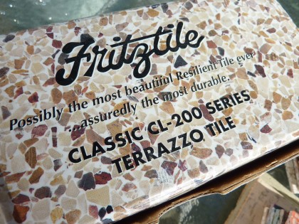
Went to look at terrazzo tile from Fritz Tile because it just sounds so frickin’ cool. But alas, it’s not quite as cool as I’d hoped. The guys at State Rug in Cranston were nice enough to hand over all their Fritz samples so we could check them out at home. Take a look…

lots of samples

A whole spectrum of colors to choose from but up against our cork flooring selection only the neutrals and possibly black looked like they might work… (click to biggify)

terrazzo possibilities against our cork floor choice

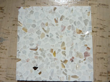
One of the boxes of samples featured terrazzo with bits of mother of pearl worked in. The sparkly bits were a nice touch on a tile that mostly comes across as kind of meh in person…

not too awful

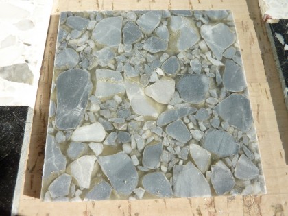
The substrate for most of their tiles is this weird clear stuff that makes these look like headcheese. From a distance the Fritz looks like terrazzo but has the sheen of a vinyl. Blech…

grey terrazzo headcheese

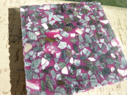
How Barney is this?

how barney is this?

I’m a big fan of terrazzo, don’t get me wrong. Definitely an awesome modern choice. But these just don’t come across as authentic. So I’m glad we took a look but the Angela Adams Argyle is looking more and more like the winner.

assuredly

back in the sacks

Tuesday, April 27th, 2010

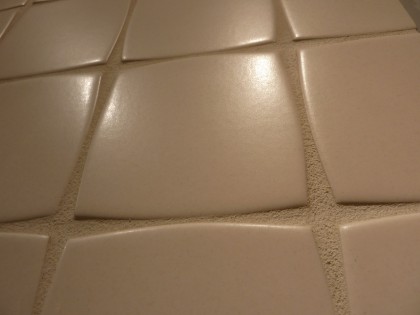
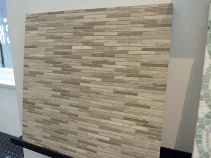
I was looking through my snaps from Ann Sacks and thought maybe my fellow tile lovers might like to see some more —  they don’t work in our entryway but deserved to be ogled.

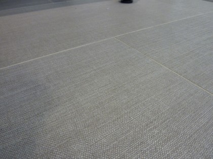
Like linen tiles. That actually feel like woven fabric…

fab linen tile

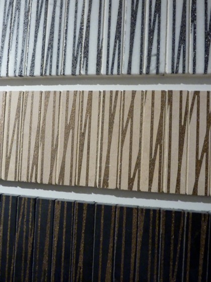
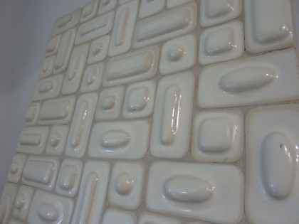
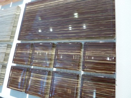
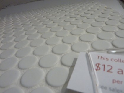
I’ll just shut up and show you the rest…

angela adams

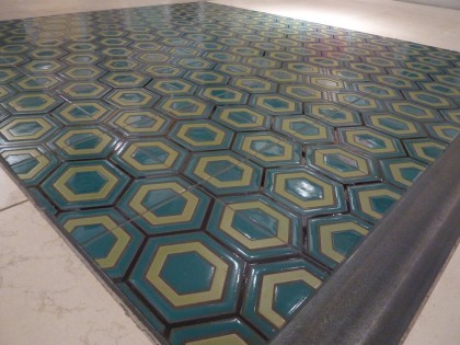
crazy hexagons

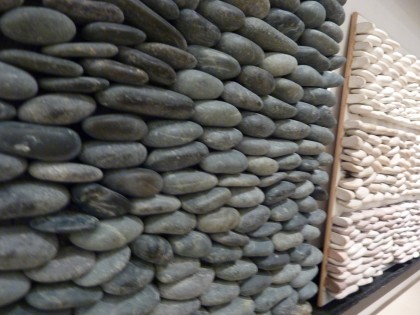
river stones

vintagey

horizontal bands

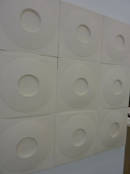
dimensional circles

pixie sticks

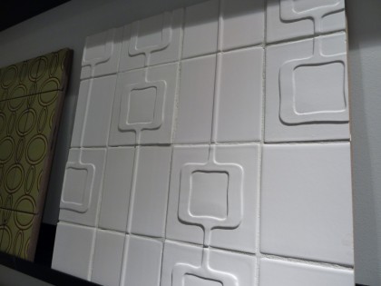
raised elliptical

striated glass

porcelain dots

clodagh

Glad I got that out of my system! Just a taste of tile to come, I’m sure. I’ll get more serious about exploring our options when we start looking beyond the entryway.

and yet another tile idea

Friday, April 9th, 2010

Just got the April Anthropologie catalog in the mail and of the many wonders it contains, the one that makes my heart flutter the most is something they don’t sell…

anthropologie, page 5, april 2010 catalog

The tile! It just reminded us that to trim costs, we could always create our own unique mosaic tile pattern in the two entryways rather than buy something readymade. Would be fun to take one of Irving Haynes’ paintings, for instance, and turn it into 8’x5′ and 4’x2′ tile “rugs.”

tile closeup

I know, I’m clearly obsessed. I made that obvious here and here. Just wait ’til we get to the bathrooms. Consider yourself warned.

a plus-sized remod tour

Sunday, March 28th, 2010

Our wants are large for this first round of the remodel. Yes, there will be other rounds. There’s not a room in this house that will go untouched. First round: the entryway to the living area. Interested in a tour?
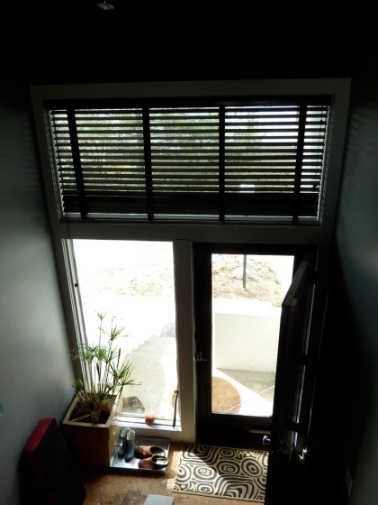
remod wants | entryway

The entryway

It feels like you’ve stepped into a well when you come into the house. There are a few things that can help with that. First off, we’ll probably change out that solid door with something in glass. Seeing out will make it feel less vertical. It will also step up the first impression.
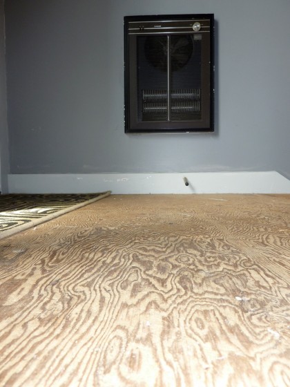
remod wants | entryway floor

Under foot, we can’t leave that plywood exposed. I already covered some of our tile options. This entry well gets cold in the winter, so we need to update the heat, too — we’re looking into removing the 40-year-old Singer heater and replacing it with in-floor heat.

Looking up from the doorway…
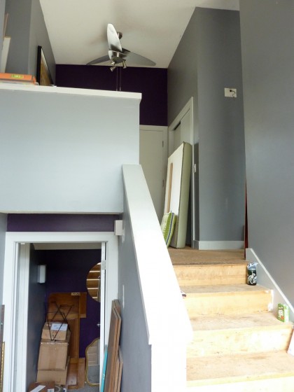
remod wants | railing on entry stairs

The solid railings don’t help with that I-fell-in-a-well feeling. Those need to be steel and glass or steel and cable, period. If you can see through the railing to the far windows (yes, that far back door will be replaced with glass for a view out to the yard), this space will feel less claustrophobic.
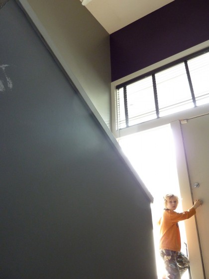
remod wants | railing on stairs again

Whether you’re headed up the stairs or down, even if the space isn’t actually bigger, it will feel bigger.

Overhead…
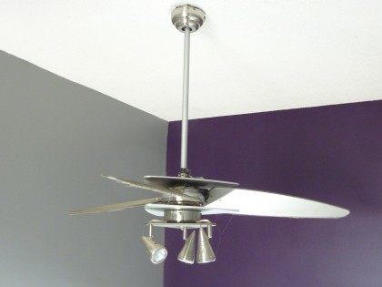
remod wants | fan removal

We have two of these ceiling fans that the previous owners put in just a few years ago. Those have to go. Anybody interested in like-new ceiling fans? We’ll remove the cobwebs.

Heading up the stairs
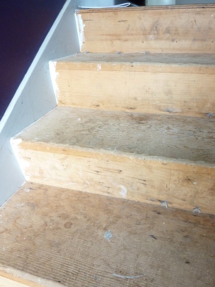
remod wants | stairs

Steps will need finishing in the cork flooring we’re going to use upstairs for a consistent flow.
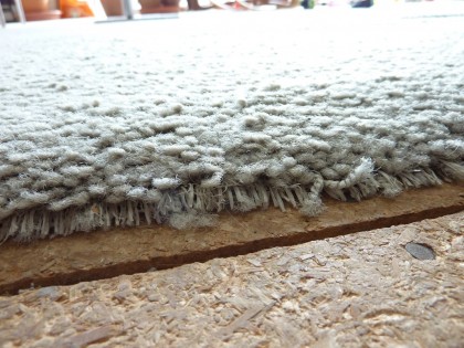
remod wants | flooring

If you’ve been following, you’ve already seen what the floor looks like at the top of the stairs: particle board and prehistoric carpet. This will all be cork. One cohesive surface throughout the top floor to unify our fairly small space.

Stepping into the living area
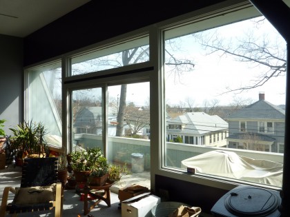
remod wants | window wall

The window wall is the star of the house. We’d like to build in seating under the windows cuz everybody likes to sit by the window, and add a shallow shelf for the succulents I have to winterize. Would also be a handy place to set a glass of wine.
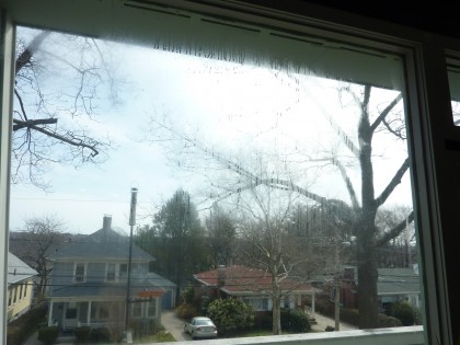
remod wants | leaky windows

Did I mention there’s water trapped inside the glass? Damn. This is something we’ve seen in a few of the larger windows, including the one by the front door. They have to be replaced. Since that’s the case, we’re looking at sexier, commercial aluminum windows and sliders with a thinner profile frame. It’ll look hot when we’re done.
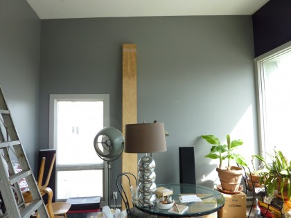
remod wants | storage wall

Storage is an issue. On either side of the window wall, we want built-ins floor to ceiling, with room for books, music and art, as well as the stuff nobody wants to see.
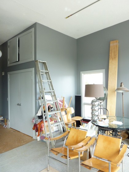
remod wants | wall removal

There is a storage closet already. But it really interrupts the space.
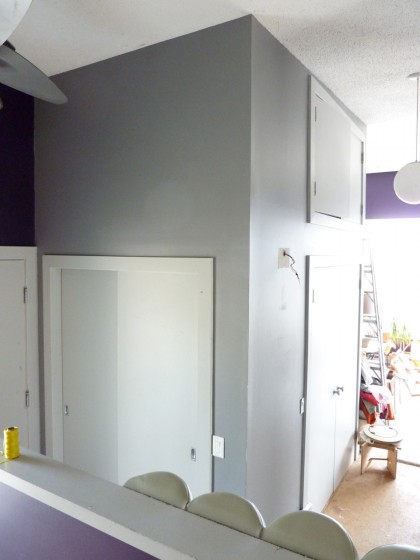
remod wants | closet removal

Here it is from the other side. We want to knock that whole thing out and replace it with window/slider wall…
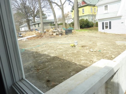
remod wants | view to patio

… so we can step right out onto our soon-to-be fabulous new patio. We’re envisioning the area that’s currently the storage closet as a sitting area that looks out to the yard, with a cozy built-in, high-efficiency woodstove.

Just across from the storage closet…
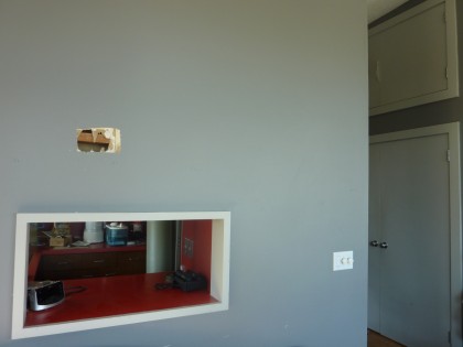
… is another wall that’s coming out. See ya, ’70s-style kitchen pass-thru.
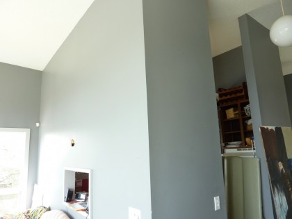
remod wants | kitchen wall removal

Once that wall comes out, it’s open concept. The kitchen becomes part of the living space and dining area. We’re picturing an island with a cooktop and a few stools pulled up to it — more entertaining-centric. And we’d like to knock out a section of the far kitchen wall to create a window onto the entry well. Once again, longer views always make a small space feel bigger.
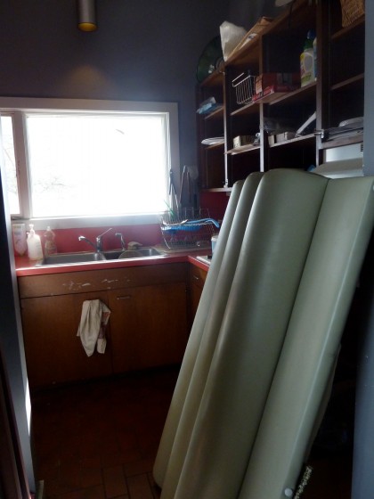
remod wants | kitchen expansion

Remember, the current kitchen is insanely small — it made sense in a home built for a single person, but not for us. The floor measures 3’10” across at the widest point. Only 3′ where the fridge would have been directly across from the stove. It’s only 6′ from the doorway to the sink.
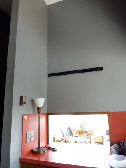
By knocking down the walls, we gain a little breathing room and hopefully a smidge more space. There are no appliances in this kitchen, so we need those. We already invested in an open-concept-worthy fridge — meaning we have to look at it from the living area so it has to be fab, as far as I’m concerned. It was the smallest footprint fridge I could find that still has enough space. Currently stashed downstairs next to our kitchenette. More on that another time.
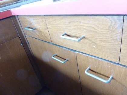
remod wants | cabinet removal

We’ll need new cabinets as the space is being reconfigured. These we’ll save for either the garage or a future shed. We need to maximize storage in here so we’ll have to go vertical.
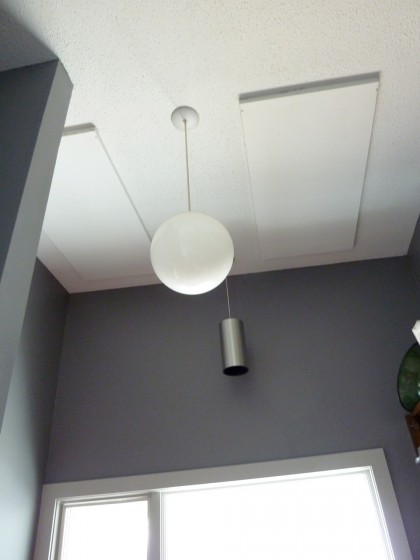
remod wants | kitchen ceiling heaters

We want to put in a big skylight, again to make this feel more spacious. But more than that, natural light and food just make for a sunnier mood. Those panels in the ceiling are heaters, which means we have to think about how to heat the kitchen as there’s no other source of heat in here.
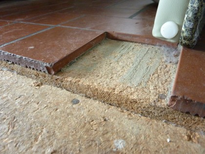
remod wants | kitchen tile removal

Kitchen flooring will be a continuation of the cork. Looking forward to losing those cold, dark tiles.

Looking down the canyon between the kitchen and the storage closet…
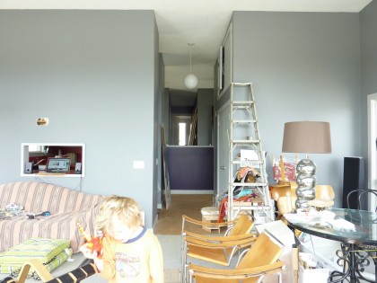
remod wants | view to back

You can see how this space would be opened up by knocking down the walls. As much as I wish it weren’t the case, those are load-bearing, which means we’ll still need support. See how the stair railing completely interrupts the view to the back? I can’t wait for that to change.

This is a good time to address the ceiling… We want to cover it in the same material we’re using for the floor. One is aesthetic: to highlight the slope of the ceiling and the long view from the front to the back of the house. The other is yuck: popcorn ceilings installed prior to ’79 may have stuff in it that you don’t want in your house. We want to encase it and forget about it, just in case.

Let’s finish that spin around the living area…
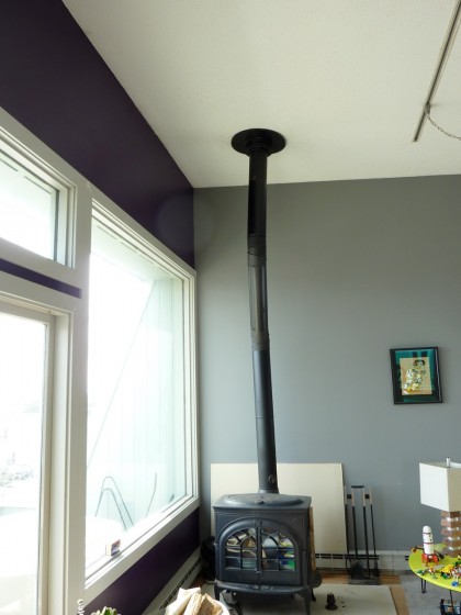
remod wants | stove removal

A woodstove sits in what we want to be our dining area. A high-efficiency Jotul we brought with us from the loft as a temporary heating solution, but it obviously doesn’t suit the style of the house. We’ll be selling that. The wall behind it will be floor-to-ceiling built-ins just like the opposite side of the room. And speaking of walls, behind them we’ll be adding insulation.
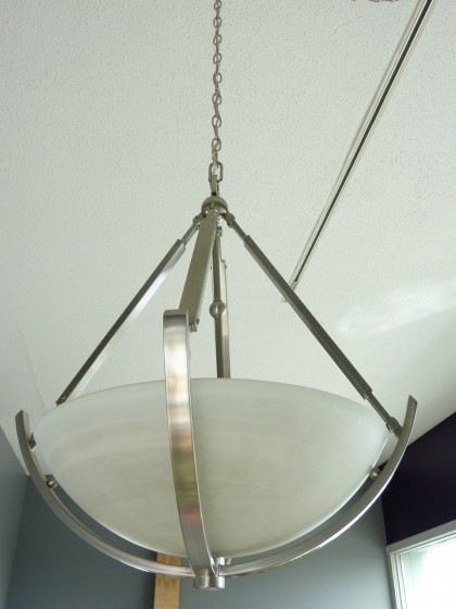
remod wants | take that chandelier

Over the dining area, the last owners put in a chandelier that’s coming out. Anybody want a chandy?
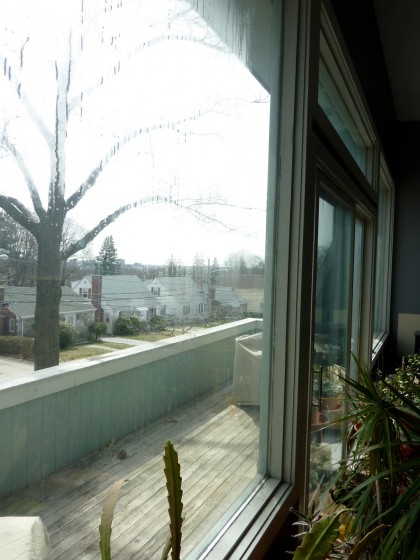
remod wants | deck updating

Wait, we’re almost done! That deck we look out onto? We use it as an extension of the living space when the weather’s good — lovely dining spot with a view of downtown. Unfortunately, it needs replacing…
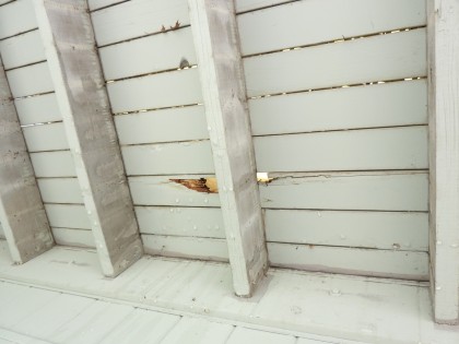
remod wants | deck rot

Here’s the view from below. You can see that soon, we may fall through.
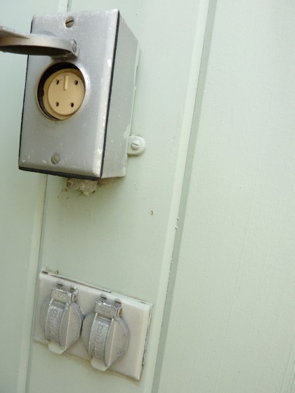
remod wants | deck phone service!

While we’re out here, let me point out this space-age creature comfort on the deck: phone lines! Man, the architect thought of everything. Here it is 2010 and we literally have not had a land line in years — I gave up mine a decade ago. My how times have changed.

So what didn’t I cover?
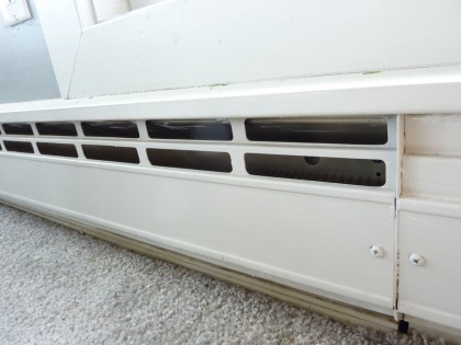
remod wants | heaters

Heaters in the living area. We have to figure out how to not have them be hideous, how to do built-ins around them, etc. We’ll cover heating and our scads of research in another post.
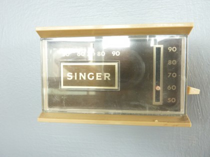
remod wants | heat control

Obviously the heat control will change. I’m sure this was advanced in its day.
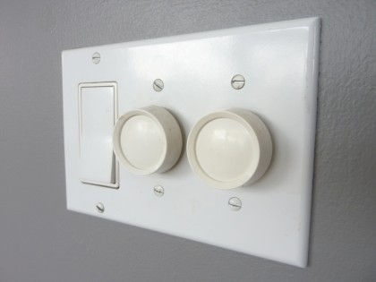
remod wants | light switches

Lighting controls will change, too. Basically, everything’s changing.

So that’s it. End of tour. You can go home now. You’re probably looking forward to a cozy, inviting place after seeing this mess. So are we.
reaching entry entropy

Saturday, March 27th, 2010

Outside: moving. Inside: going nowhere until we settle on finishes. We finally agree on the flooring. Except that we’d both like to see something different than cork in the entryways. What we’re loving: concrete tile.

It’s gorgeous, ridiculously durable and generally an eco-friendly choice. Thus far, I’ve come across three styles of concrete tile:

  • something monolithic that resembles poured — these range from plain to colored to terrazzo
  • patterned
  • and dimensional or relief, meaning it has raised bits — doesn’t make sense in a high-traffic area

Whatever we choose, we’re not going to need much. The front entry is roughly 8’x5′. The back entry maybe 4’x2′. The tile has to go with the cork flooring we think we’re going to use…

edipo cork tile in bleach white | duro-design.com

edipo cork tile in bleach white | duro-design.com

So considering that, I’ve found a few options that catch my eye…

_________________________________

Monolithic

In a modern house, you can never go wrong with terrazzo. The drawback to polished terrazzo in an entryway, of course, is that when it gets wet it may get slippery. But it is a modern staple and who knew you could get it in tile?

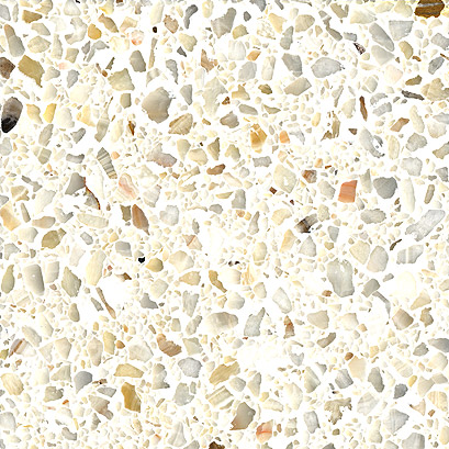
marble mosaic in honey onyx | fritztile.com

marble mosaic in honey onyx | fritztile.com

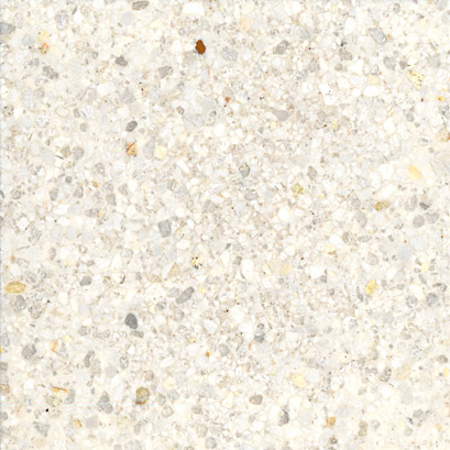
custom marble in twilight white | fritztile.com

custom marble in twilight white | fritztile.com

Both of those from Fritz Tile and use marble in the aggregate. Pretty. We’d need an inside doormat no matter what kind of tile we choose, so maybe slippery won’t matter? Hmmm.
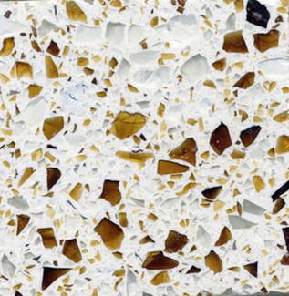
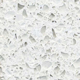
Fritz also offers two lines of LEED-certified recycled glass terrazzo tiles set in aggregate, but I’m not as fond of their look. For glass terrazzo, I prefer this…

recycled glass tile in riviera | wausautile.com

recycled glass tile in riviera | wausautile.com

or this…

recycled glass tile in swiss alps | wausautile.com

recycled glass tile in swiss alps | wausautile.com

from Wausau Tile, which also uses an aggregate base. Some recycled glass terrazzos are set in resin rather than aggregate (like countertop materials) — Enviroglas is a popular, environmentally friendly source. If we order samples, I’ll share.

Patterned

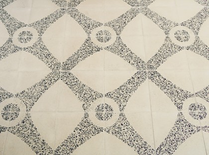
Here’s a tile from Ann Sacks that’s not only concrete with a pattern but terrazzo as well…

neoterrazo by andy fleishman | annsacks.com

neoterrazo by andy fleishman | annsacks.com

Less glossy than the all-terrazzo choices above. I’m not one to shy away from pattern but I’d have to see it next to the cork to know if it would work. Maybe too… traditional?

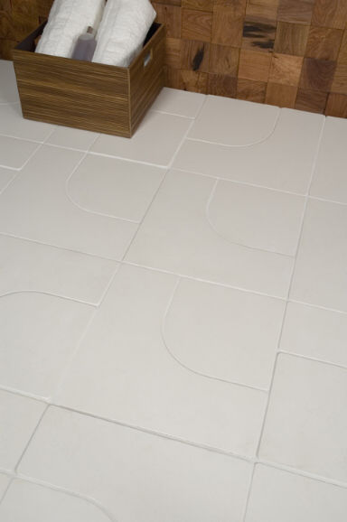
Just to funk things up, Angela Adams has a few subtle but very modern patterned concrete tiles at Ann Sacks…

argyle by angela adams | annsacks.com

argyle by angela adams | annsacks.com

manfred by angela adams | annsacks.com

manfred by angela adams | annsacks.com

Nice matte finish. A hint of the ’70s there, am I right? Might be good in a circa ’72 house. Anything by Angela is a class act.

In case my design aesthetic isn’t all over the place enough for you, how about these Paccha concrete tiles, also at Ann Sacks…

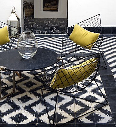
zigzag by paccha | annsacks.com

zigzag by paccha | annsacks.com

Would the pattern overwhelm the rest of the room? Maybe. Popham Design who makes Zigzag also makes lots of other styles not carried by Ann Sacks — some that might go better. Although Zigzag doesn’t have to look like a quilt. Their website shows you how you can change things up in layout…

zigzag, zigging | pophamdesign.com

zigzag, zigging | pophamdesign.com

zigzag, zagging | pophamdesign.com

zigzag, zagging | pophamdesign.com

Does crazy things to your eyes after a while, doesn’t it?

Here’s another Popham style completely covered in awesome sauce…

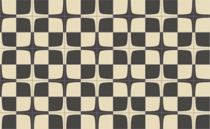
popham squarish | pophamdesign.com

popham squarish | pophamdesign.com

Called Squarish. Simple yet arty. Probably my favorite by Popham for our entryway. Just love that so much.

Another configuration of Squarish, more vintage looking…

squarish, yet againish | pophamdesign.com

squarish, yet againish | pophamdesign.com

I emailed back and forth with Popham not long after we moved in. At the time they were only in Morocco and had no U.S. dealer. Not sure if the ordering deets have changed since ’08 (may well have and if we decide to pursue, I’ll double-check), but this is what Popham shared with me about ordering through them at the time:

We sell the tiles for $15/square foot and can ship via air or sea. For air, which takes about a week once the tiles are dry, you’ll add about $12/square foot, for groupage (marine), which takes about a month, the cost is about $5/square foot. Or, if you want a container’s worth :), about 6,000 square feet, the shipping cost drops to about $1/square foot. Our production lead time is 2-3 weeks depending on the size of the orders.

So maybe $20 a square footish. Not cheap but also not out of the realm of possibility given the small footprint. Not very “green” ordering from Marrakech, I know. On the other hand, it does employ local artisans in a very low-tech process. Conundrum. Nice video, btw.

_________________________________

I dream of a statement-making entry floor but my gut tells me this house wants something sleek and simple. We’ll see. For me, tile is a must-touch, must-ogle item. This means a visit to Ann Sacks, for sure. And I located Fritz Tile’s terrazzo at a few shops in MA and RI. Field trip!

my cork finally popped

Tuesday, March 16th, 2010

I thought it might never happen but I just laid eyes on cork flooring I’m pretty smitten with. Just unboxed some samples of DuroDesign’s Edipo cork and, yes, it would actually complement this house nicely. Guess you can consider my cork POPPED.

Edipo cork flooring from DuroDesign

It’s made up of strips of cork, so it’s very linear, just like our house. No swirls. And yet not so uniform that it looks like a corkboard. Neither of those are styles I’ve disliked in other people’s houses — I just think they wouldn’t be the best choice here given our straight lines and hard angles. Perhaps this linear style has existed and I just somehow missed it in other flooring lines? Dunno.

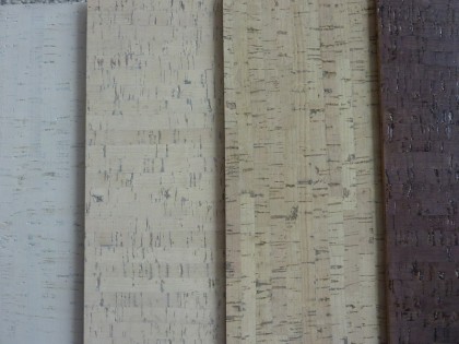
Here’s Edipo in a range of neutrals, from bleached to darker…

Edipo in shades

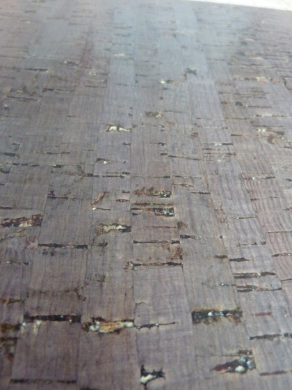
I like how the linearity makes the cork resemble its original form: tree bark. In fact, the lighter shades remind me a lot of birch bark. Here’s a closeup of the darkest sample…

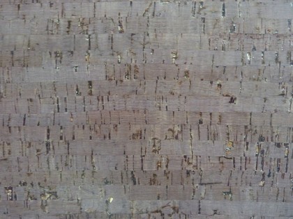
Edipo closeup

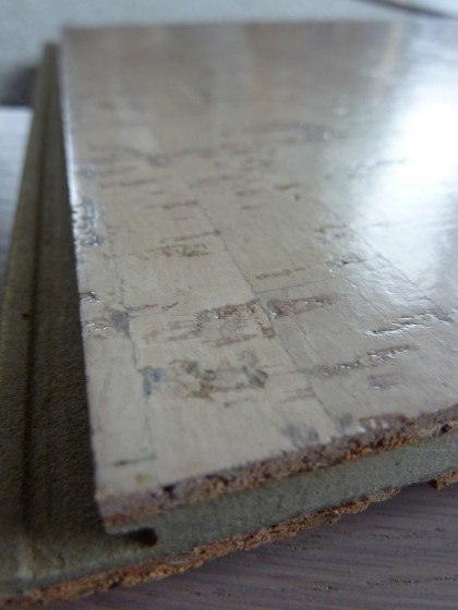
It comes in 12″x36″, click-together planks that would be easy enough to float in…

Edipo 1/2" plank edge

And they have thin, very light cork tiles that could work well on the ceiling (we want to contain our popcorn ceiling)…

Edipo tile edge

They’d need to be glued and/or nailed to something else first in order to be installed overhead, but that seems do-able.

As far as I’m concerned, the Edipo is a strong contender, assuming it’s in our price range. And of course, if we go with this we get all the sustainable, LEED-certified benefits of cork. As I mentioned in my last post:

… composed of 100% post-industrial recycled content from wine-stopper production.

Luv that. Lots more info and pictures of DuroDesign’s cork flooring options here in their PDF brochure.

floored

Monday, March 8th, 2010

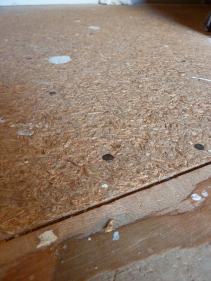
We think this house was recently swathed in floor-to-floor carpet, including the stairs. Ugh. The last owner ripped out a good deal of it…

particle board floor

But not all of it. Which leaves us with flaking particle board. And splinters in our feet. So you can probably understand why we’ve been collecting flooring samples. A few days ago, we woke up to a new box of samples on our front step. Wanna peek?

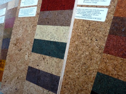
Duro Design sent us a ton of eco-friendling flooring samples for free (nice), including cork (available in 54 colors)…

duro cork

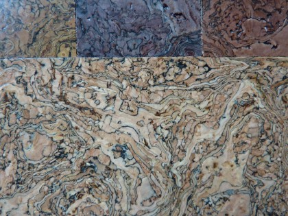
But why does cork leave me so… meh? Honestly. I love the idea of cork — that it’s completely renewable and easy on the feet. But I’ve yet to come across cork I love the look of. Duro’s cork comes from “post-industrial recycled content from wine stopper production,” so there’s a lot to be said for it.  And some of the patterns are pretty interesting…

duro cork closeup

Maybe too interesting? My discrimination is completely unfair, I realize that. David loves this stuff.

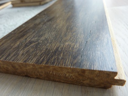
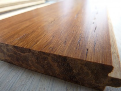
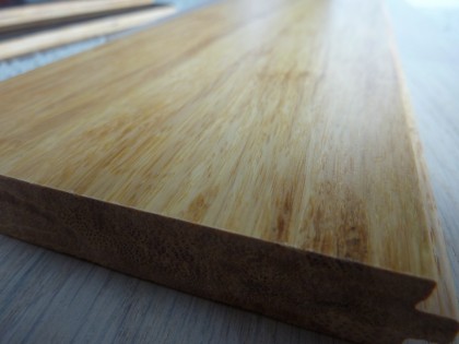
I do like the look of their strand bamboo

duro strand bamboo — spanish leather

No PVCs. No formaldehyde. Low VOC-finish. More durable than hardwood or regular bamboo floors. And I’ve long preferred the look of the stranded.

duro strand bamboo — miel

Available in 22 colors, although for us there are really only a few that could work.

duro strand bamboo — country

I’ve noticed that lately I’m drawn to lighter finishes… that clean, airy Scandinavian look must be appealing to me.

Which leads me to something I hadn’t considered before…

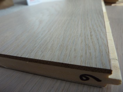
duro fsc oak — oyster

FSC oak, from environmentally and sustainably managed forests. I normally despise oak but for some reason I’m liking the look of their extra-wide engineered oak planks in the lighter finishes. Above, Oyster.

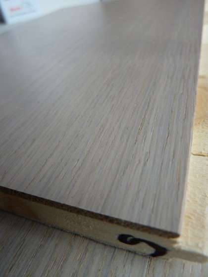
duro fsc oak — pastis

And this is Pastis. The difference is subtle but if you put them side by side you can see…

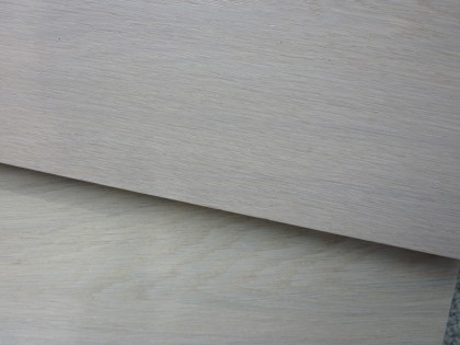
side by side duro fsc oaks

The Pastis on top has a little more pink in it. I prefer Oyster.

Ultimately we can’t settle on flooring without taking into account kitchen cabinetry and countertop materials, as they’ll all be visible in the main living space once we’re done with the remodel. I see this calls for a future post of some possible combinations.

Guess that means I better start gathering countertop samples.

jazzed about this tile

Tuesday, March 2nd, 2010

tile in peoria

This is not about me, it’s about the tile. The glorious, glorious vintage tile. Doesn’t it look fantastic with the bright orange seats? That pattern makes me ridiculously giddy.

Where: Peoria International Airport

When: The terminal was dedicated in 1942, so there’s a chance it dates to then. Not really sure. Just read they’re expanding. I hope they don’t touch the tile!

Why: On our first trip to the Bix Biederbecke Memorial Jazz Festival and its companion Bix 7 race in Davenport, Iowa, in 2005. Every year about 15,000 come for the music and more than 20,000 run the race. Crazy.

I’m posting this for my friend Steve, who’s on his way to Peoria. Say hello to the floor for me. And if you see that awesome hat of mine, bring it home. It went MIA.

the beginning of the end-grain

Friday, February 12th, 2010

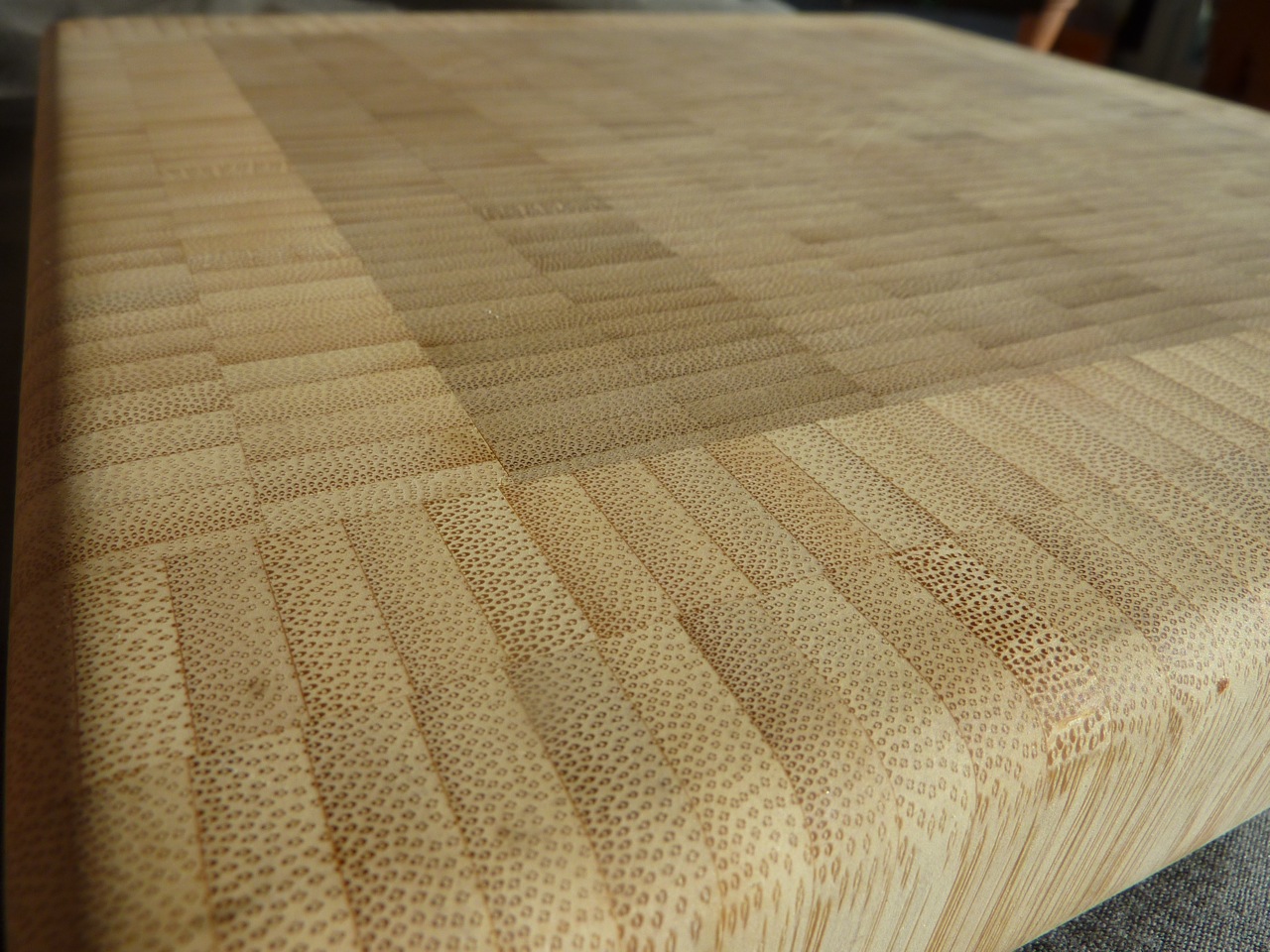
end-grain bamboo cutting board

Off on a tangent — an end-grain wood tangent I began yesterday. Forgive my obsession and just play along.

If the term “end-grain” leaves you thinking, huh? don’t worry. If you’ve seen a butcher block table or countertop, you’ve seen end-grain. That’s my own end-grain bamboo cutting board above.

It’s called end-grain because all those individual blocks of wood in the butcher block are turned on end rather than set longways, so you can see the grain of the wood where the saw blade sliced through it. Think of a pepperoni sausage… laying on its side, that’s long-grain. But slice it into discs and lay those face up, that’s end-grain. If you still don’t get it, watch this.

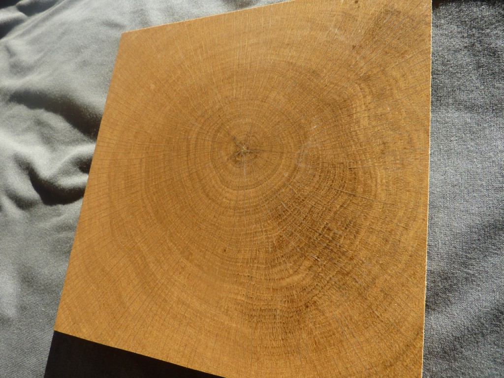
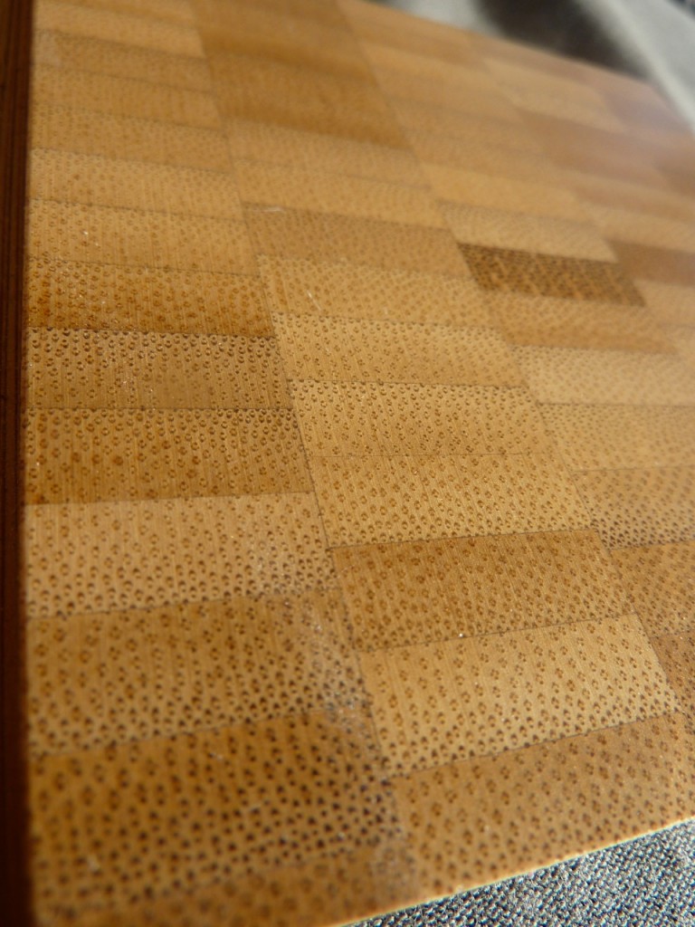
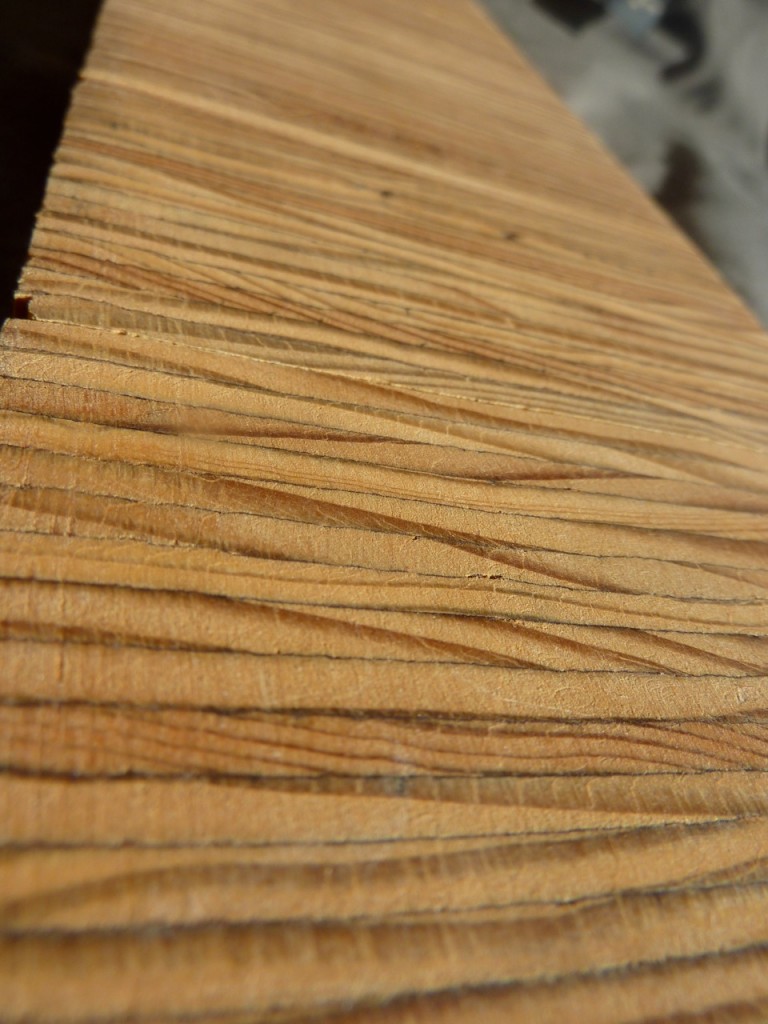
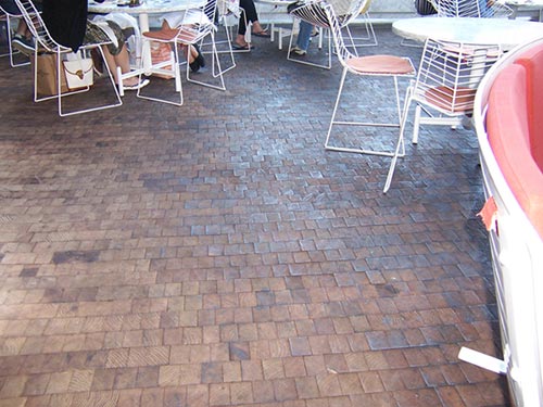
End-grain cutting surfaces are traditionally maple, because it’s a hard, durable wood. But end-grain lends itself to other woods and other applications — like flooring! Really gorgeous, incredibly pricey flooring. I only know because I’ve been looking into flooring options for our remod and have been hoarding samples of things that catch my eye. Okay, I’ll show you a few end-grain samples but no touching….

end-grain oak flooring

bamboo end-grain flooring

plywood end-grain flooring

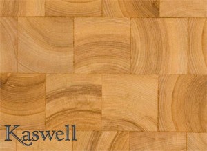
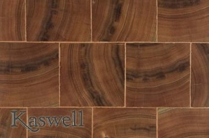
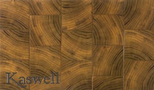
End-grain bamboo flooring you can find from a few different sources, Plyboo on the West Coast being the leader (also end-grain ply for furniture). Kaswell Flooring Systems in Framingham, MA, makes end-grain wood flooring from scads of different species, some more sustainable than others. We prefer the more eco-conscious options but they’re all pretty awesome to behold…

kaswell ash

kaswell ash

kaswell cerisewood

kaswell cerisewood

kaswell hemlock

kaswell hemlock

kaswell teak

kaswell teak

kaswell mesquite rounds

kaswell mesquite rounds

kaswell white oak

kaswell white oak

Eyes buggin’ yet? My personal favorite… strips of plywood end-grain! Plywood! (Scroll back up to my flooring samples for supa-dupa extreme closeup.)

kaswell plye

kaswell plye

God I love how a material that seems like such a throwaway can create such an amazing pattern. Just look at it in some lucky bugger’s fabulous New York City apartment:

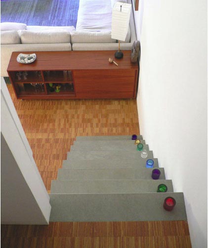
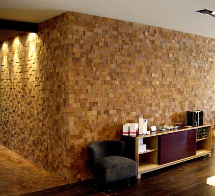
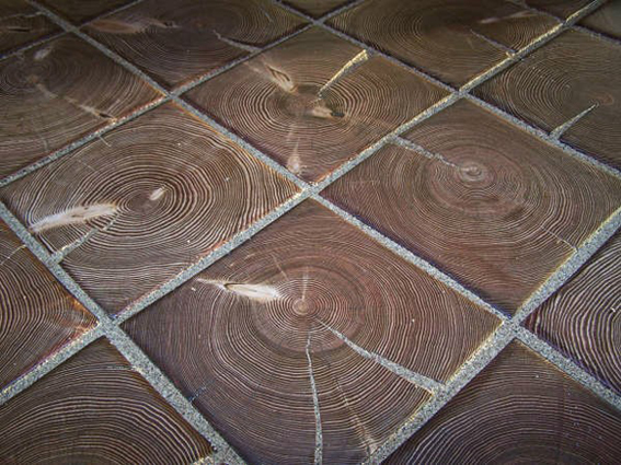
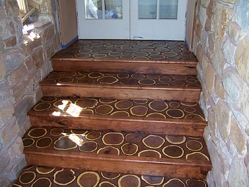
It is to sigh. There are waaaay more species to choose from here and here. Want to see a few more installations? Hopefully Kaswell won’t mind… I’m on a roll.

mesquite floors and walls

hemlock used as tile

stairs with rounds

nyc standard hotel

As much as I love them, I have to admit that most of those choices are too busy design-wise for our space even if we could afford them.

But I’ll always have the samples.