Posts Tagged ‘1972’

re-decking done, pt.2

Saturday, October 6th, 2012

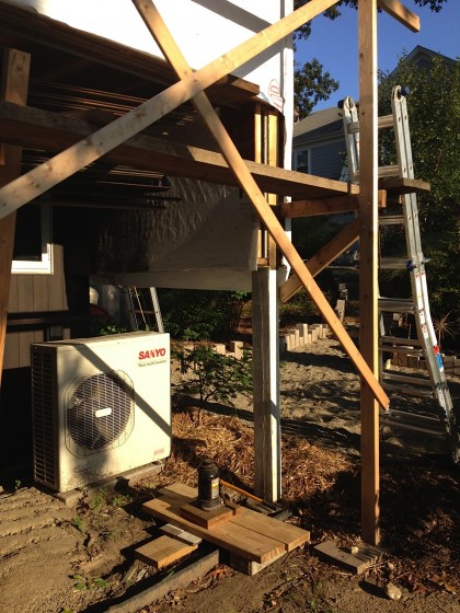
Ladies and gentlemen, we are floating in space. Posts formerly holding up our deck are now completely removed.

Remember this?

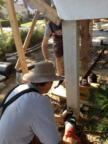
sawing off the posts


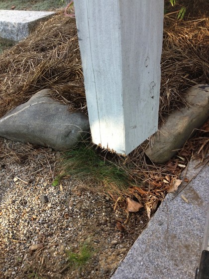
When the boys pulled out the jacks, we were left with mysterious hanging posts for a while…

one of our hanging posts


Cut off but not actually touching the ground. Mysteeeeeeerioussss…

mysterious post no longer touches theground


David and Joe finally pulled out the posts they had sliced a few weeks back. So now we’re not only officially cantilevered, it actually looks like we’re officially cantilevered!

posts are gone! cantilevering!


yep, other side, too!


Magic! It’s happening!


getting ready for steel

Thursday, August 9th, 2012

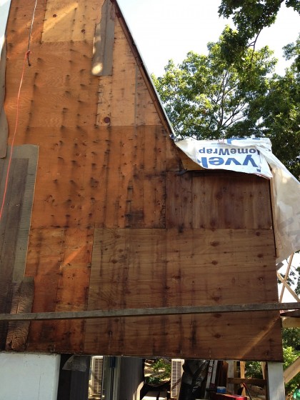
David and Joe have been prepping for the installation of the steel that will cantilever our deck. For the last few days, they’ve been removing the siding on the forward third of the house. David reports: “You can see that the original construction paper didn’t keep out moisture very well. The nails heads all show rust trails…”

getting ready for steel: siding removed


“Above, you can see on the lower right where the deck structure was repaired with pressure treated plywood in the ’80s. However, the object should have been to keep water out, not make a structure that could survive moisture penetration.”

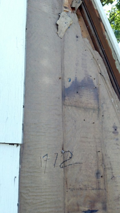
Look what Joe found etched underneath the siding…

getting ready for steel: 1972


Nice.

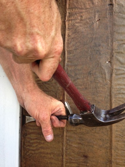
More from David: “Cutting the aluminum nails they used to install the siding in ’72 turned out to be easer than punching them in. I have a lot of respect for the carpenters that used these soft nails!”

getting ready for steel: siding nail removal


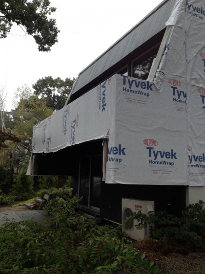
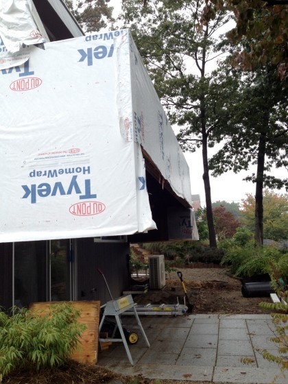
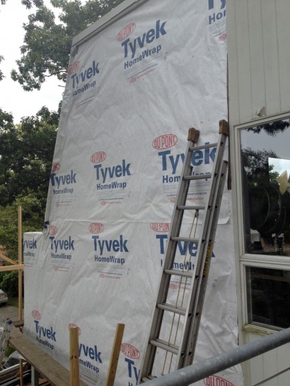
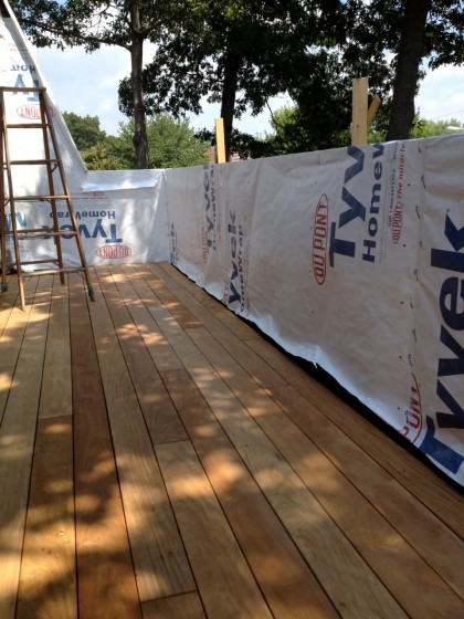
Once the boards were off, the boys added house wrap to keep water out temporarily — eventually all the walls will receive 3″ of foam insulation like the deck-end of the house did…

getting ready for steel: house wrap


With that done, attention turned to the inner walls of the deck…

getting ready for steel: deck walls await


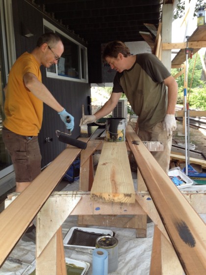
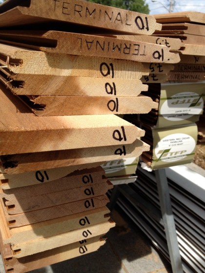
Now that the new LVL beams are in, the deck is rebuilt and the wall height  raised to code, the siding that goes on the inner walls can go up. David and Joe began staining it dark to match the siding below the deck…

getting ready for steel: staining the siding


Looks to me like they’ll be busy…

getting ready for steel: siding in waiting


The saga continues… but not today. Today the boys are taking a break.

a glint in the architect’s eye

Thursday, August 26th, 2010

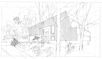
architectural rendering of our house, circa ’70 | Haynes and Associates

Our house, before it was born. This is what the architect, Irving Haynes, envisioned before the house was built. Pretty cool to have the original rendering from 1970. Click to biggify for full vintagey glory.

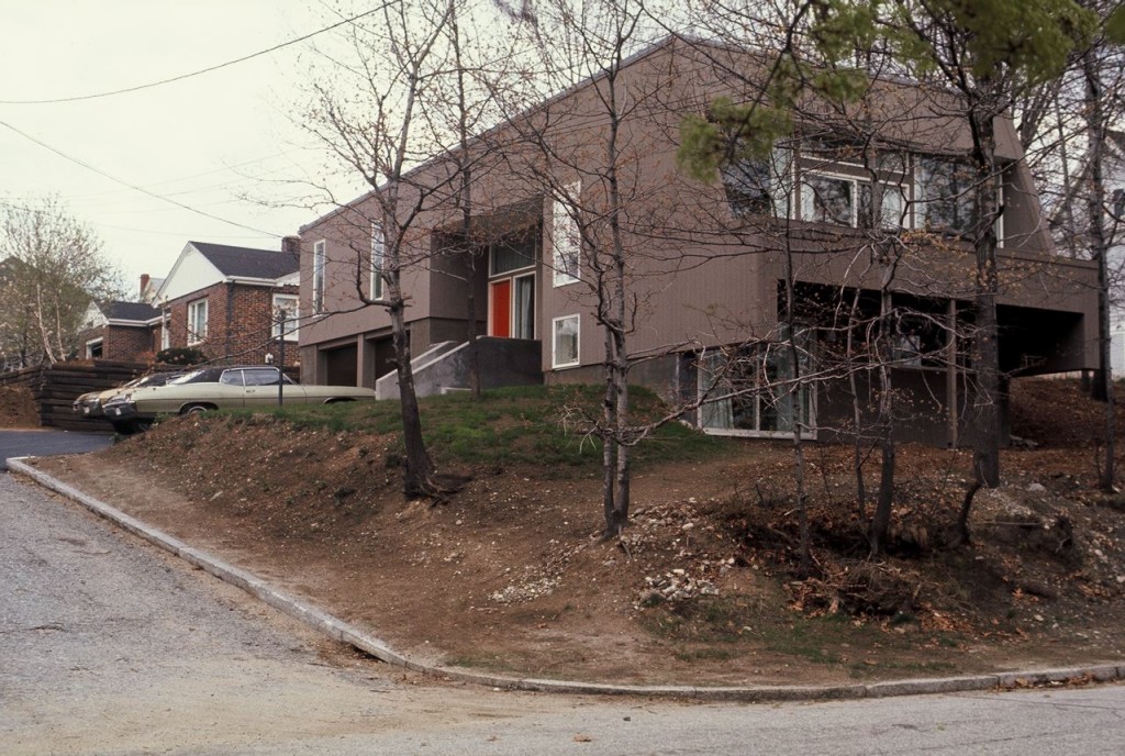
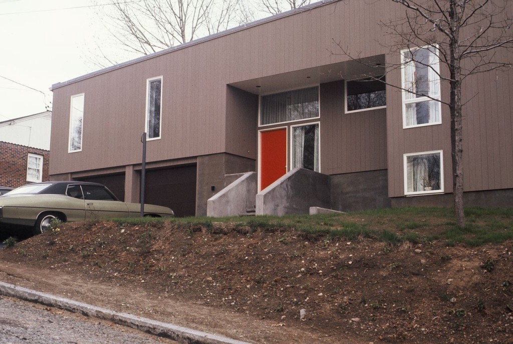
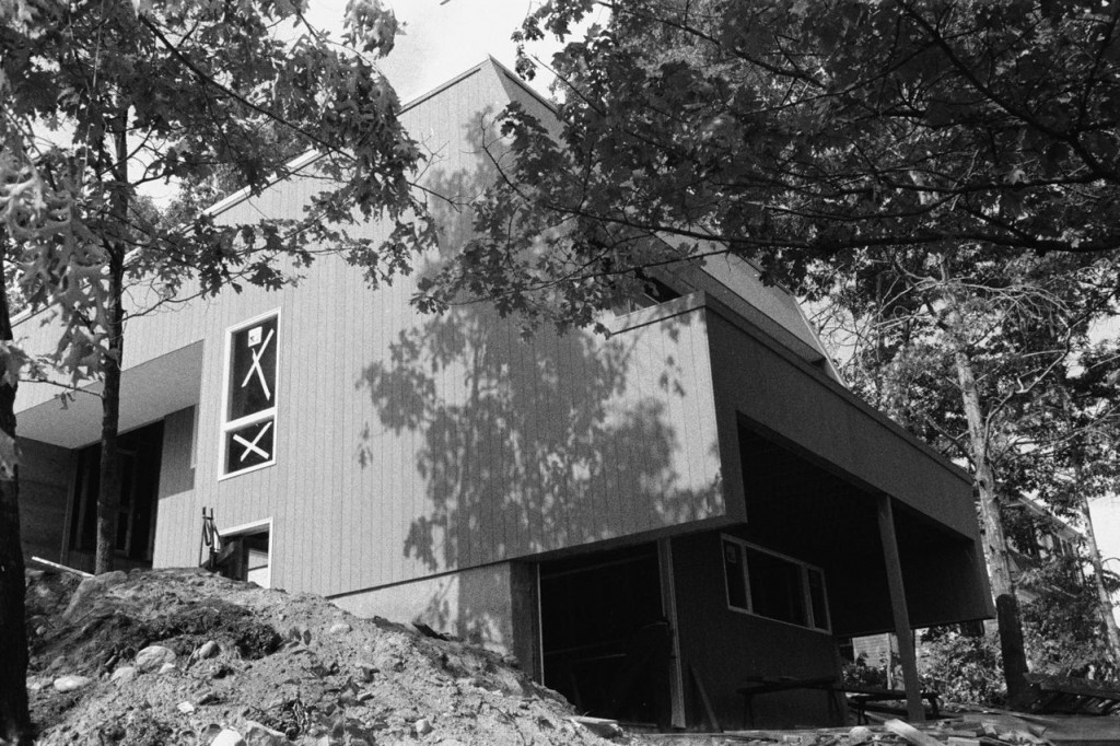
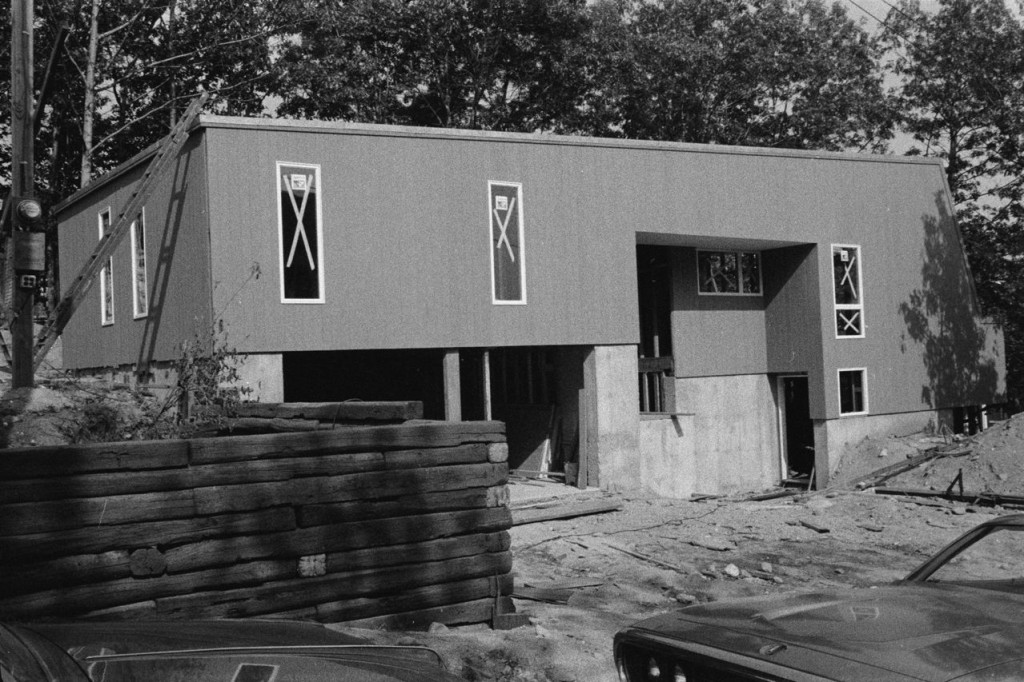
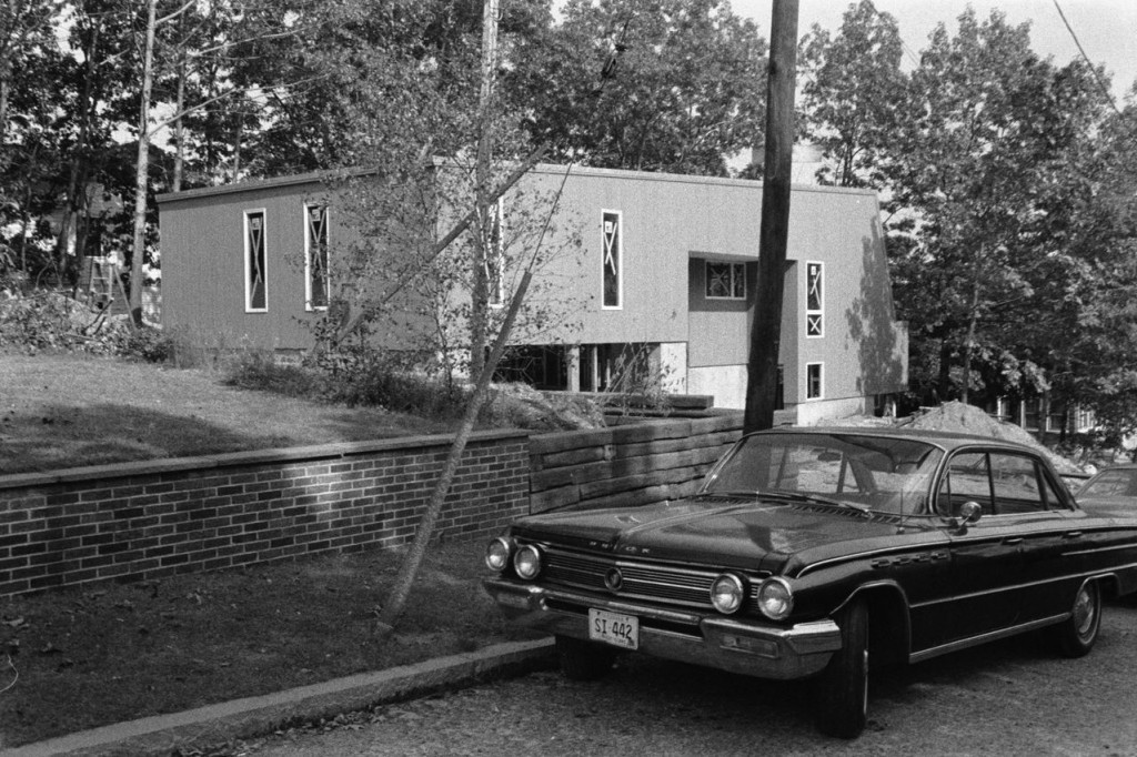
It turned out pretty much as drawn. Except no sidewalk down to the street. Here’s a finished shot from ’72 — if you saw the construction photos from my second post ever, you’ve seen this one before…

view from the corner, post-construction | Haynes and Associates

Sweet ride in the driveway.

They obviously had to cheap out on the retaining wall along the driveway as the one in the drawing is much, much cooler. They went with railroad ties… which eventually rotted, go figure. The new wall designed by architect Markus Berger is more along the lines of what Haynes was picturing…

finished wall, February 2010

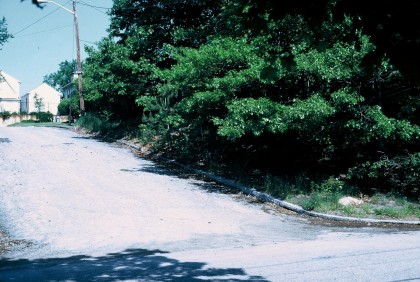
Want to see the lot before there was a house on it? Yeah, we got that. Here’s the same corner view…

view of the corner, before the house was built

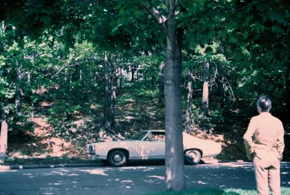
Looking up from across the street from the house, here’s the backyard we’ve been reworking when it was completely untouched and there were plenty of trees to keep the slope from washing away…

view of the back from the street

My my, aren’t we looking natty, Mr. Architect.

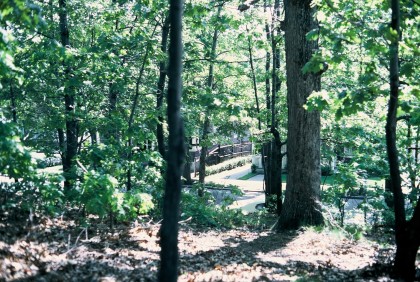
Here’s the view looking back down to the street from the future yard…

view from the lot down to the street

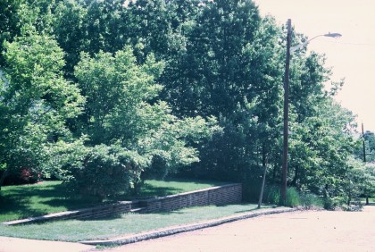
And here’s the view of what will become our veggie garden at the end of our neighbor’s brick retaining wall…

view of the future veggie garden

Yeesh. A whole lotta trees died to build this house…

Okay, trip down memory lane is over. Get back to work!

reaching entry entropy

Saturday, March 27th, 2010

Outside: moving. Inside: going nowhere until we settle on finishes. We finally agree on the flooring. Except that we’d both like to see something different than cork in the entryways. What we’re loving: concrete tile.

It’s gorgeous, ridiculously durable and generally an eco-friendly choice. Thus far, I’ve come across three styles of concrete tile:

  • something monolithic that resembles poured — these range from plain to colored to terrazzo
  • patterned
  • and dimensional or relief, meaning it has raised bits — doesn’t make sense in a high-traffic area

Whatever we choose, we’re not going to need much. The front entry is roughly 8’x5′. The back entry maybe 4’x2′. The tile has to go with the cork flooring we think we’re going to use…
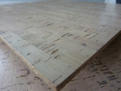
edipo cork tile in bleach white | duro-design.com

edipo cork tile in bleach white | duro-design.com

So considering that, I’ve found a few options that catch my eye…

_________________________________

Monolithic

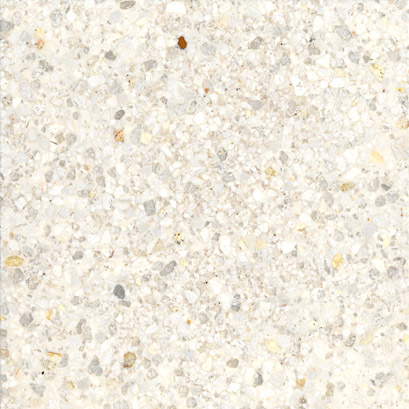
In a modern house, you can never go wrong with terrazzo. The drawback to polished terrazzo in an entryway, of course, is that when it gets wet it may get slippery. But it is a modern staple and who knew you could get it in tile?
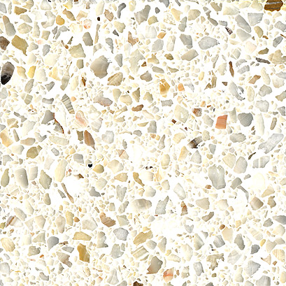
marble mosaic in honey onyx | fritztile.com
marble mosaic in honey onyx | fritztile.com

custom marble in twilight white | fritztile.com

custom marble in twilight white | fritztile.com

Both of those from Fritz Tile and use marble in the aggregate. Pretty. We’d need an inside doormat no matter what kind of tile we choose, so maybe slippery won’t matter? Hmmm.

Fritz also offers two lines of LEED-certified recycled glass terrazzo tiles set in aggregate, but I’m not as fond of their look. For glass terrazzo, I prefer this…
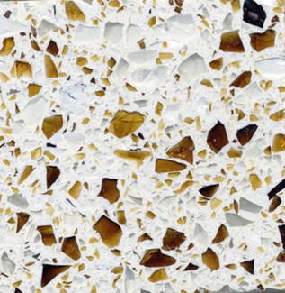
recycled glass tile in riviera | wausautile.com

recycled glass tile in riviera | wausautile.com

or this…
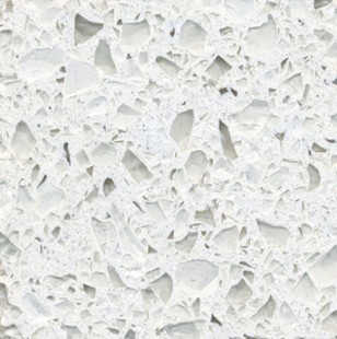
recycled glass tile in swiss alps | wausautile.com

recycled glass tile in swiss alps | wausautile.com

from Wausau Tile, which also uses an aggregate base. Some recycled glass terrazzos are set in resin rather than aggregate (like countertop materials) — Enviroglas is a popular, environmentally friendly source. If we order samples, I’ll share.

Patterned

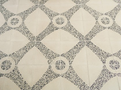
Here’s a tile from Ann Sacks that’s not only concrete with a pattern but terrazzo as well…
neoterrazo by andy fleishman | annsacks.com

neoterrazo by andy fleishman | annsacks.com

Less glossy than the all-terrazzo choices above. I’m not one to shy away from pattern but I’d have to see it next to the cork to know if it would work. Maybe too… traditional?

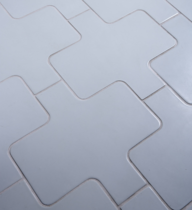
Just to funk things up, Angela Adams has a few subtle but very modern patterned concrete tiles at Ann Sacks…
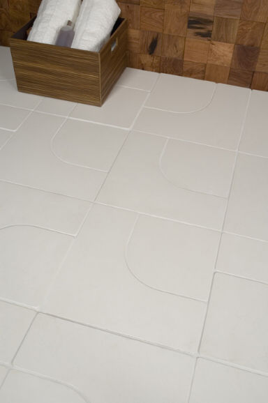
argyle by angela adams | annsacks.com
argyle by angela adams | annsacks.com

manfred by angela adams | annsacks.com

manfred by angela adams | annsacks.com

Nice matte finish. A hint of the ’70s there, am I right? Might be good in a circa ’72 house. Anything by Angela is a class act.

In case my design aesthetic isn’t all over the place enough for you, how about these Paccha concrete tiles, also at Ann Sacks…
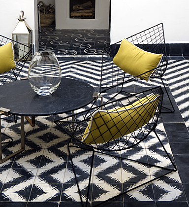
zigzag by paccha | annsacks.com

zigzag by paccha | annsacks.com

Would the pattern overwhelm the rest of the room? Maybe. Popham Design who makes Zigzag also makes lots of other styles not carried by Ann Sacks — some that might go better. Although Zigzag doesn’t have to look like a quilt. Their website shows you how you can change things up in layout…

zigzag, zigging | pophamdesign.com

zigzag, zigging | pophamdesign.com

zigzag, zagging | pophamdesign.com

zigzag, zagging | pophamdesign.com

Does crazy things to your eyes after a while, doesn’t it?

Here’s another Popham style completely covered in awesome sauce…

popham squarish | pophamdesign.com

popham squarish | pophamdesign.com

Called Squarish. Simple yet arty. Probably my favorite by Popham for our entryway. Just love that so much.

Another configuration of Squarish, more vintage looking…

squarish, yet againish | pophamdesign.com

squarish, yet againish | pophamdesign.com

I emailed back and forth with Popham not long after we moved in. At the time they were only in Morocco and had no U.S. dealer. Not sure if the ordering deets have changed since ’08 (may well have and if we decide to pursue, I’ll double-check), but this is what Popham shared with me about ordering through them at the time:

We sell the tiles for $15/square foot and can ship via air or sea. For air, which takes about a week once the tiles are dry, you’ll add about $12/square foot, for groupage (marine), which takes about a month, the cost is about $5/square foot. Or, if you want a container’s worth :), about 6,000 square feet, the shipping cost drops to about $1/square foot. Our production lead time is 2-3 weeks depending on the size of the orders.

So maybe $20 a square footish. Not cheap but also not out of the realm of possibility given the small footprint. Not very “green” ordering from Marrakech, I know. On the other hand, it does employ local artisans in a very low-tech process. Conundrum. Nice video, btw.

_________________________________

I dream of a statement-making entry floor but my gut tells me this house wants something sleek and simple. We’ll see. For me, tile is a must-touch, must-ogle item. This means a visit to Ann Sacks, for sure. And I located Fritz Tile’s terrazzo at a few shops in MA and RI. Field trip!
we have forsaken thee, paul rudolph

Tuesday, March 9th, 2010
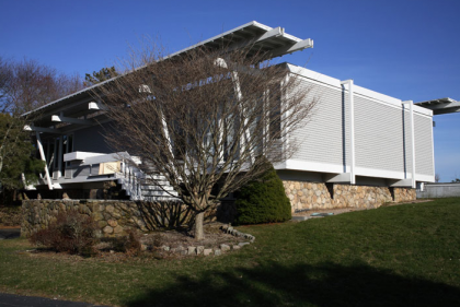
the micheels house by paul rudolph, westport ct '72-'07 | mottalini.com

the micheels house by paul rudolph, westport ct '72-'07 | mottalini.com

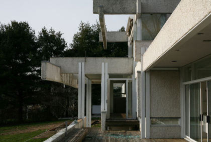
Yesterday I happened across two separate posts concerning Paul Rudolph, the modernist architect both celebrated and scorned for his groundbreaking work. Now heartbreaking work, because many of his buildings have succumbed in quick succession to demolition… and this country’s blatant  disdain for meaningful, historic architecture.

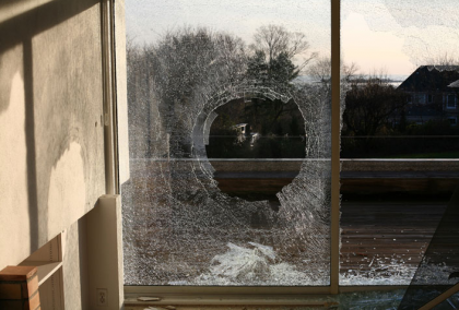
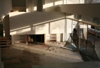
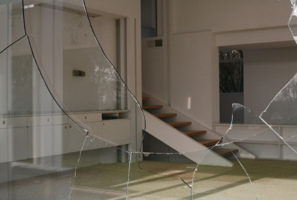
Design Observer, a favorite stop of mine, posted a link to a series of photographs by Chris Mottalini entitled After You Left, They Took It All Apart (Demolished Paul Rudolph Homes). The collection captures three Rudolph houses in sad states of decay just before they were demolished. Wiped off the map. I can’t encourage you enough to look at the whole set… it’s very moving.

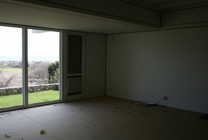
The Micheels House (above and below) was built in 1972. The same year as our house! Torn down and replaced by a hideous McMonstrosity. That’s exactly what the world needs more of.
the micheels house by paul rudolph, westport ct '72-'07 | mottalini.com

the micheels house | mottalini.com

the micheels house by paul rudolph, westport ct '72-'07 | mottalini.com

the micheels house | mottalini.com

the micheels house by paul rudolph, westport ct '72-'07 | mottalini.com

the micheels house | mottalini.com

Mottalini’s  photographs are haunting. And depressing. Ugh, so depressing. He writes:

This project focuses on a group of now-demolished homes by the acclaimed and controversial Modernist architect Paul Rudolph, which I photographed mere days prior to their demolition in 2007. The resulting images capture a state of Modernist architecture few people have witnessed, revealing the grace of these homes as they stood in defiance of severe neglect and abandonment.

Among the houses torn down is one right here in Rhode Island — the Cerrito House. I recall following the news of its plight with great horror. The Paul Rudolph Foundation made valiant efforts to save it but it all fell through in the end. What was wrong with the house? According to the New York Times article:

The house’s owners… who live on the West Coast, want it removed so they can build a larger vacation home on the site…

cerrito house by paul rudolph, watch hill RI '56-'07 | mottalini.com

cerrito house by paul rudolph, watch hill RI '56-'07 | mottalini.com

cerrito house | mottalini.com

cerrito house | mottalini.com

cerrito house | mottalini.com

cerrito house | mottalini.com

Our disposable society has no hesitation in throwing away a perfectly good home, even if it is functional, beautiful and the only one if its kind. It’s maddening. As Mottalini notes:

Several other Paul Rudolph projects are currently slated for demolition and, as a result, he has become representative of a tragic disregard for mid-century architecture.

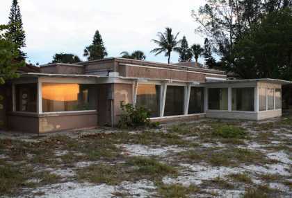
the twitchell house by paul rudolph, siesta key fl '41-'07 | mottalini.com

the twitchell house by paul rudolph, siesta key fl '41-'07 | mottalini.com

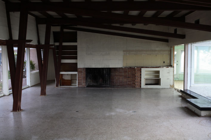
the twitchell house | mottalini.com

the twitchell house | mottalini.com

the twitchell house | mottalini.com

the twitchell house | mottalini.com

A few hours before I came across Mottalini’s photos, I read a tweet by Grain Edit that lead me the excellent Metropolis Magazine film, Site Specific: The Legacy of Regional Modernism. It’s a fascinating look at the Sarasota School of Architecture’s desire to “escape the international culture of uniformity” by combining site-specific modern architecture and the clever use of local materials. Woven throughout the story is Riverview High School (circa 1956), Paul Rudolph’s first civic building and an example of revolutionary thinking. There were efforts by many to save it from destruction. Regrettably, it saw the wrecking ball last July when the school board decided to turn it into blacktop.

If this subject saddens you as much as it does me, you might be interested in a new exhibition currently at AIA New York’s Center for Architecture: Modernism at Risk. It’s open to the public February 17 – May 1. From the website:

Modernism represents the defining movement of twentieth-century architecture and design; yet, every day, important works of modern architecture are destroyed or inappropriately altered…

Saving modern landmarks is important because they enrich a community’s sense of place – providing continuity between its past and important buildings of our own times.

Damn straight. I’ll be in attendance some time soon. Hope to see you there.

… the idea that you need to show off your success to the world in the form of a gargantuan mock-Georgian or mock-Tudor manse, the bigger the better, is to me more than a little depressing. If McMansions are like enormous, overdesigned, gas-guzzling Cadillacs, then early modernist houses are like Toyota Priuses — fresh looking, reasonable, modest, elegant in a simple, understated way. So there is a lesson — I might almost call it a kind of moral lesson — in a lot of the modernism that is now threatened. It’s a lesson of understatement and rationality.

— Paul Goldberger, architecture critic for The New Yorker and National Trust for Historic Preservation Trustee | from The Modernist Manifesto


*     *     *     *     *

Important reading for those so inclined

The Modernist Manifesto: Why buildings from our recent past are in peril, and why saving them is so crucial Insightful perspective from the magazine of the Trust for Historic Preservation

Modern Homes Survey: New Canaan Connecticut A survey of modern homes in New Canaan prompted by the demolition of Rudolph’s Westport home in 2007, along with a cry for historic preservation — amazing photos and extremely important work

The Sixties Turn 50 The Los Angeles Conservancy and its Modern Committee celebrate Greater Los Angeles’ rich legacy of 1960s architecture, which starts turning 50 years old in 2010 — a droolworthy mix of mid-century modern and Googie photos here

Recent Past Preservation Network Promoting preservation education and advocacy to encourage a contextual understanding of our modern built environment — includes a link to a petition to save yet another Paul Rudolph site

Cape Cod Modern House Trust Incorporated in 2007 to promote the documentation and preservation of significant examples of Modernist architecture on the Outer Cape — includes news of open houses and annual tours of their amazing preservation projects

baby pictures

Tuesday, February 2nd, 2010

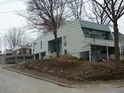
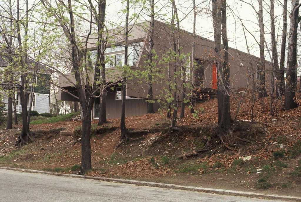
minty 1972, corner view

The average cost of a house in the U.S. in 1972: $27,550. Roughly what you’d pay today for a Chevy Impala fully loaded, if you actually wanted such a thing. I’ll take the house, please. What it cost in 1972 to have the fairly modest modern above designed and built with the help of a local architect in Providence… no idea. But it’s now ours! And we love it.

Click the images for big-ification.

minty 1972, back view

Here’s the background we’ve been able to dig up on our home since we dragged our very first moving box inside in January of 2008…

minty 1972, front view

Designed and built: The blueprints say May 1971. Construction was completed in 1972.

Original owner: Kathleen McBride. Wanted a house she could share with her aging parents — they got the downstairs with an efficiency kitchen and bath, she got the upstairs with its own kitchen and bath.

Architect: Irving B. Haynes, a graduate of Rhode Island School of Design in 1951. He returned there to teach from ’73 to ’05. Started Haynes and Associates in 1968, which became Haynes, deBoer and Associates. Irving passed on in ’05. The architecture firm, still active (but no website?!), was nice enough to share photos of the construction — sweet! — as well as blueprints. BLUEPRINTS! That’s like striking gold.

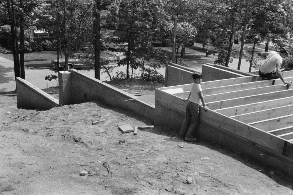
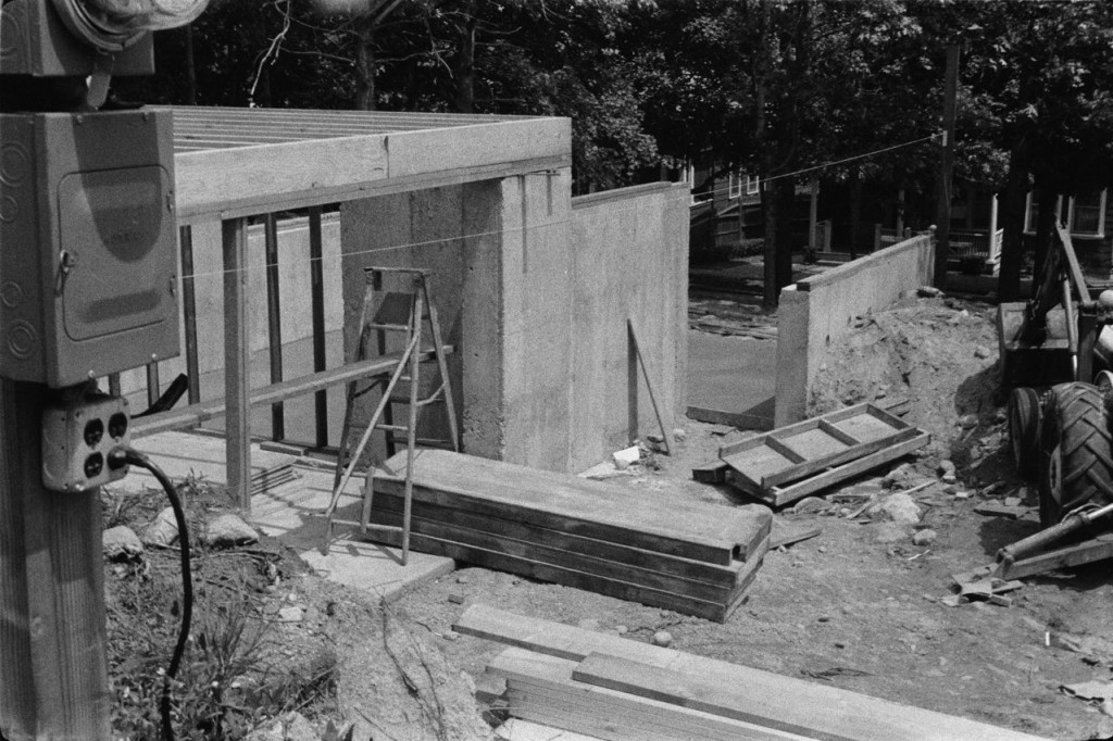
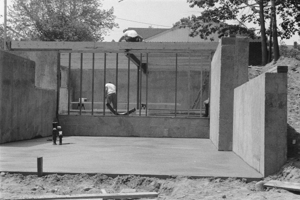
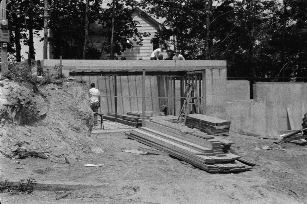
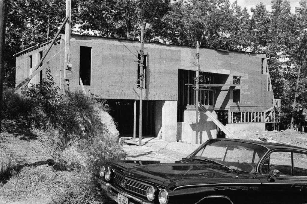
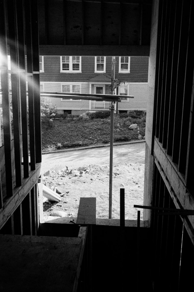
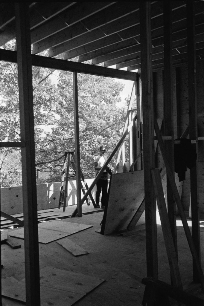
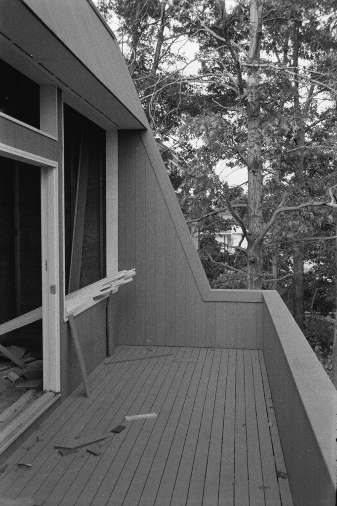
And now, a few snaps of our house in its infancy… awwwwwwwww.

construction, looking down the hill

construction, the front

construction, downstairs

construction, progress on the front

construction, second floor added

construction, looking out entry from top of stairs
upstairs, looking out big window

view of deck

looking up at deck

view of front, almost finished

view of front from top of the hill