Posts Tagged ‘architect’

the best surprise

Thursday, February 10th, 2011

More proof that you just never know what a new day will bring you… So this morning the doorbell rings. And who’s on our doorstep? Two happy, shiny offsproing of Irving B. Haynes, the original architect of the house we love so much. What the?

Seth and Libby stopped by to say that until they happened across mymodremod, they’d had no idea that this house was their father’s creation — even after passing by it for so many years. We had a lovely chat and stumbled them through our embarrassingly fakakta interior.

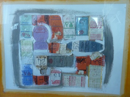
And then they asked if we’d like this (click to biggify)…

irving b haynes collage

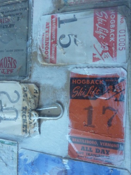
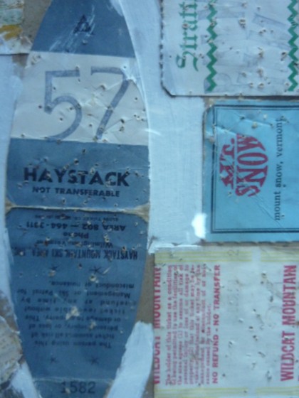
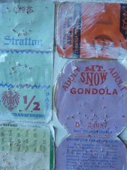
It’s a collage of ski passes made by their father in 1971 — the year construction began on our house. Hailing from Maine, Irving liked to take the family skiing around New England. Nice bit ’o regional history there…

irving b haynes collage, detail 1

irving b haynes collage, detail 2

irving b haynes collage, detail 3

How sweet is it of Seth and Libby to share a little bit of Irving with us? That’s so nice! We’ll most definitely be in touch. I’d love to prove to them that we’re really not slobs. Well, mostly not slobs anyway.

Thanks, you two! And I promise we’ll figure out the glitch in posting comments so that you can chime in every now and then.

the upstairs plan

Tuesday, January 18th, 2011

On Friday I showed you the downstairs plan we worked out with Emily, our architect. Speaking of which, we met with her and the engineer today to make sure everything’s hunky-dory before we go to the city for the permit. Getting closer. While we wait for final engineering drawings, let’s discuss the rough upstairs plan that Emily drew up. K?

Stage Two: Main Living/Kitchen Area

The upstairs remodel will have to wait for warmer weather — which is fine since we’ll be plenty busy with the downstairs. Upstairs is more involved than the downstairs as this is where the main living area and kitchen are located. Feel free to take the visual tour of what we want to do (I posted that back when we thought upstairs was going to be Stage One).

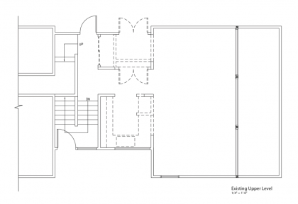
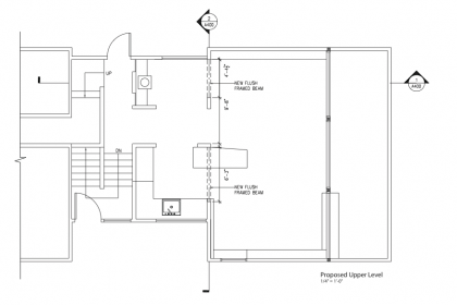
The upstairs currently looks like this (click to biggify)…

existing upper level

With the changes we want to make, it will look more like this…

proposed upper level

Not easy to spot the differences but here they are:

Just like downstairs, we’re knocking out a few load-bearing walls and putting in beams in order to open up the space. We’ll gain some breathing space in the kitchen by putting in a cooking island/breakfast bar that juts into the living area, plus we’ll go vertical with storage and add a large cooling tower/skylight over the whole space. Facing out to the backyard, we’re knocking out the giant closet and putting in glass sliders and little sitting area with a fireplace insert. The main living area will be flanked by floor-to-ceiling built-ins with built-in seating. The dining area next to the tiny kitchen will get a built-in sideboard/serving shelf as part of its floor-to-ceiling built-ins. We’ll replace current sliders and windows, put in a new floor and ceiling, and improve lighting and heating.

Basically, nothing goes untouched. So do you think we can get it all done in 2011? Let the wagering begin.

the downstairs plan

Friday, January 14th, 2011

I go on and on about how this remodel is really going to happen and yet it looks like nothing actually does. But behind the scenes, things are happening. Our supastar architect, Emily Wetherbee, has met with us several times to get the Stage One plans finalized. Shall we take a look?

Stage One: Downstairs Entertainment/Guest Area

We always thought the upstairs would be Stage One. But because we’re planning structural changes, we want to begin at the bottom and work our way up. Plus timing is everything, right? It’s winter and the work we want to do upstairs in the main living area and kitchen involves skylights and tearing out walls. Who wants a blizzard in their livingroom? Not us. It just makes more sense to begin downstairs — it’s all interior work down there.

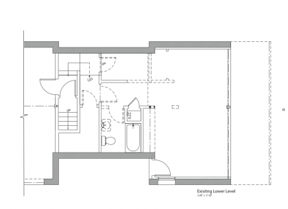
The downstairs currently looks like this (click to biggify)…

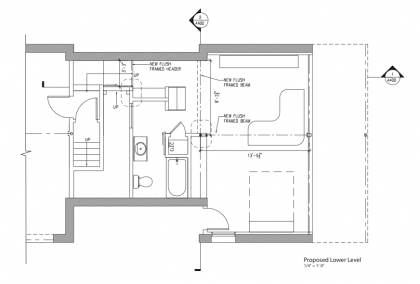
With the changes we’re about to undertake, it will look more like this…

10910_proposedlowerlevel

So what are the differences — other than furniture being drawn in?

Essentially we’re knocking out some space-interrupting, load-bearing walls and replacing them with two headers that will make the downstairs less chopped up. We’ll move the water heaters out to gain a new access corridor and built-ins, tear out the tiny efficiency kitchen we’re currently relying on and replace it with an office area, gain a few feet of bathroom space, add storage space plus a cushy Murphy bed for guest visits. Oh, and a wet bar, since we already have the plumbing. There will be lots of other details, like new windows, new floor and ceiling, eliminating window and door trim, new lighting, etc. etc.

Because we’re dealing with load-bearing walls, Emily also had to take into account future plans for the upstairs. Interrelated pieces that have to go to both the engineer and the city in order to get a building permit. I’ll show you on Monday. Thanks, Emily, for starting off our New Year right!

the coolest house on the planet

Thursday, November 4th, 2010

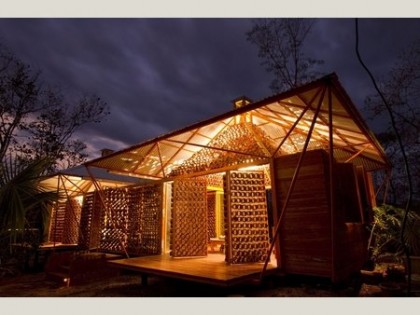
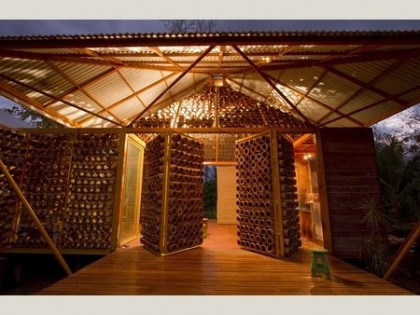
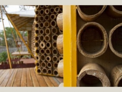
Bursting with pride today! Not for myself but a friend. A smart, ridiculously talented young architect by the name of Benjamin Garcia Saxe, whose personal project just made him the winner in the house category of the 2010 World Architecture Festival. That’s world, people. Winner of the whole freaking world!

Take a look at the magical creation he crafted for his mother in Costa Rica in his spare time. All photos by Andres Garcia Lachner Fotografia via worldbuildingsdirectory.com…

Andres Garcia Lachner Fotografia via worldbuildingsdirectory.com

Andres Garcia Lachner Fotografia via worldbuildingsdirectory.com

Andres Garcia Lachner Fotografia via worldbuildingsdirectory.com

Andres Garcia Lachner Fotografia via worldbuildingsdirectory.com

Andres Garcia Lachner Fotografia via worldbuildingsdirectory.com

All that and much more to enjoy here — read what inspired him, it really gives the project a lovely human spirit. According to yesterday’s announcement

The jury immediately sensed that this project, designed  by Benjamin Garcia Saxe Architect, was a potential winner, and were left in no doubt after the architect’s presentation.

Yay! Ben got his Master of Architecture at RISD in 2007. We know him because we entrusted his beautiful and equally talented wife Erika with our most valuable possession: Bix. She took great care of him from the age of 8 months to 3 years at our home and theirs. After Ben graduated, they moved to London where Erika pursued dance and Ben went to work doing great things for Rogers Stirk Harbour + Partners, I’m sure.

The last time we saw them, Ben gave us this amazing plywood sculpture for Bix…

bix’s sculpture via benjamingarciasaxe.com

bix’s sculpture via benjamingarciasaxe.com

We love that piece and will treasure it forever! I’ll be sure to post a photo of it in Bix’s room, where it lives.

Congratulations again, Benji. I hope you and Erika are sipping champagne tonite!

ooh, we’re “significant”!

Tuesday, September 28th, 2010

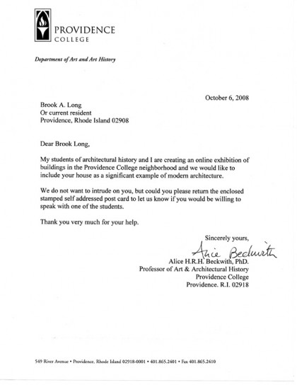
A little something to make you chuckle… Just after we moved in at the beginning of 2008, we got a letter from the Providence College Department of Art and History asking if we’d consider adding our house to their “online exhibition” as a “significant example of modern architecture.” Really? Our place?

letter from PC architecture

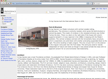
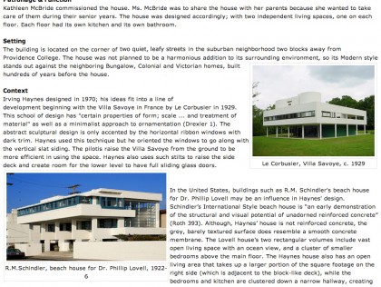
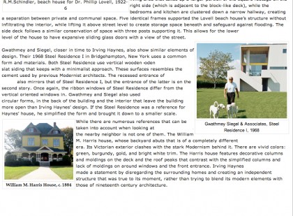
Sure, why not. I guess we do own the only modern in the ’hood after all. So we were visited by a shiny young thing from the architecture class who then did her research, we gave her photos and told her what we knew, and she put together this entry for the PC architecture website. Keep in mind that this was a student project and makes our house sound a little, how you say, highfalutin?

Page 1 (click to biggify)…

PC site | page 1

Page 2 …

PC site | page 2

Page 3 …

PC site | page 3

I’ve told you what we know about Irving Haynes in previous posts. I wonder what he’d think about being compared to Le Corbusier and Schindler? Flattered? Embarrassed? Which brings me to an unexpected syncronicity…

David’s grandmother, Maria Fenyo McVitty, was an architect who worked in Paris with Le Corbusier right after World War II. No, really! I’m pretty sure she’d laugh off the comparison to Le Corbusier. However, she did give this house her stamp of approval on an all-too-rare visit to Providence the year we moved in — unfortunately also the same year she passed on. Hers is a fascinating story I intend to share with you someday.

Miss you, Ria!

back on track

Friday, September 24th, 2010

meeting with markus

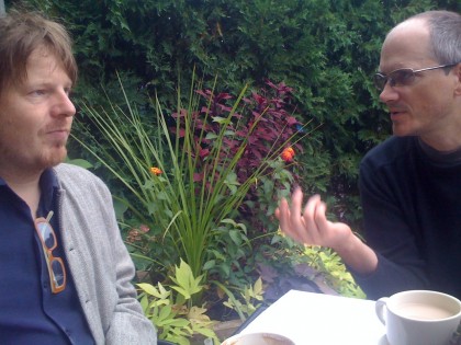
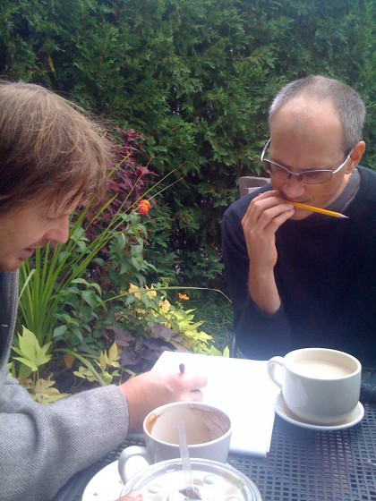
With the outside projects soon drawing to a close (fingers crossed), it’s time to bring the momentum indoors. This morning we met with Markus Berger, our architect, to get things rolling again. There was coffee. And tea. And baked goods… and pencil gnawing.

pencil gnawing... this must be the exciting part

Hopefully construction begins in October.

a glint in the architect’s eye

Thursday, August 26th, 2010

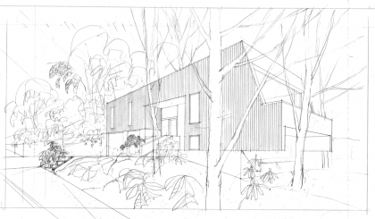
architectural rendering of our house, circa ’70 | Haynes and Associates

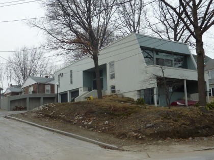
Our house, before it was born. This is what the architect, Irving Haynes, envisioned before the house was built. Pretty cool to have the original rendering from 1970. Click to biggify for full vintagey glory.

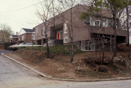
It turned out pretty much as drawn. Except no sidewalk down to the street. Here’s a finished shot from ’72 — if you saw the construction photos from my second post ever, you’ve seen this one before…

view from the corner, post-construction | Haynes and Associates

Sweet ride in the driveway.

They obviously had to cheap out on the retaining wall along the driveway as the one in the drawing is much, much cooler. They went with railroad ties… which eventually rotted, go figure. The new wall designed by architect Markus Berger is more along the lines of what Haynes was picturing…

finished wall, February 2010

Want to see the lot before there was a house on it? Yeah, we got that. Here’s the same corner view…

view of the corner, before the house was built

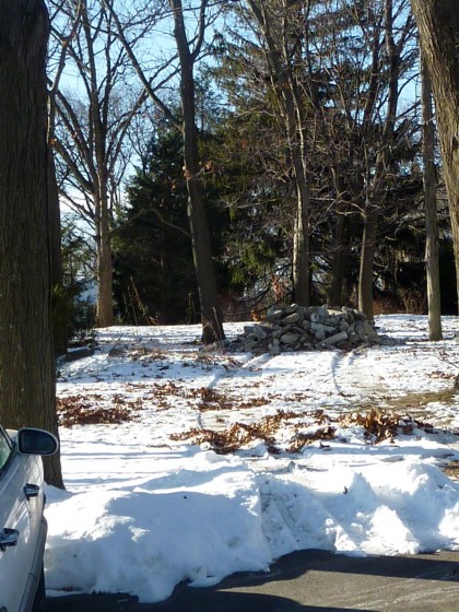
Looking up from across the street from the house, here’s the backyard we’ve been reworking when it was completely untouched and there were plenty of trees to keep the slope from washing away…

view of the back from the street

My my, aren’t we looking natty, Mr. Architect.

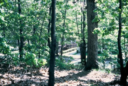
Here’s the view looking back down to the street from the future yard…

view from the lot down to the street

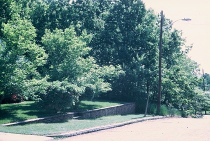
And here’s the view of what will become our veggie garden at the end of our neighbor’s brick retaining wall…

view of the future veggie garden

Yeesh. A whole lotta trees died to build this house…

Okay, trip down memory lane is over. Get back to work!

we have forsaken thee, paul rudolph

Tuesday, March 9th, 2010
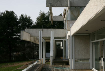
the micheels house by paul rudolph, westport ct '72-'07 | mottalini.com

the micheels house by paul rudolph, westport ct '72-'07 | mottalini.com

Yesterday I happened across two separate posts concerning Paul Rudolph, the modernist architect both celebrated and scorned for his groundbreaking work. Now heartbreaking work, because many of his buildings have succumbed in quick succession to demolition… and this country’s blatant  disdain for meaningful, historic architecture.

Design Observer, a favorite stop of mine, posted a link to a series of photographs by Chris Mottalini entitled After You Left, They Took It All Apart (Demolished Paul Rudolph Homes). The collection captures three Rudolph houses in sad states of decay just before they were demolished. Wiped off the map. I can’t encourage you enough to look at the whole set… it’s very moving.

The Micheels House (above and below) was built in 1972. The same year as our house! Torn down and replaced by a hideous McMonstrosity. That’s exactly what the world needs more of.
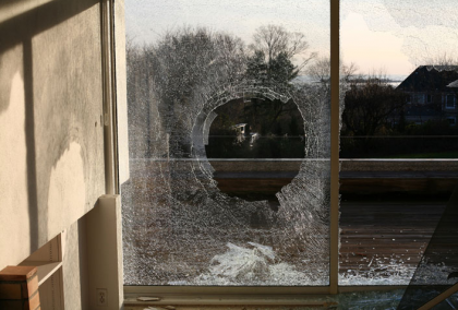
the micheels house by paul rudolph, westport ct '72-'07 | mottalini.com

the micheels house | mottalini.com
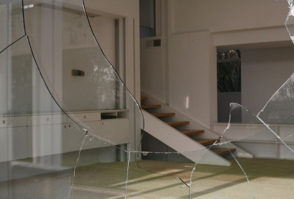
the micheels house by paul rudolph, westport ct '72-'07 | mottalini.com

the micheels house | mottalini.com

the micheels house by paul rudolph, westport ct '72-'07 | mottalini.com

the micheels house | mottalini.com

Mottalini’s  photographs are haunting. And depressing. Ugh, so depressing. He writes:

This project focuses on a group of now-demolished homes by the acclaimed and controversial Modernist architect Paul Rudolph, which I photographed mere days prior to their demolition in 2007. The resulting images capture a state of Modernist architecture few people have witnessed, revealing the grace of these homes as they stood in defiance of severe neglect and abandonment.

Among the houses torn down is one right here in Rhode Island — the Cerrito House. I recall following the news of its plight with great horror. The Paul Rudolph Foundation made valiant efforts to save it but it all fell through in the end. What was wrong with the house? According to the New York Times article:

The house’s owners… who live on the West Coast, want it removed so they can build a larger vacation home on the site…
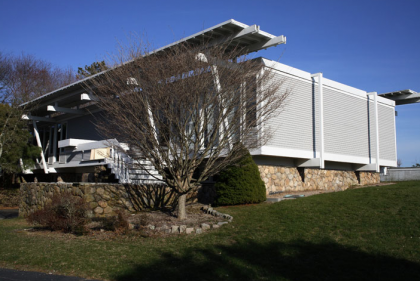
cerrito house by paul rudolph, watch hill RI '56-'07 | mottalini.com
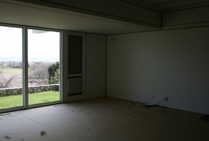
cerrito house by paul rudolph, watch hill RI '56-'07 | mottalini.com

cerrito house | mottalini.com
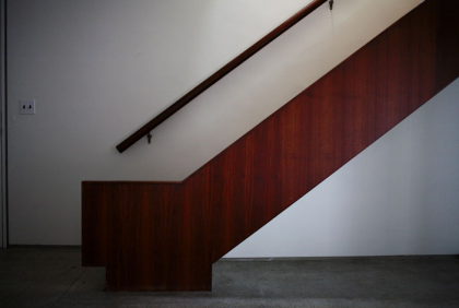
cerrito house | mottalini.com

cerrito house | mottalini.com

cerrito house | mottalini.com

Our disposable society has no hesitation in throwing away a perfectly good home, even if it is functional, beautiful and the only one if its kind. It’s maddening. As Mottalini notes:

Several other Paul Rudolph projects are currently slated for demolition and, as a result, he has become representative of a tragic disregard for mid-century architecture.
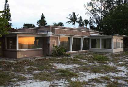
the twitchell house by paul rudolph, siesta key fl '41-'07 | mottalini.com
the twitchell house by paul rudolph, siesta key fl '41-'07 | mottalini.com

the twitchell house | mottalini.com
the twitchell house | mottalini.com

the twitchell house | mottalini.com

the twitchell house | mottalini.com

A few hours before I came across Mottalini’s photos, I read a tweet by Grain Edit that lead me the excellent Metropolis Magazine film, Site Specific: The Legacy of Regional Modernism. It’s a fascinating look at the Sarasota School of Architecture’s desire to “escape the international culture of uniformity” by combining site-specific modern architecture and the clever use of local materials. Woven throughout the story is Riverview High School (circa 1956), Paul Rudolph’s first civic building and an example of revolutionary thinking. There were efforts by many to save it from destruction. Regrettably, it saw the wrecking ball last July when the school board decided to turn it into blacktop.

If this subject saddens you as much as it does me, you might be interested in a new exhibition currently at AIA New York’s Center for Architecture: Modernism at Risk. It’s open to the public February 17 – May 1. From the website:

Modernism represents the defining movement of twentieth-century architecture and design; yet, every day, important works of modern architecture are destroyed or inappropriately altered…

Saving modern landmarks is important because they enrich a community’s sense of place – providing continuity between its past and important buildings of our own times.

Damn straight. I’ll be in attendance some time soon. Hope to see you there.

… the idea that you need to show off your success to the world in the form of a gargantuan mock-Georgian or mock-Tudor manse, the bigger the better, is to me more than a little depressing. If McMansions are like enormous, overdesigned, gas-guzzling Cadillacs, then early modernist houses are like Toyota Priuses — fresh looking, reasonable, modest, elegant in a simple, understated way. So there is a lesson — I might almost call it a kind of moral lesson — in a lot of the modernism that is now threatened. It’s a lesson of understatement and rationality.

— Paul Goldberger, architecture critic for The New Yorker and National Trust for Historic Preservation Trustee | from The Modernist Manifesto


*     *     *     *     *

Important reading for those so inclined

The Modernist Manifesto: Why buildings from our recent past are in peril, and why saving them is so crucial Insightful perspective from the magazine of the Trust for Historic Preservation

Modern Homes Survey: New Canaan Connecticut A survey of modern homes in New Canaan prompted by the demolition of Rudolph’s Westport home in 2007, along with a cry for historic preservation — amazing photos and extremely important work

The Sixties Turn 50 The Los Angeles Conservancy and its Modern Committee celebrate Greater Los Angeles’ rich legacy of 1960s architecture, which starts turning 50 years old in 2010 — a droolworthy mix of mid-century modern and Googie photos here

Recent Past Preservation Network Promoting preservation education and advocacy to encourage a contextual understanding of our modern built environment — includes a link to a petition to save yet another Paul Rudolph site

Cape Cod Modern House Trust Incorporated in 2007 to promote the documentation and preservation of significant examples of Modernist architecture on the Outer Cape — includes news of open houses and annual tours of their amazing preservation projects
garden bones: the big reveal

Thursday, February 18th, 2010

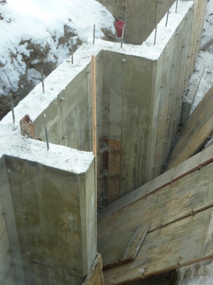
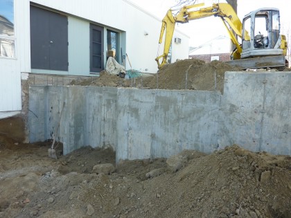
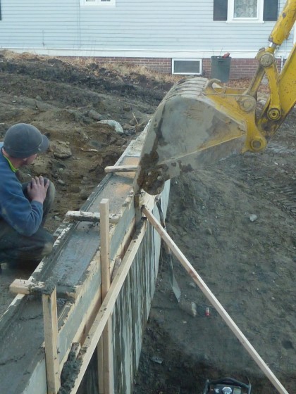
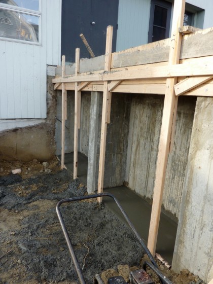
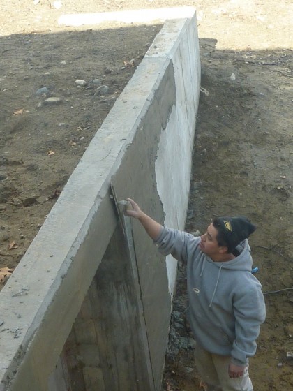
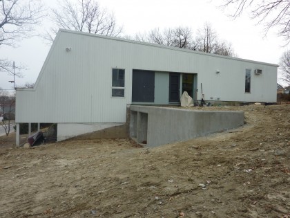
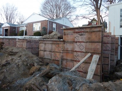
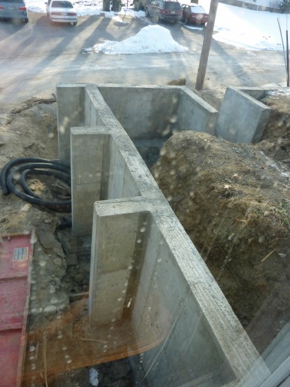
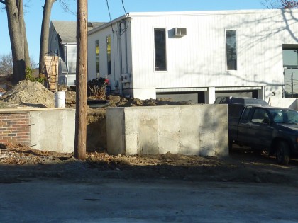
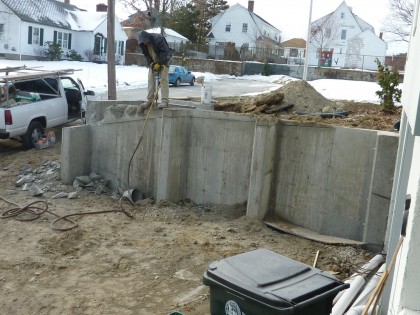
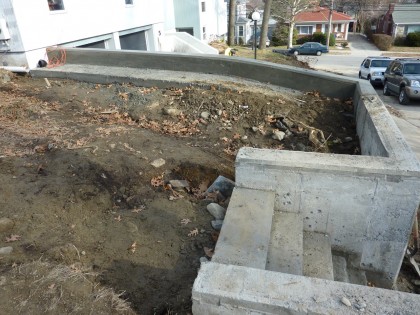
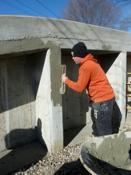
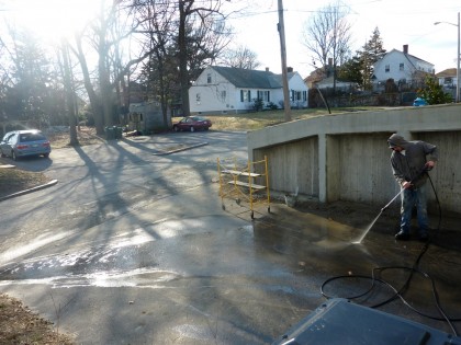
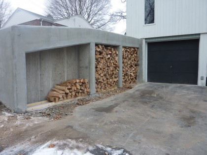
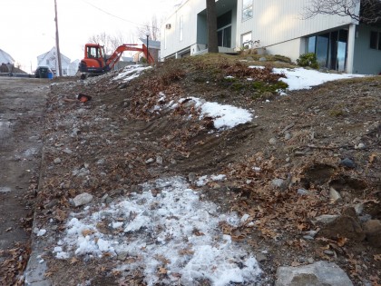
Retaining wall construction wrapped about two weeks ago. Let’s get right to the final results… As always, click to biggify.

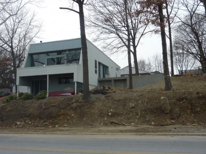
final front view

final back view

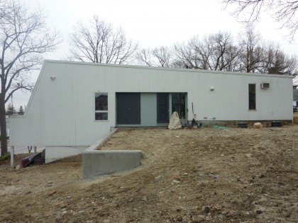
Very happy with how the walls look like they belong to the house — the mark of an architect. Irving would be thrilled. Thanks Markus Berger and Naomi Clare at Inside Out Design! Once the paint comes off the foundation, it should look even more seamless.  Doors still need to be built on the storage bays of the back wall. And when spring rolls around, plantings will soften the edges and add privacy.

The construction, chronicled

Want the nitty gritty? Read on…

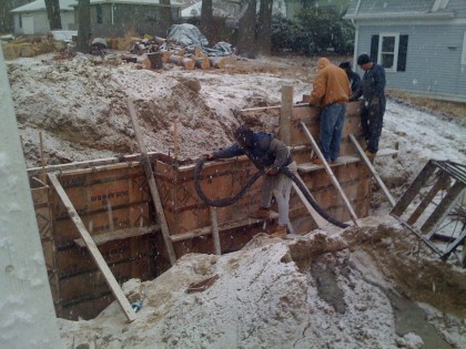
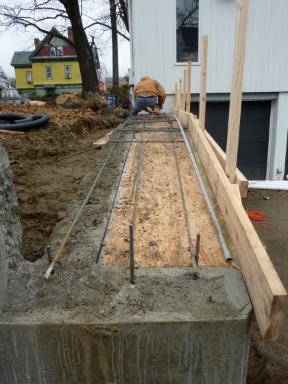
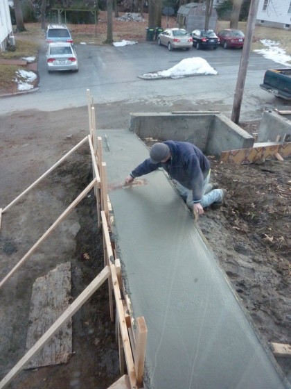
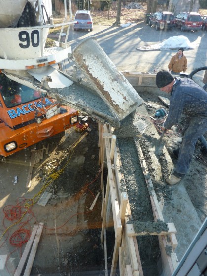
The retaining wall plans got done in November. The next step was getting bids from cement contractors. And tick tick tick tick tick, suddenly it’s December. Impending winter. This is Rhode Island, after all. Is building now really a good idea?

The contractor we settled on seemed to think it was. “Adjust the concrete mix to deal with the cold,” they said confidently in their thick Rhody accents. We were dubious. But our engineer, Erik Anders Nelson, was down with that. The city inspector was, too. So fine, then.

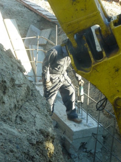
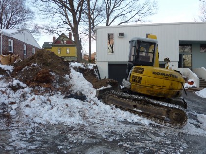
To start, we had to take out two trees in back that happened to fall directly in line with the placement of the retaining wall…

backwall 1

Sorry trees. I know it’s not much consolation but digging would have killed you. You’ll be replaced by something exquisite, I assure you.

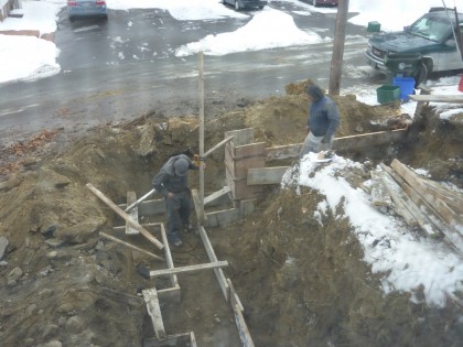
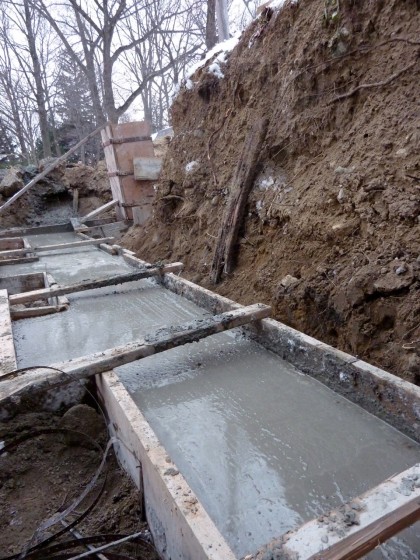
Digging started on December 15th. My Facebook friends weathered six weeks worth of almost daily posts on the progress. Highlights below. If you really want to get your geek on, you’re welcome to check out the full project from beginning to end, complete with angst and commentary.
Back wall:

back wall 2

back wall 3

back wall 4

back wall 6

back wall 7

back wall 8

back wall 9

back wall 10

back wall 11

back wall 12

back wall 13

back wall 14

Front wall:

front wall 1

front wall 2

front wall 4

front wall 6

front wall 7

front wall 8

front wall 9

front wall 10

front wall 11

front wall 12

front wall 13

front wall 14

front wall 15

front wall 16

front wall 18

front wall 19

Goodbye, rocky menace:

rocky menace

rocky menace gone

Four dumptruck’s worth of crappy stone, gone! Some of it…

rocky menace jr. in the neighbor's yard

ended up right across the street, in our neighbor’s yard! Glad someone can use it. We tried to give it away to any contractor who’d take it. No takers.

The ugly and unresolved:

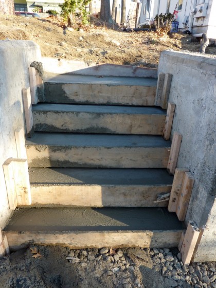
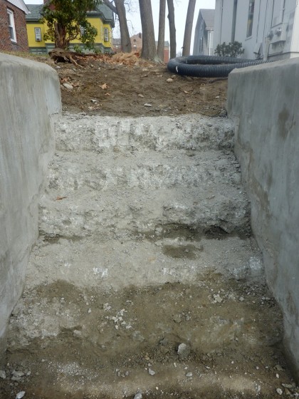
front wall stairs

Drama with the stairs. The concrete crew couldn’t seem to make the detail consistent from step to step (5th photo down, after the jump). David had them rip it out… three times. Oy. Says he’ll be pouring the detail himself. Hallelujah.

There’s also some debate about the stucco-ish finish. David thought he’d prefer it over the patchwork look of the concrete that resulted from multiple pours. Now he hates it. I could have lived with the bare concrete. Oh well.

Consider yourself caught up. Next step: adding skin to the garden bones. Epic look at ideas tomorrow!

the hunt for irving

Tuesday, February 16th, 2010

Quick note… David and I have been emailing back and forth with Jane Ingall, wife of Irving Haynes, the architect of our house as you may recall. We love his artwork and the idea of bringing a painting into the home he built, if such a thing is available. And if we can afford it.

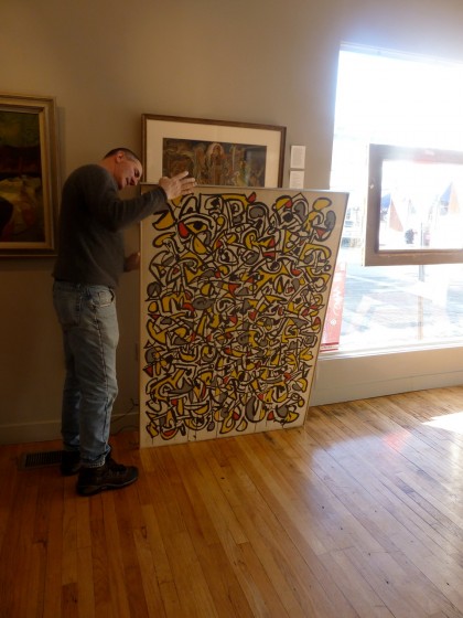
So far, the word is good. Jane says there’s work to look at. Yay! And a few days ago she let us know that she added a few of his pieces to Adam Tamsky Fine Art in Providence. We zipped over there right away…

Adam Tamsky pulls out a Haynes painting

That’s Adam. He’s easy to talk to and chock full of information. We’ll probably take a look at a few more Haynes paintings before we decide.

Side note: interesting modern bench by BILT at Adam Tamsky’s gallery…

BILT bench

Funny. I’ve already posted about those guys two other times in the past week. Sometimes I forget how small Providence is.

Expect a return to How Green Is My Brain Week shortly…