Posts Tagged ‘art’

autumn at storm king

Tuesday, October 11th, 2011

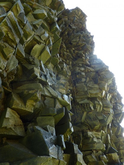
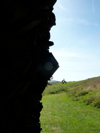
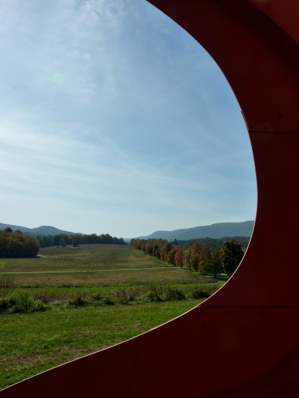
Spent an absolutely gorgeous Columbus Day afternoon in complete awe at Storm King Art Center in New Windsor, NY. If you haven’t been, go. My meager photography skills cannot fully capture glory on such an epic scale (rollover for credits)…

storm king | calder’s the arch from a distance


storm king | adonai by alexander liberman, ’70-’71


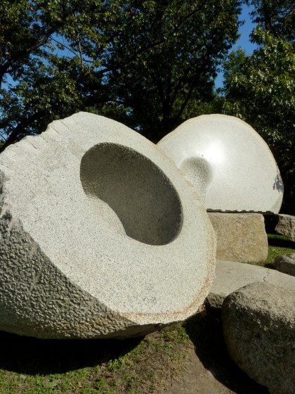
storm king | spheres by grace knowlton, ’73-’85


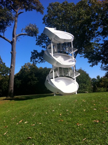
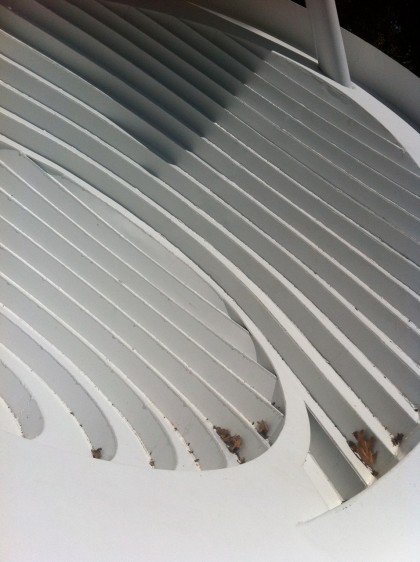
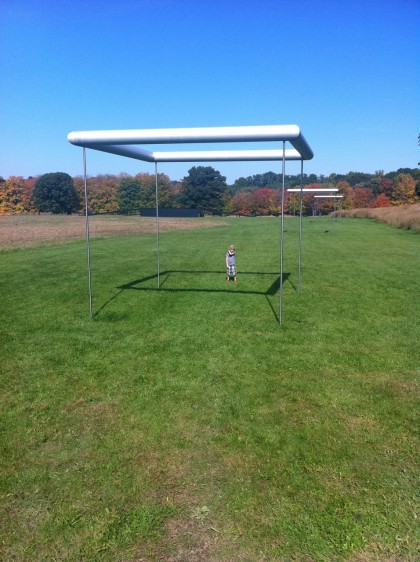
storm king | three-fold manifestation II by alice aycock, ’87


storm king | three-fold manifestation II by alice aycock, ’87


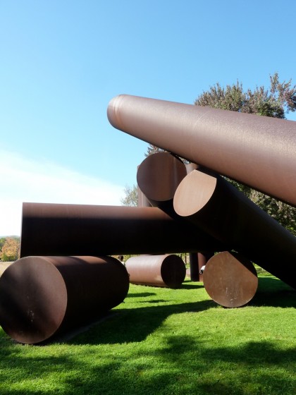
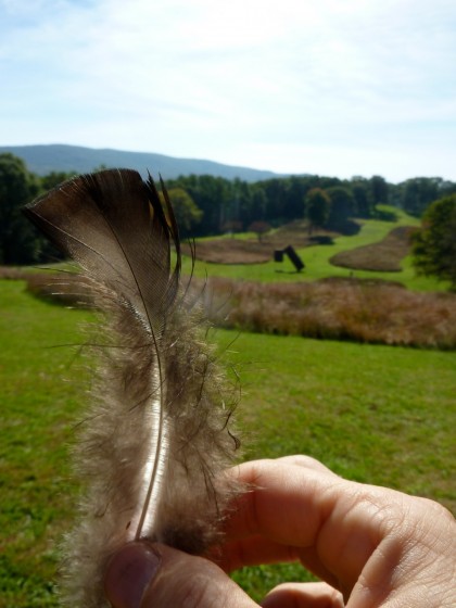
storm king | kadishman corten sculpture with feather


storm king | suspended by menashe kadishman, ’77


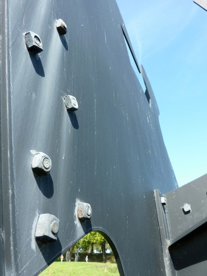
storm king | corten steel closeup


storm king | adam by alexander liberman, ’70


storm king | five modular units by sol lewitt, ’71


More Sol Lewitt? Yes, please!

storm king  | momo taro by isamu noguchi, ’78


storm king  | momo taro by isamu noguchi, ’78


storm king  | momo taro by isamu noguchi, ’78


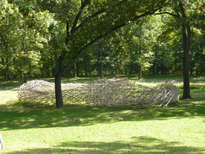
storm king stream: a folded drawing by stephen talasnik, ’09-’10


storm king stream: a folded drawing by stephen talasnik, ’09-’10


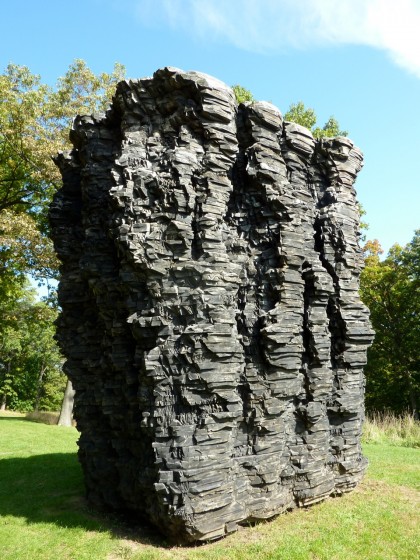
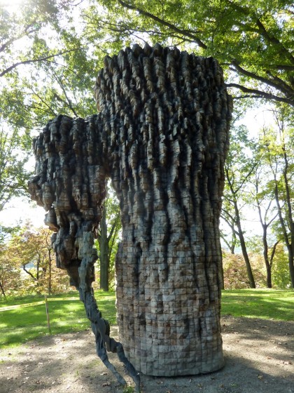
storm king  | for paul by ursula von rydingsvard, ’90 to ’92


storm king  | for paul by ursula von rydingsvard, ’90 to ’92


storm king  | detail from waiting for ufo by nam june paik, ’92


storm king | seeing calder from von rydingsvard


storm king | black flag by alexander calder, ’74


storm king | black flag by alexander calder, ’74


storm king | five swords by alexander calder, ’76


storm king | five swords by alexander calder, ’76


storm king | luba by ursula von rydingsvard, ’09-’10


storm king | south field with mark di suvero sculptures and bix


storm king | above south field


storm king | foci by chakaia booker, ’10


storm king | foci by chakaia booker, ’10


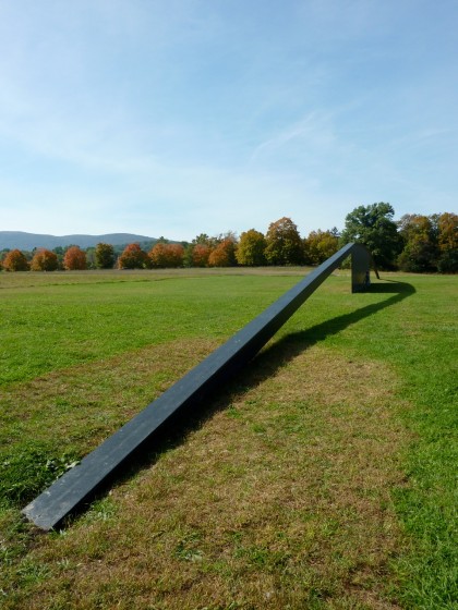
storm king | untitled by david von schlegell, ’72


storm king | untitled by robert grosvenor, ’70


storm king | the arch by alexander calder, ’75


storm king | the arch by alexander calder, ’75


storm king | the arch by alexander calder, ’75


Didn’t make it through the entire property. Next time, bikes! Missed Maya Lin, Richard Serra, Roy Lichtenstein, Andy Goldsworthy, Henry Moore, and on and on and on. Speaking of which, did you catch the Henry Moore exhibit at Denver Botanic last October?

the best surprise

Thursday, February 10th, 2011

More proof that you just never know what a new day will bring you… So this morning the doorbell rings. And who’s on our doorstep? Two happy, shiny offsproing of Irving B. Haynes, the original architect of the house we love so much. What the?

Seth and Libby stopped by to say that until they happened across mymodremod, they’d had no idea that this house was their father’s creation — even after passing by it for so many years. We had a lovely chat and stumbled them through our embarrassingly fakakta interior.

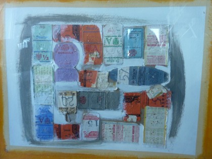
And then they asked if we’d like this (click to biggify)…

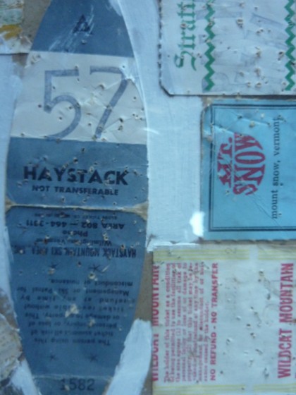
irving b haynes collage

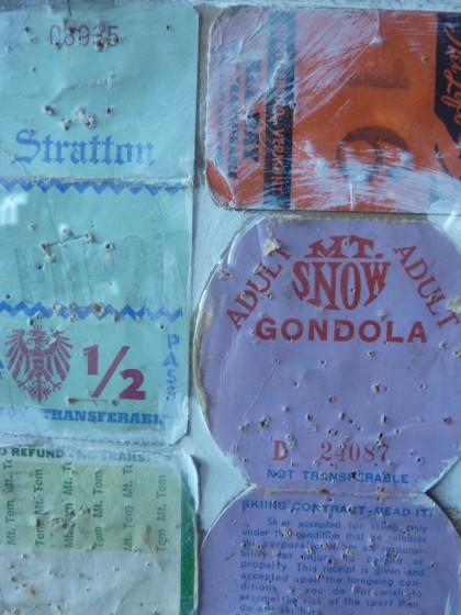
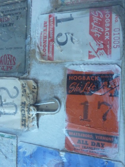
It’s a collage of ski passes made by their father in 1971 — the year construction began on our house. Hailing from Maine, Irving liked to take the family skiing around New England. Nice bit ’o regional history there…

irving b haynes collage, detail 1

irving b haynes collage, detail 2

irving b haynes collage, detail 3

How sweet is it of Seth and Libby to share a little bit of Irving with us? That’s so nice! We’ll most definitely be in touch. I’d love to prove to them that we’re really not slobs. Well, mostly not slobs anyway.

Thanks, you two! And I promise we’ll figure out the glitch in posting comments so that you can chime in every now and then.

del sol

Wednesday, February 2nd, 2011

Hey, guess what? It’s snowing again! So tired of grey skies. I could use a little something to brighten my day, how about you?

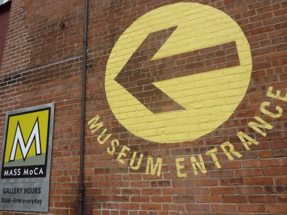
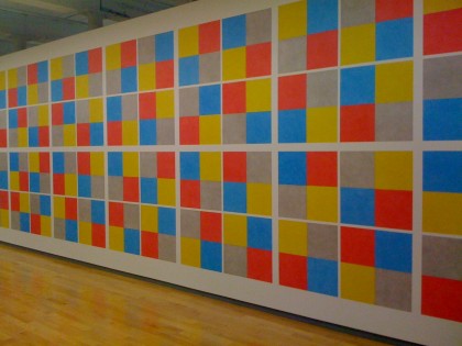
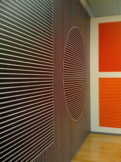
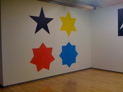
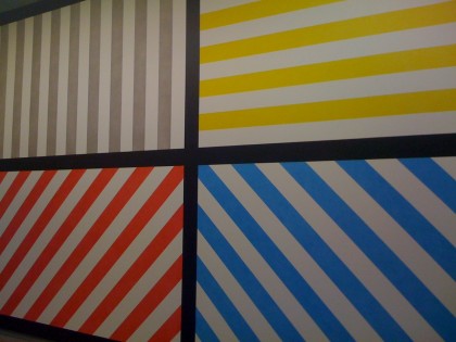
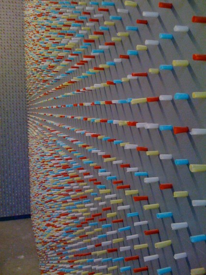
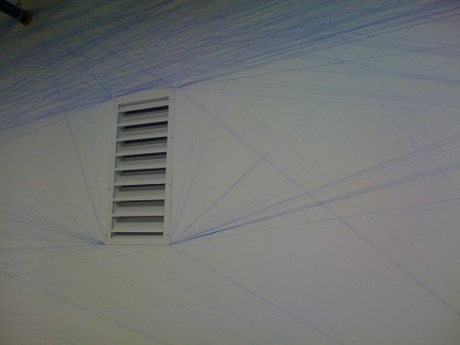
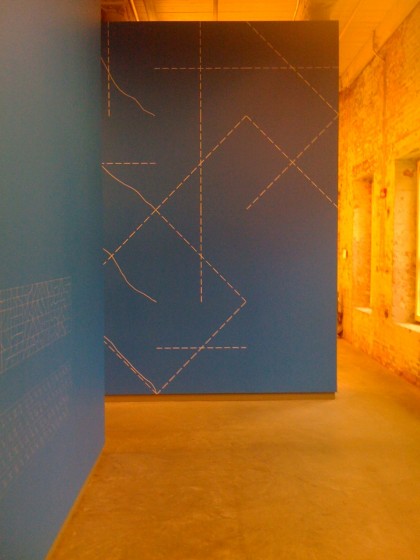
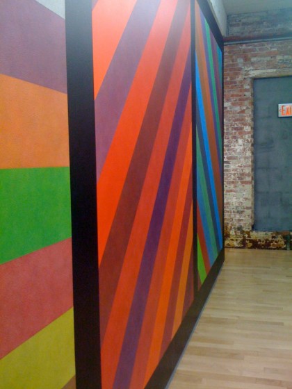
Digging through my snaps for inspiration I came across last fall’s trip to Mass Moca to see the Sol Lewitt retrospective. Was a downpour day so the light was low. Even so, the strong colors and graphics in his conceptual art are really  a pow in the eye socket…

massmoca_entrance

massmoca_wall drawing retrospective

massmoca_1

massmoca_3

massmoca_4

massmoca_5

massmoca_6

massmoca_7

massmoca_9

massmoca_11

massmoca_12

massmoca_15

massmoca_13

massmoca_16

massmoca_10

Thanks, Sharon, for the profile view! Love that shot. All those graphics make me want to take to our walls with a paintbrush.

More info on the Sol Lewitt show and his work…

the coolest house on the planet

Thursday, November 4th, 2010

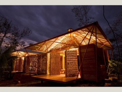
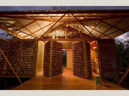
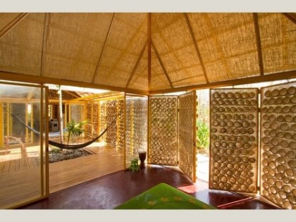
Bursting with pride today! Not for myself but a friend. A smart, ridiculously talented young architect by the name of Benjamin Garcia Saxe, whose personal project just made him the winner in the house category of the 2010 World Architecture Festival. That’s world, people. Winner of the whole freaking world!

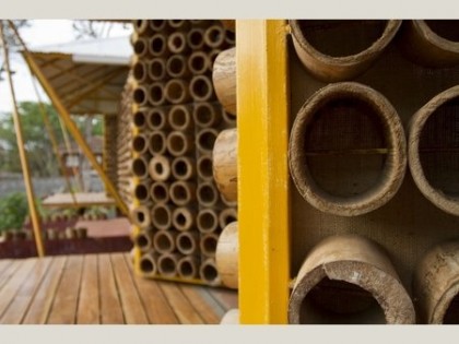
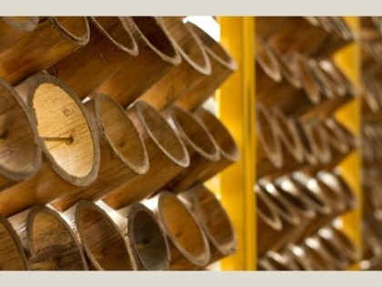
Take a look at the magical creation he crafted for his mother in Costa Rica in his spare time. All photos by Andres Garcia Lachner Fotografia via worldbuildingsdirectory.com…

Andres Garcia Lachner Fotografia via worldbuildingsdirectory.com

Andres Garcia Lachner Fotografia via worldbuildingsdirectory.com

Andres Garcia Lachner Fotografia via worldbuildingsdirectory.com

Andres Garcia Lachner Fotografia via worldbuildingsdirectory.com

Andres Garcia Lachner Fotografia via worldbuildingsdirectory.com

All that and much more to enjoy here — read what inspired him, it really gives the project a lovely human spirit. According to yesterday’s announcement

The jury immediately sensed that this project, designed  by Benjamin Garcia Saxe Architect, was a potential winner, and were left in no doubt after the architect’s presentation.

Yay! Ben got his Master of Architecture at RISD in 2007. We know him because we entrusted his beautiful and equally talented wife Erika with our most valuable possession: Bix. She took great care of him from the age of 8 months to 3 years at our home and theirs. After Ben graduated, they moved to London where Erika pursued dance and Ben went to work doing great things for Rogers Stirk Harbour + Partners, I’m sure.

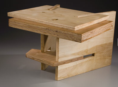
The last time we saw them, Ben gave us this amazing plywood sculpture for Bix…

bix’s sculpture via benjamingarciasaxe.com

bix’s sculpture via benjamingarciasaxe.com

We love that piece and will treasure it forever! I’ll be sure to post a photo of it in Bix’s room, where it lives.

Congratulations again, Benji. I hope you and Erika are sipping champagne tonite!

fall at denver botanic

Monday, October 25th, 2010

In Denver last week, our very first stop (after our favorite noshery) was Denver Botanic.  This is high country, so you see a lot of drought-tolerant ornamental grasses, native plants and conifers here. I get great compositional ideas from DenBot.

As luck would have it, this time Henry Moore’s sculptures were on display. Take a look…

moore sculpture near the entrance

<3

ponderosa border at entry

<3

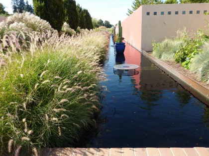
water feature with pennisetums

<3

pedestals and perennials

<3

fall blooming crocus: colchicum ‘waterlily’

<3

moore sculpture

<3

roses and juniper

<3

buddleia alternifolia ‘fountain butterfly bush’ and nessela tenuissima ‘mexican feather grass’

<3

pond

<3

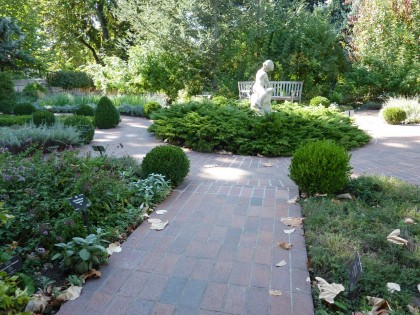
moore sculpture in the herb garden

<3

scripture garden

<3

viburnum carlesii ‘korean spice viburnum’

<3

virburnum carlesii ‘korean spice viburnum’

<3

moore sculpture

<3

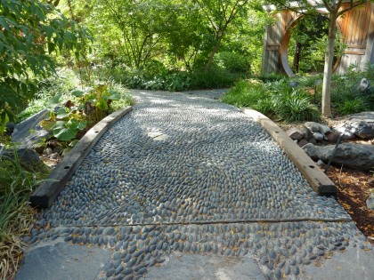
path to the asian garden

<3

<3

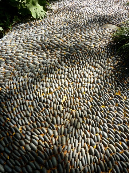
river stone detail

<3

hakonechloa macra ‘japanese forest grass’

<3

moore sculpture

<3

closeup of a bloom

<3

the fading towering stalk of agave ‘henry’s parryi’

<3

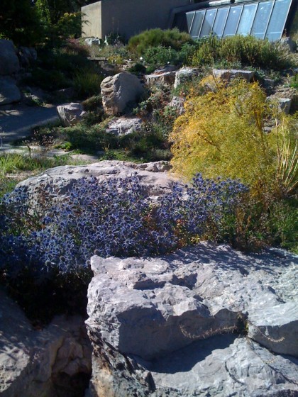
eryngium still in bloom in the rock garden

<3

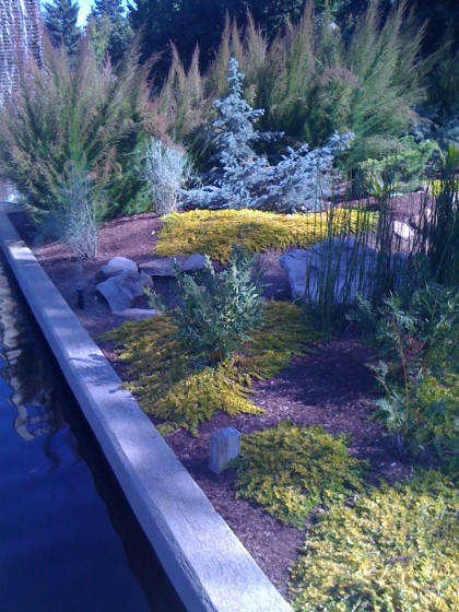
pond’s edge... lysimachia nummularia ‘aurea’ (gold creeping jenny) with conifers

<3

fountain

<3

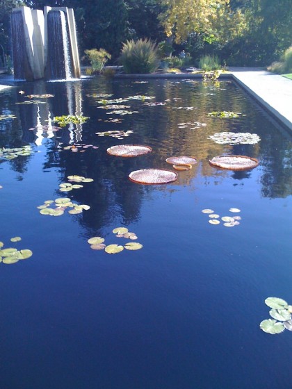
giant 3' waterlilies

<3

ornamental grasses... nassella tenuissima ‘mex feather grass’, schizachyrium scoparium ‘little bluestem’), miscanthus

<3

ephedra ‘bluestem joint fir’, mexican feather grass, yucca, pine

<3

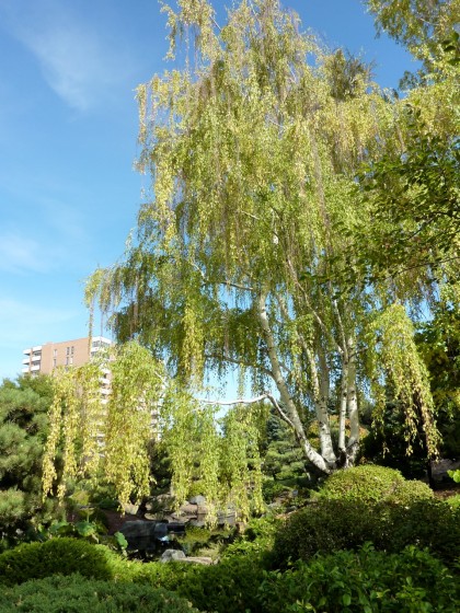
japanese garden

<3

conifers in the japanese garden

<3

ponderosa pine

<3

meadow with sculpture in the plains garden

<3

bix at water garden

<3

turtle sunning on rock

<3

glaucium corniculatum ‘red horned poppy’ and yucca

<3

wildflower rockery with sculpture

<3

salvia

<3

caesalpinia giliesii ‘bird of paradise’ shrub

<3

reclining figure on the water garden

modern benches at berkshire botanical

Tuesday, August 31st, 2010

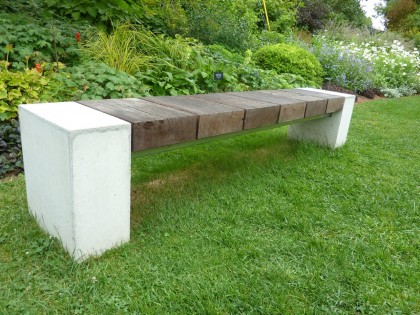
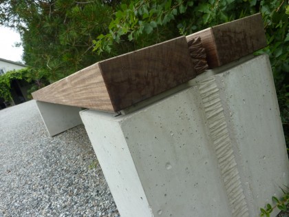
Just spied on my recent getaway to the Berkshires: two drooltastic modern benches at Berkshire Botanical Garden

“baseball” bench at berkshire botanical garden

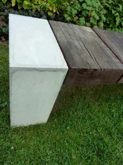
Designed by Douglas Thayer, “Baseball” (as this bench is curiously called) is made of reclaimed Greenheart, reclaimed Ipe and concrete. Looks like it could stand up to a New England Nor’easter. It’s a work of art you can sit on. Have I mentioned lately how much I love concrete?…

closeup on the concrete end piece

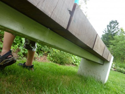
Underneath, there are two metal crosspieces… maybe steel?

view of the metal cross pieces underneath

Clearly seen through the wood planks…

view through the slats

No prices on his website. Dare I email him and find out how much such a piece might cost? I’m afraid.

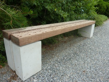
Around the corner from Baseball sits this beauty…

another bench at berkshire botanical garden, same designer

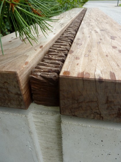
Couldn’t locate a name or description for this one, but it’s obviously another creation by Thayer. Similar minimal aesthetic and concrete + wood design. The spots are raindrops, btw.

Here’s a closer look at the detail between the planks and on the concrete supports…

a look at the inset detail

detail closeup

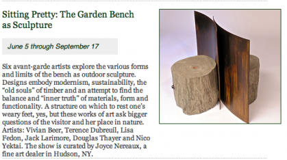
There were lots of benches on display at Berkshire Botanical as part of their Garden Bench as Sculpture show, but those two were my favorites. Simple. Solid. Honest looking. According to their website, the show ends September 17:

info from Berkshire Botanical events calendar

other people’s gardens followup

Thursday, June 10th, 2010

Just thought I’d share. Remember that awesome garden in North Stonington, CT, where we spent the day a few weeks back? This one…

daffodils at blue flag farm

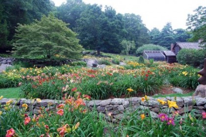
Turns out it’s Blue Flag Farm, which specializes in raising daylilies — 600 varieties! That explains this shot…

daylilies in waiting

Imagine how crazy colorful it is with all those daylilies in bloom…

daylilies in bloom | shot from blueflagfarm.com

daylilies in bloom | shot from blueflagfarm.com

other people’s gardens

Monday, May 3rd, 2010
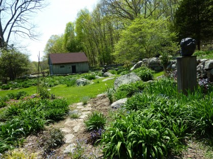
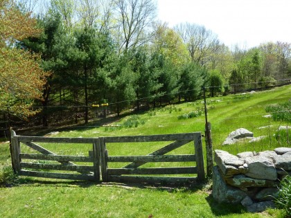
Visit to the garden of a friend of the family. A perfect day in a lovely sunny spot in the woods of North Stonington, CT, right on a creek.
Shall we?
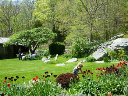
bix ’n tulips ’n lawn
<3
more tulips
<3
purple and white wisteria
<3
wisteria
<3
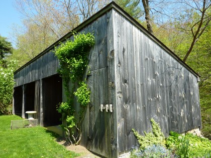
weathered shed
<3
blues and purples
<3
up thru the apple tree
<3
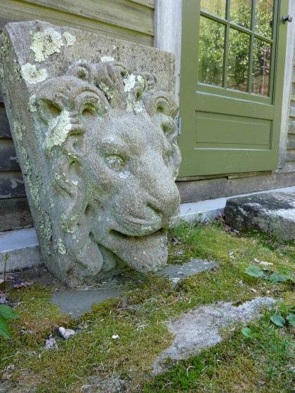
concrete lion
<3
chien bizarre
<3
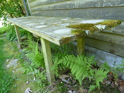
mossy bench
<3
shade plants
<3
anemone canadensis
<3
sculpture in the woods
<3
stone passage
<3
bees beginning to swarm
<3
daffodils
<3
the daylily garden
<3
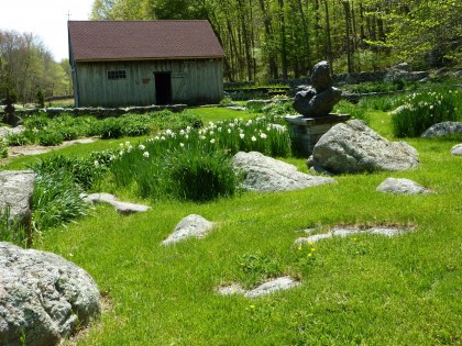
bronze sculpture with daffodils
<3
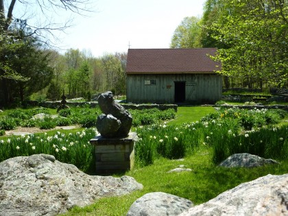
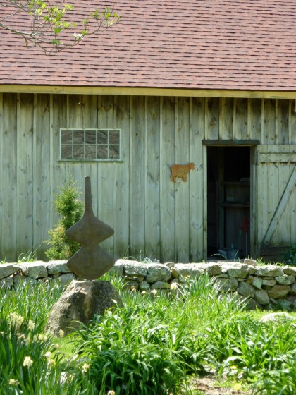
art and barn
<3
weathervane on the sheep barn
<3
daylily tables
<3
old sheep grazing field
<3
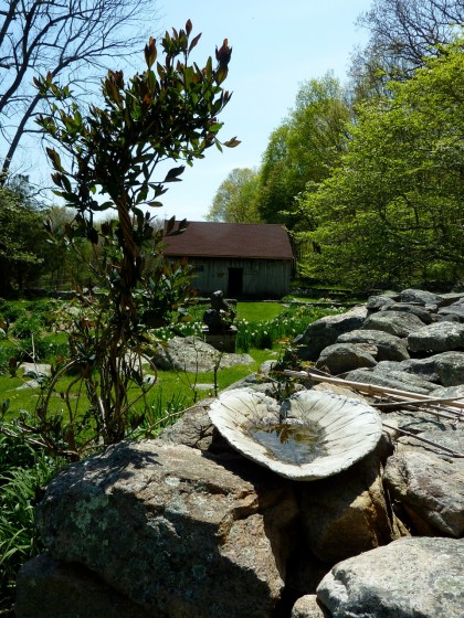
vine and birdbath
<3
ape sculpture
<3
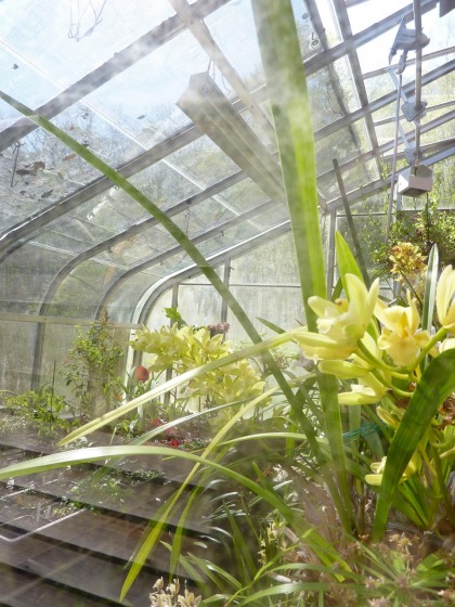
orchids in the greenhouse
<3
lilac and lawn
<3
sculpture ’n daffodils
<3
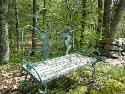
forest bench
<3
bamboo
<3
bamboo closeup
<3
sign on the bridge

conflicted in kid-dom

Thursday, February 25th, 2010

Our friends are always asking if we’ve made progress in the kid’s room. No wonder. The move was two years ago, which means Bix has spent nearly half his life in a mess. So we tackled his room first, hoping to create a calm, fun place away from the remodeling storm. I like the result. But I’m also conflicted about it. Argh.

Starting with what we already had

Luckily, we moved in with most of the stuff we used, including mandatory KidKraft train table, some chairs, and the drawers and bookcases David built when Bix was a baby…
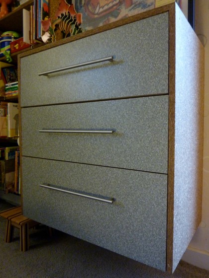
dresser

I see the drawers need a little readjusting but you get the idea. We used Sunflower Seed Board from Van Beek’s in Michigan. Here’s a closer look…
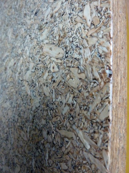
closeup of sunflower seed MDF

It’s an eco-friendly MDF made from pressed sunflower seed hulls. LEED-certified, no formaldehyde, no outgassing. Finished in a simple water-based poly. Makes us feel good.

David had made the drawer fronts using a laminate we thought was fun enough for a kid but easy to like as an adult…
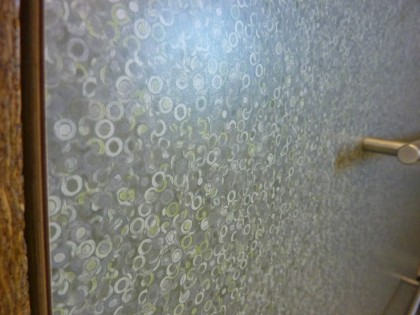
Formica in matte finish Beluga (#3697)

We debated about the environmental friendliness of laminate and decided that because drawers see a lot of grimy little fingers and can take a beating that the sunflower board can’t (without getting chipped, that is), it made sense.

Attack of the madwoman with a paintbrush

Before we could hang the furniture on the wall above the heaters, I had to scrape off the babyish wallpaper border that went all around the room, prep the walls and paint.
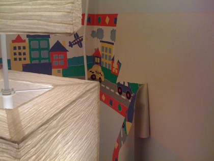
early room view 3

To encourage drawing, I decided on kid-height chalkboard walls around the perimeter. I taped off the space…
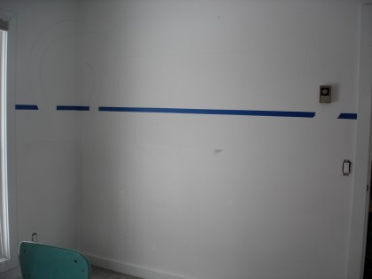
chalk board prep 1

Used a dab of caulk along the bottom of the painter’s tape for a nice, clean edge. Then filled in my lines with four or five layers of chalkboard paint to make it extra durable.
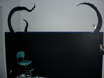
chalk board prep 3

I was hoping to tie the chalkboard to artwork we commissioned our friend Ryan Lesser to make a few years ago (click to biggify if you care to)…
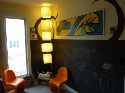

wide shot, finished chalkboard

creature

chalkboard finished

more artwork from Ryan Lesser

Those are a few more characters by Ryan.

I brought the tentacles around the corner and over onto the adjoining wall behind the door…
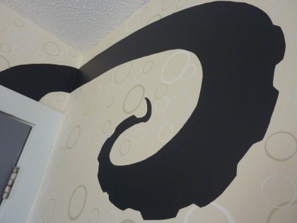
tentacles

I maybe went a little overboard carrying the “bubbles” look from the laminate onto the wall…

glossy bubbles on matte paint

I used high gloss paint in various tints of white (some bluish, some greyish, some super white, etc.) on top of a matte oatmealy white. The anal part: I used round container lids in three sizes, dipped them into the paint and then pressed them onto the wall. Looks good when the light hits it. David thinks it’s too busy. Just wait, it gets much busier.

Bunk bed in a closet

The dressers are more than adequate storage for the wardrobe of a 5-year-old — with plenty of room for toys, too. His closet was wasted space, so we decided it was a smart spot to fit a bunkbed with storage underneath. Great for sleepovers someday, or the occasional guest.

In order to be twin-bed length and last Bix well into his teens, we needed to make the space a little longer…

closet build-out

David extended the closet space by about 6″ and added some serious mass loaded vinyl sound-proofing to the walls. The occasional mid-construction reading break was called for…
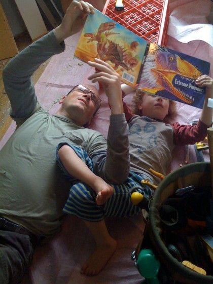
demolition break

Then he put in new drywall and spots for lights for both bunks.

finishing the drywall

He drilled crazy long wood screws into the studs for extra support.
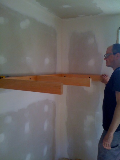
building bunk bed supports

Hang on a sec and I’ll show you the finished bed. Keep your pants on.

Paint overload

Building out the closet ruined  the edge of my paintjob. No biggie. Easily camouflaged with a little sanding and some paint in a contrasting pattern to trick the eye. I did a color study using various shades from around the room — Benjamin Moore zero-VOC Natura paint so I could feel reasonably okay about sticking to our eco-friendly principles…
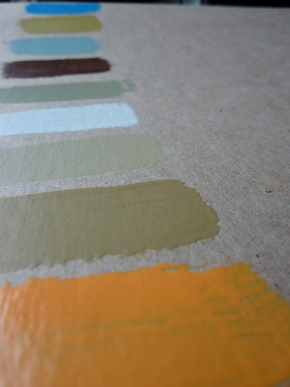
paint swatches

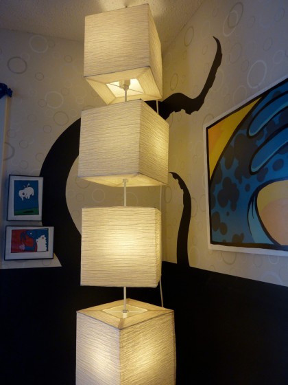
First, I taped off a floor-to-ceiling strip for magnetic paint (not so eco-friendly, I’m sure). The Ben Mo’ semi-gloss can go right over the top to dress it up, so I taped off cubes to echo the Ikea paper lamp hanging in the opposite corner…
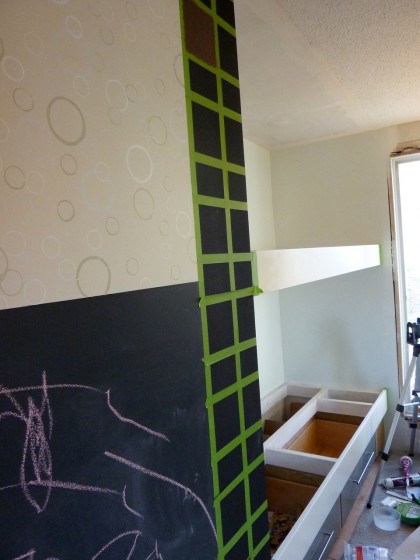
taping off the magnetic board

So the result?

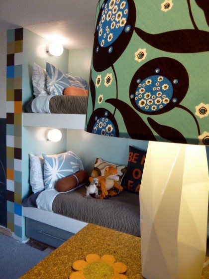
bunk beds and magnetic board

I matched bunk bed walls to the aqua in the bookcases. The magnetic strip brings in all the colors of the room. Recovered the shade of the West Elm lamp I picked up for half price. I’m liking how circles vs. squares turned out.
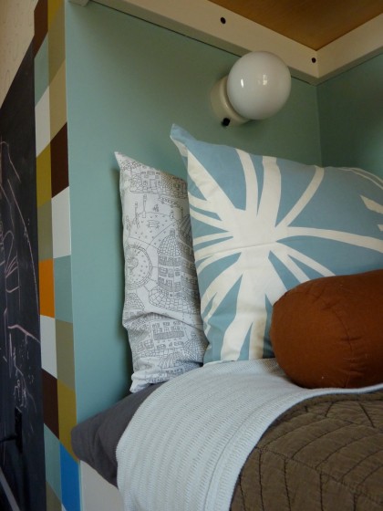
closeup on lower bunk

Aqua pillowcases from Area we already had. Added the illustratey one and cushy flannel sheets from Garnet Hill. Organic blanket and a quilt picked up at West Elm. Roll pillow half price from Unison. Sales rawk.
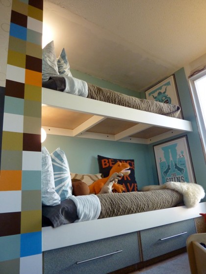
full shot bunk bed

The underbed drawers we stole from one of the dismantled dressers David made for Bix’s baby room. As Bix gets older, we could decide to pull out the bottom bunk and put in a desk. Or add a clothing rod under the top bunk. It’s a very flexible space. And the whole thing could easily become a closet again if need be.
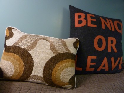
etsy pillows

Pillows from two great etsy sellers: Spruce Home who works in some great vintage fabrics and Alexandra Ferguson who uses 100% post-consumer recycled felt. A nice comfy back for a little storytime action.

Shins “monster” art from Tad Carpenter...
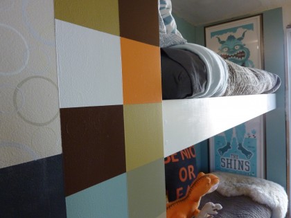
Shins monster

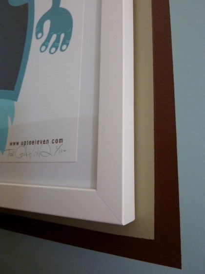
painted border around art

Such a paint addict — I thought it needed a border. As a side note, that’s not glass inside the frame. It’s plexi. Globe lights are also plastic and not glass. Just in case, ya know.

monsters in a barrel

Barrel found at PB Teen at a get-it-outta-here discount of 75% (years ago, sorry). So many uses but for now, all things stuffed.

On the way over to the book nook…
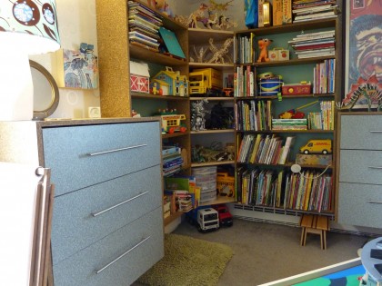
bookshelves viewed from bed

Trish Grantham painting

New painting by Trish Grantham and Frank Kozik figures from Kid Robot over the dresser.
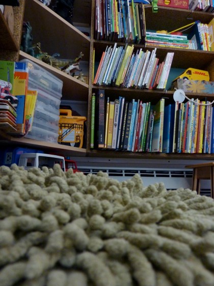
nice grassy pillow for sitting and reading

A grassy knoll pillow for reading, repurposed from the living area.
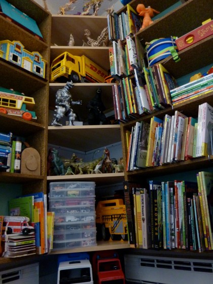
looking up at bookshelves

We bridged the space between bookshelves with cheap Ikea corner shelves, which added even more storage.
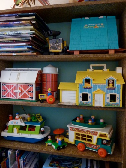
vintage Fisher Price “little people” toy collection

Vintage Fisher Price “little people” toys collection. Thanks, eBay. I always wanted an A-frame.

mechagodzilla and godzilla

Mechagodzilla and Godzilla — gifts from Bix’s friends “the Godzilla girls.”
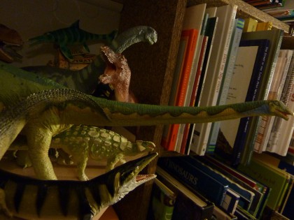
dinos on a shelf

Bix’s true love: his dino shelf.

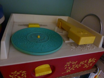
vintage Fisher Price record player

Vintage Fisher Price record player came with six “records.” Priming him to be a DJ from a very young age. eBay.
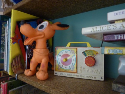
vintage Fisher Price “radio”

Ancient Fisher Price “radio” still works. eBay. I’m getting repetitive, sorry.

the Seuss section

The Seuss section.

’zilla feet, licensed by Toho

Godzilla feet from Toho for stomping through the house.
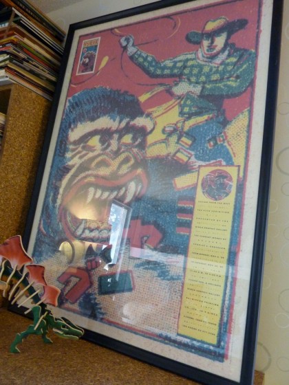
Charles S. Anderson poster circa 1990

On the other dresser, a leaning Charles S. Anderson poster hides a hideous air conditioner. Dated ’89, although I picked it up at a paper show in Houston years after that. It’s a French Paper sample Bix insists he must have in his room because up above King Kong…
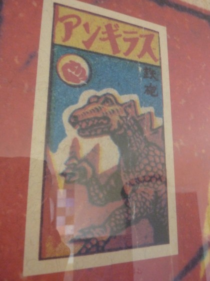
Godzilla on King Kong/C.S. Anderson poster

there’s a tiny Godzilla. I cannot deny him.
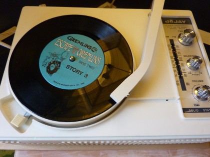
gremlins on the turntable

Gremlins on the crappy eBay turntable that came with about a zillion records to add to those we already had.
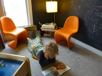
bix listening to records

And now we’re back to the corner where we started! Only now somebody’s appreciating the joys of vinyl. Good boy.

What’s left undone

Still to come: the ladder and top railing for the bunk bed, replacement baseboard and trim here and there…

need new trim around the window

a wood ceiling (to cover the popcorn ceiling) and wood floor. Can’t wait to get rid of that hideous toxic carpet, too.

Why I’m conflicted

Had really hoped this room would be super “green,” seeing as it’s our child’s room. Sustainable materials, great.  Completely thrilled with the organic mattresses — beautifully made and comfy. Eco-conscious paints, very good, but so much paint, right? And it amazes me the shizzload of plastic in this room! On the one hand, much of it’s vintage — we’re keeping plastic out of the landfill, yay. On the other hand, it’s still plastic. Oy.

So I give myself an 85% on achieving my goals for Bix’s room. Granted, I’m a harsh grader.
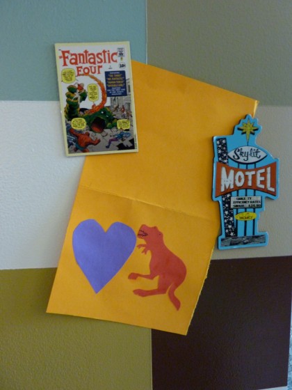
Valentine’s Day card from Orrin

Orrin made Bix a Valentine. So cute. Thanks, Orrin!
one perfect thing

Monday, February 22nd, 2010

neon clock 1

neon clock 2

What is it? Minty vintage aluminum clock with painting we commissioned from John Dee.

Where did it come from? David and I came across the clock in the dusty corner of a stripmall antique store in Pueblo, Colorado, ages ago. The tag said $25. Sold! Spun aluminum case, un-dinged (finally got all the paint off). Original glass with pinstripes, unscratched. Hands and clocky bits, working. The face had some awful lunchmeat promo on it, sloppily hand-painted right over the top of what was probably a great Chevy bow-tie sign. It was begging to be stripped, so I did.

Had the neon replaced. Mmmmm, glowy. Then it sat in the corner of our loft until I asked John if he’d  throw his paint voodoo on it. Now it sits dark and unplugged in the corner of our house longing for a wall.

Circa? Unsure. Guessing the ’40s or ’50s.

Interesting tidbit: John Dee is a UI artist and illustrator at Harmonix working on games like RockBand and, well, probably all their other titles as well. His paintings make me smile. More here.