Posts Tagged ‘furniture’

downstairs: before

Tuesday, February 22nd, 2011

So. I broke out the plan for downstairs not too long ago but I’ve never given you the tour. My dear, dear friend, invaluable running partner and talented interior photographer Ellen Connery dropped by to capture the mess downstairs before we started tearing it apart.

It’s somewhat embarrassing but why let that stop me from giving you showing you around, right? We tried to make this space somewhat livable knowing it was temporary. Biggify to see the full glory…

downstairs | the vintage file cabs

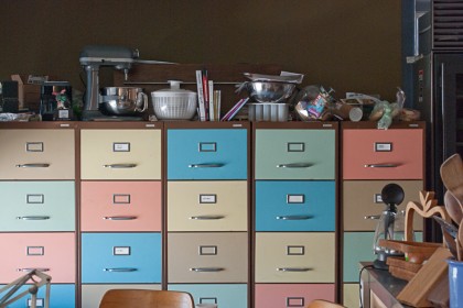
My vintage file cabs. These I am not embarrassed about. My first ever eBay purchase back in… ’98? Could I have bought something more complicated? I think not. Had to hire movers to get them to Providence but it was worth it. These came from DuPont offices in Delaware. Original paint. We had to stash most of our kitchen items inside and on top because the efficiency kitchen down here is so… inefficient.

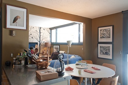
We got rid of the goth paint and chose colors that would work with the crazy file cabs. Inches from the cabinets is the kitchen/dining room with David’s grandmother’s Tulip table. Thonet bent ply chairs from the ’50s. That partial wall’s coming down…

downstairs | the wallpaper wall

On the wall: Owl print  from Catherine’s Animals by Catherine Ledner. Black and white wood block (or linoleum, not sure which) prints from the Voices From the Mountains series by Katie Truskoski.

Opposite side of the room…

downstairs | sitting area

A hint of our hand-silkscreened Blackbird wallpaper by Cavern Home in kraft on the wall there. Wool Libre sectional from DWR (the smallest sectional I could find), covered in all-cotton moving blankets so the 6-year-old cannot destroy it. As much. Roost Aluminum Antler Lamp from Velocity Home. Walnut and maple credenza by David.

View down the hall from the couch…

downstairs | the hallway

That interrupting wall is coming out, thank goodness. The tiny 2′ stove is now in use upstairs for the moment. That first door with the paint scraped off it will be the wet bar. And down at the end of the hall…

downstairs | bath

The bathroom. Even Ellen can’t make that look good. Flesh-tone paint. Gross. Soon, this will gain a few more feet. It will still be small but much mo nicer when we’re done with it.

That’s it. Your 5 cent tour has come to an end. Now gimme my nickel and get out! heh heh. Stay tuned for destruction photos.
off my rocker?

Thursday, February 3rd, 2011

As we finish moving things upstairs in prep for the downstairs remodel, we’re forced to edit our belongings to fit the space. We’re in full-on purge mode and have already sold a ton via Craigslist. But some things I’m just loathe to part with, no matter how much the huz insists they gots to go.

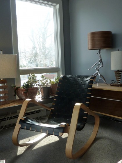
Like the Dondolo rocker I picked up via DWR in anticipation of Bix’s birth. For someone who rarely buys new furniture, this was a real treat…

dondolo rocker in front of lamps in waiting

God I can’t wait to get rid of that nasty carpet. Ugh. So anyway… Not giving this up, sorry. I used to rock the baby to sleep in this!

Originally designed by Luigi Crassevig, Design Within Reach sold this Dondolo Rocker for a short time. No longer available from DWR, I picked up mine more than six years ago. The info I can dig up online about the DWR version claims the design dates to the ’50s:

Behold one of the most fetching of a new (old) wave of reissued rockers, an authorized reproduction of a 1950s Italian stunner. Using original molds, Design Within Reach — noted purveyor of pop-art furnishings — bends hardy beechwood into zoomy curves and laces it with thick saddle leather or heavy cotton canvas. The result? The DONDOLO ROCKER, named as it was back in ’50 when it was penned by designer Luigi Crassevig.
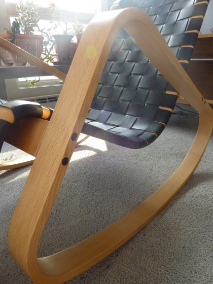
But it’s such a ’70s look, isn’t it? I mean look at that crazy shape…

definitely a 70s shape

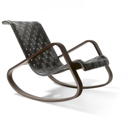
So I did a little more research and found on Architonic that the original Dondolo actually dates to 1970, not the ’50s. Told ya. In fact, Crassevig itself gives a date of 1970 on its own site and lists the chair among its many current products.

legacy.dondolo.avanti | via crassevig.it

legacy.dondolo.avanti | via crassevig.it

Which obviously means the chair is still in production. So if the Dondolo is still in production and the leather is stamped Made in Italy on the back, does that mean my chair isn’t a reproduction but an actual Crassevig? There’s no Crassevig label on it. Hmmm. Maybe I should ask DWR just to satisfy my curiosity.

Back to my case. What better place for a ’70s rocker than our ’70s house? I should keep it, right? Here, have a seat…

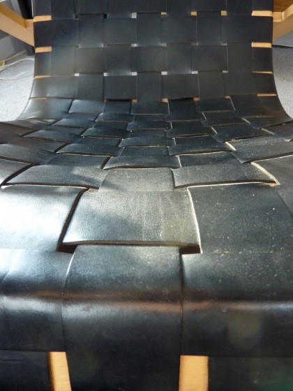
the dondolo’s woven leather straps

Now that you’re comfortable, I’ll just assume you agree with me. It stays.

one perfect thing

Tuesday, February 1st, 2011

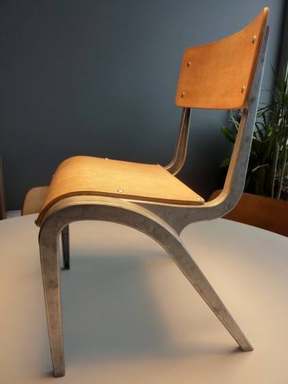
my leonard chair

What is it? It’s a modernist’s vision of the ideal child’s chair, that much is obvious. What’s not obvious is who made it. There’s no maker’s mark. Figures. It took a surprising amount of sleuthing to discover this chair’s pedigree, but I did it.

Turns out this chair is the work of  James W. Leonard for the Education Supply Association (Esavian Ltd) in the UK. The cast-aluminum alloy frame and bent beech-plywood child’s school chair made by Esavian was designed to be stackable. So this is no frou-frou object. It’s a utilitarian piece of furniture designed to stand up to rigorous use — and yet it’s a thing of beauty.

Where did it come from? I happened across it on eBay a few years back via a seller in upstate New York, not the UK. Once I spotted that slung-back aluminum leg, I was hooked. These chairs are tough to find in the states — believe me, I’ve tried since lucking across this one. They do, however, turn up upon occasion on ebay.co.uk.

Circa? Post-war. The design dates to 1948.

Interesting tidbit:

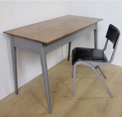
There were also adult-sized chairs, some in molded ply and others vinyl covered…

james w leonard chair for adults | salvonews.com/uk

james w leonard chair for adults | salvonews.com/uk

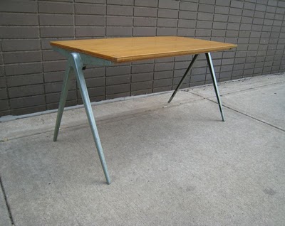
and a gorgeous stacking table that’s to die for…

james w leonard table for esavian | referencelibrary.blogspot.com

james w leonard table for esavian | referencelibrary.blogspot.com

Much to-do has been made about whether Leonard or Jean Prouvé first designed what’s come to be termed as the “compass leg.” As I understand it — from what I’ve read — Leonard’s design predates Prouvé’s by a few years. But what do I know anyway?

Want to see a few other perfect things I’ve dug up while sifting through our premodel mess? I can show you a vintage aluminum clock we hope to have a place to hang someday and a vintage steel sculpture David’s grandfather made that deserves an eventual special spot.

recently spotted

Tuesday, January 4th, 2011

I seldom go shopping these days, much preferring to order from the comfort of Chez Mess when possible. On Christmas Eve, however, I had to dash into the mall, that temple of mass consumption and hideous carpeting. Last-minute stocking stuffers, ya know.

Snagged some cute vintagey card games for the kid at Restoration Hardware…

classic card games | restorationhardware.com

classic card games | restorationhardware.com

And then I spotted something interesting over in the corner…

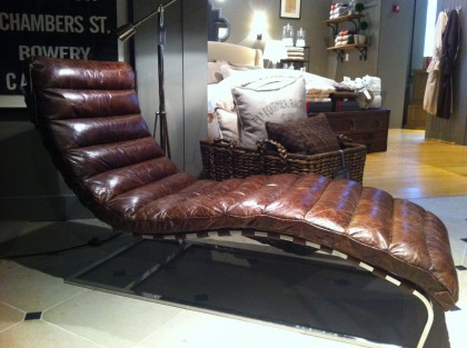
oviedo chaise lounge spotted at restoration hardware

lounge tag

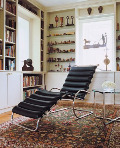
An obvious tribute to Knoll’s MR Chaise Lounge, designed by Mies van der Rohe in 1927…

mr chaise lounge by mies van der rohe for knoll | dwr.com

mr chaise lounge by mies van der rohe for knoll | dwr.com

Far from cheap but much more affordable than the original. Have you seen how much the Knoll goes for? A little history on the original, still in production, here.

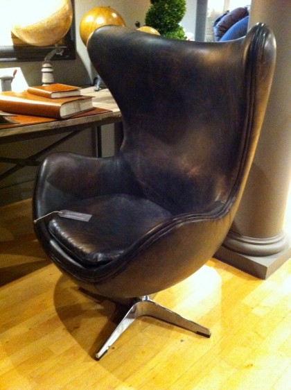
Then a few feet away from the chaise, I spotted this…

1950s copenhagen chair at restoration hardware

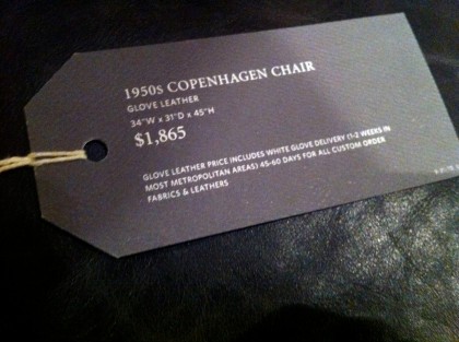
chair tag

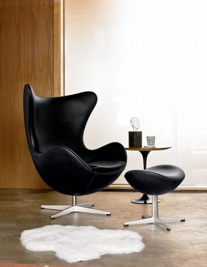
Basically a distressed leather homage to the iconic Egg Chair designed by Arne Jacobsen for Fritz Hansen…

egg chair by arne jacobsen for fritz hansen | dwr.com

egg chair by arne jacobsen for fritz hansen | dwr.com

Gorgeous since 1958 and still going strong. If you’ve ever longed for an Egg of your own, you’re probably well aware of what it costs brand-new. If you don’t require the original, I suppose Restoration’s version isn’t too shabby. The leather gives it a men’s club/smoking lounge kind of a look. Cuba meets Denmark?

Not the sort of thing I expect to see at Restoration Hardware, although they have added a little midcentury modern into their mostly traditional mix in the last few years. Their Modern Collection of bath hardware is about as minimal as they get. Anyway, just thought I’d share.

Still undecided about reproduction/reinterpretation vs original. I mean, I don’t like to think of myself as a total snob, insisting on an original no matter the price. Label hounds can be so irritating. On the other hand, is it asking too much for brands to come up with their own designs rather than profiting from someone else’s design? Granted, finding a way to make expensive things for less is the way of the world — it’s what makes sites like whiteonwhite so wildly popular. And I suppose Restoration Hardware’s whole schtick is “restoring” classic style to home goods. I dunno. What do you think?

landing stripped

Friday, November 12th, 2010

On my brain today: the landing strip. That pesky area where you come into your house and want to divest yourself of the sundry things weighing you down. Coat. Muck boots. Scarf and hat. Mail. Keys. You know the drill.

As I’ve mentioned before, we don’t have much room in our entryway…

the landing

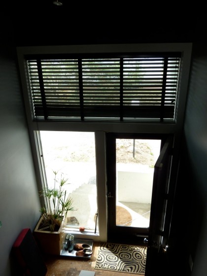
No room for a closet. Possibly room for a small bench (we have one in the works). The galvanized boot tray from now defunct Smith & Hawken we’ll likely keep for underneath the yet-to-happen bench. I vote for carting our coats upstairs, but I do see a need for a place our guests can unload before they make the journey up.

In just the past week, I’ve come across two possibilities that don’t look as though they’d intrude too much into our small space…

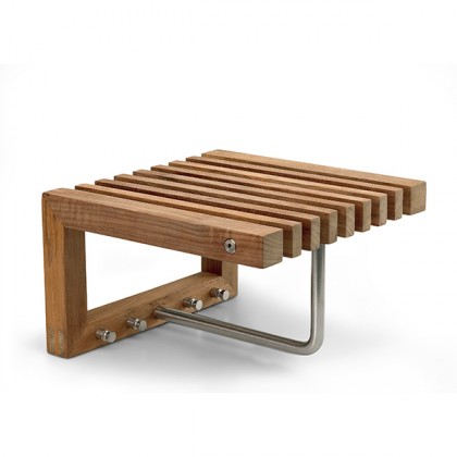
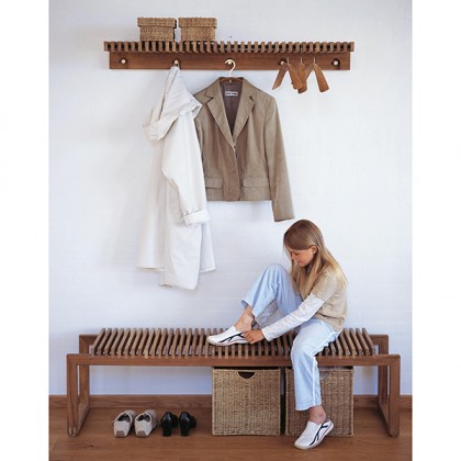
small teak Cutter wardrobe by Skagerak | horne.com

small teak Cutter wardrobe by Skagerak | horne.com

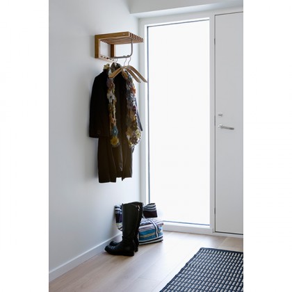
Funny, the photo of it in situ reminds me of our landing strip setup…

Skagerak Cutter wardrobe | horne.com

Skagerak Cutter wardrobe | horne.com

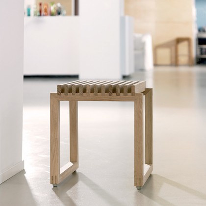
Looks like it needs a boot tray. They also have a matching stool for underneath…

small teak Cutter bench by Skagerak | horne.com

small teak Cutter bench by Skagerak | horne.com

Plus a longer version with a matching bench…

large Cutter bench and wardrobe by Skagerak | horne.com

large Cutter bench and wardrobe by Skagerak | horne.com

Made of plantation grown teak — a nice sustainable touch. Thinking those would do well in a bathroom as well as an entryway. Thanks to Remodelista for pointing me in their direction.

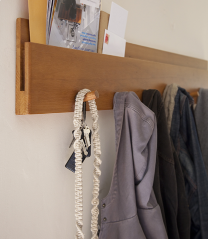
I came across another coatrack with landing strip potential while poking around the Amenity site. This one has an even slimmer profile…

douglas fir Muir wall coatrack | amenityhome.com

douglas fir Muir wall coatrack | amenityhome.com

douglas fir Muir wall coatrack | amenityhome.com

douglas fir Muir wall coatrack | amenityhome.com

Made of reclaimed fir.  Comes in a low-VOC, non-toxic walnut finish in addition to natural. I like that. The mail slot in the back makes it extra functional. Sweet.

Add those to my list of “gee I wish I had that.”

modern benches at berkshire botanical

Tuesday, August 31st, 2010

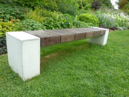
Just spied on my recent getaway to the Berkshires: two drooltastic modern benches at Berkshire Botanical Garden

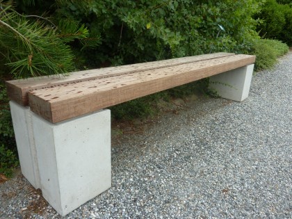
“baseball” bench at berkshire botanical garden

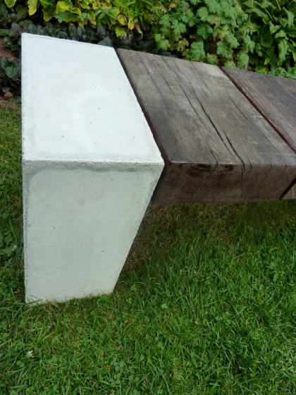
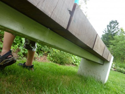
Designed by Douglas Thayer, “Baseball” (as this bench is curiously called) is made of reclaimed Greenheart, reclaimed Ipe and concrete. Looks like it could stand up to a New England Nor’easter. It’s a work of art you can sit on. Have I mentioned lately how much I love concrete?…

closeup on the concrete end piece

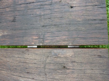
Underneath, there are two metal crosspieces… maybe steel?

view of the metal cross pieces underneath

Clearly seen through the wood planks…

view through the slats

No prices on his website. Dare I email him and find out how much such a piece might cost? I’m afraid.

Around the corner from Baseball sits this beauty…

another bench at berkshire botanical garden, same designer

Couldn’t locate a name or description for this one, but it’s obviously another creation by Thayer. Similar minimal aesthetic and concrete + wood design. The spots are raindrops, btw.

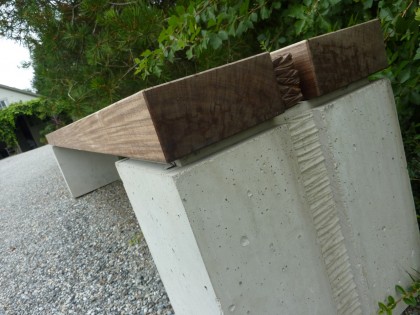
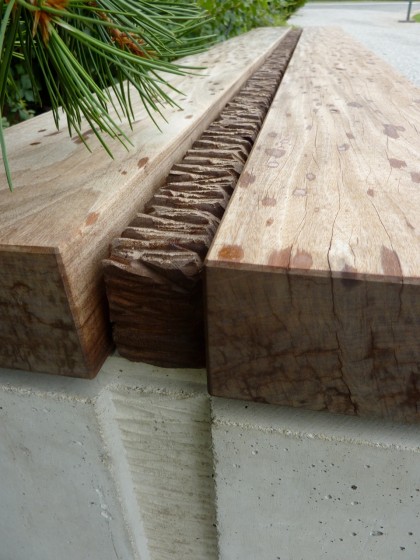
Here’s a closer look at the detail between the planks and on the concrete supports…

a look at the inset detail

detail closeup

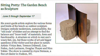
There were lots of benches on display at Berkshire Botanical as part of their Garden Bench as Sculpture show, but those two were my favorites. Simple. Solid. Honest looking. According to their website, the show ends September 17:

info from Berkshire Botanical events calendar

mmmmm, benchy

Saturday, July 24th, 2010
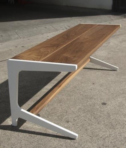
Semigood Rian RTA Bench | semigoods.com

Semigood Rian RTA Bench | semigoods.com

David’s taking the welding class at The Steel Yard this weekend. Thinking a bench similar to this minimal Rian RTA Bench by Semigood would be perfect just inside our door as a place to sit down and kick off your muddy shoes before you come up the stairs. Semigood makes a gorgeous wood version but I don’t think the woven seat makes sense with wet coats and boots.

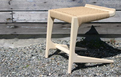
RTA Cantilever Bench | semigoods.com

RTA Cantilever Bench | semigoods.com

Semigood’s lovely Cantilever Stool above? Not to be riffed on. Investment quality. Definitely one of those pieces you could pass down through the generations. In my dreams…

old-modern i’d put my butt on

Wednesday, February 10th, 2010

Old vs. modern. I don’t think they’re mutually exclusive — especially since modernism took root in the 1920s if not earlier. Old can be very modern, at least in principle. An example…

Last October, David, Bix and I spent a few days in Denver — loving that city a little more every time we go. In search of great sushi, we stumbled onto the amazing REI Flagship store, which rubs elbows with the Greenway Trail, South Platte River and Confluence Park. REI is located in a drop-dead gorgeous Tramway Power Company Building built in 1901. It’s an excellent example of sustainable development, in which historic preservation, adaptive reuse and social responsibility combine to create something the city can take pride in.

Take a quick peek at the inside — it’s mind-blowing.

Enough background. Outside the REI building, I saw a few of these:

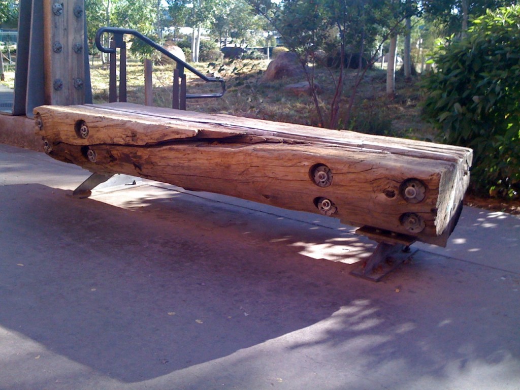
bench at Denver REI Flagship

Ancient. Rustic. Beautiful. Not modernist per se and yet in my eyes modern. An example of reuse that’s completely in keeping with its sustainably inspired environment. I think the simplicity of the steel and the bolts works well… Nothing fancy here.

detail on bench

So would a super organic bench hewn from an old log work in the context of a “modern” house like ours? I say yes. Maybe not inside as we’re really taxed for space, but outside, absolutely.

When I see the word modern, I think of an aesthetic that embraces not just the past — not just modernist icons like Le Corbusier and the Eameses, among many — but what also makes sense now. Beyond simplicity of form and a focus on function, modernism has always celebrated a connection to nature. That deep respect for the environment makes more sense than ever.

Then there’s this, which I just came across today…

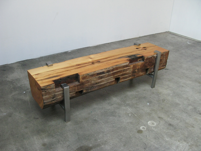
1838 Bench 2 by BILT

1838 Bench 2 by BILT

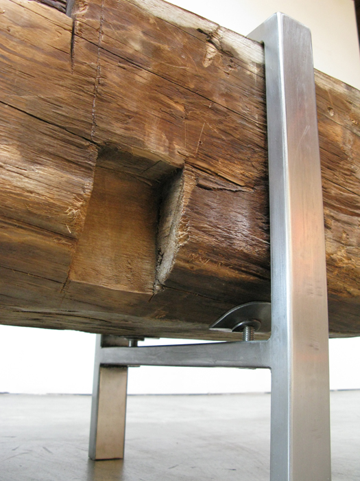
Similar to the bench outside REI but a more refined interpretation. Instead of a log, the wood was taken from 19th century wooden beams. Imperfectly gorgeous and another great example of reuse. The steel that holds it off the floor is more stylized but still simple, unadorned, absolutely modern.

steel detail on 1838 bench by BILT

steel detail on 1838 bench by BILT

Turns out BILT, the designers of this bench and other drool-worthy furniture, is from Providence. You’ll find more about BILT’s work here and here. They take commissions. Uh-oh.

*   *   *   *   *

UPDATE 02/16 | It’s been less than a week since I posted this and suddenly their website and their etsy shop are empty. What up?!