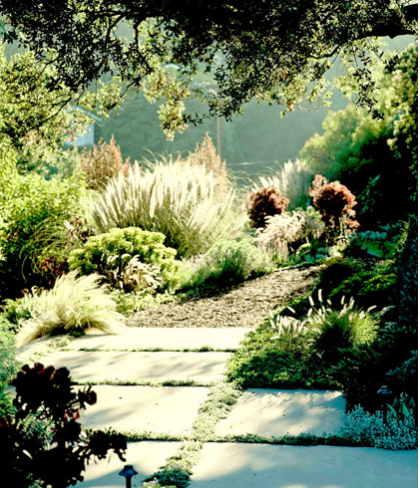
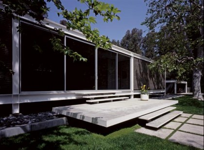
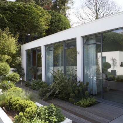
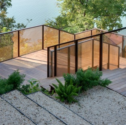
Name a category for our remodel, inside or out, and I’ll show you a stash of dreamy ideas dug up online or shot in my daily travels. Trying to show you all my inspiration for outside is ha! fuhgeddaboudit. Let’s just talk hardscape. I’ve culled some of the bazillion images I have so you can see how a few themes for the look of our future yard rise to the top. Ready to take a dive?
DRIVEWAY
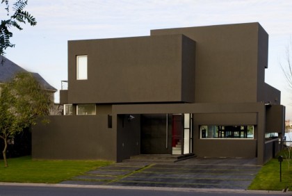
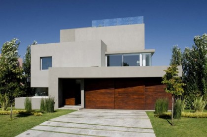
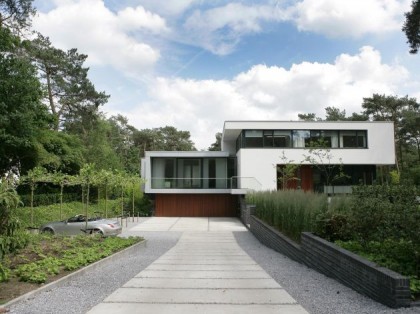
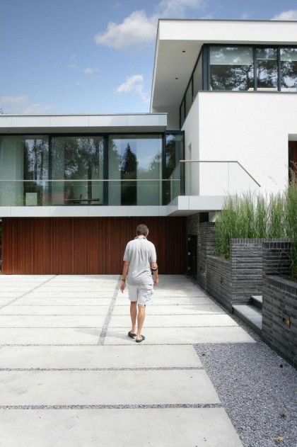
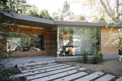
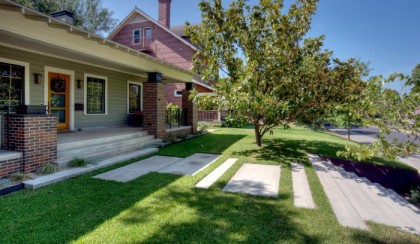
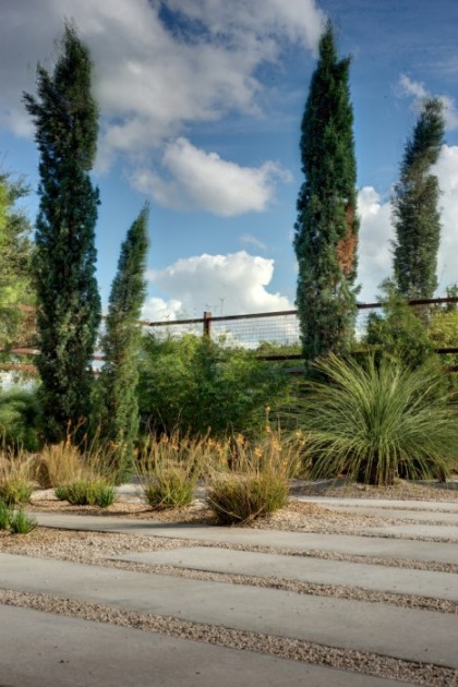
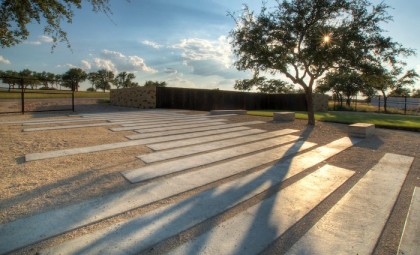
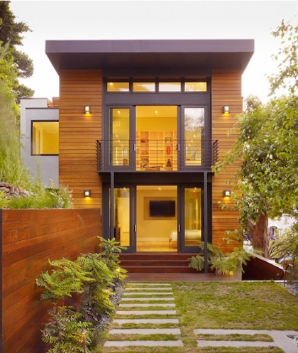
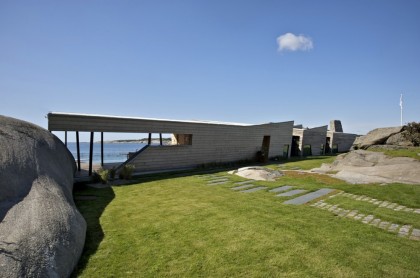
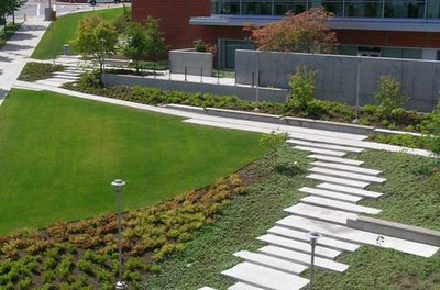
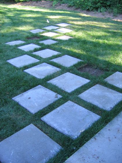
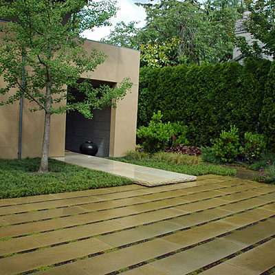
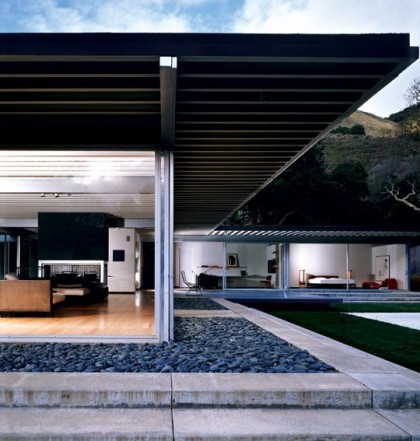
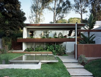
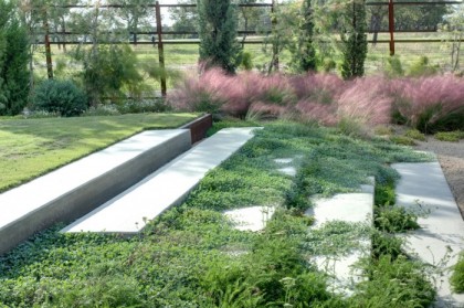
Major theme here: Strips of concrete set into gravel or grass. These could be squares, rectangles, angles — all shapes Irving Haynes, the architect of our house, used again and again in his work and his art. Linear strips would complement the modern architecture of the house (more so than the stupid blacktop there now) and reduce runoff into the street (and that slippery sheet of ice across our sloped driveway in winter).
Below, not exactly a driveway but definitely a style we could duplicate for a driveway…
PATIO
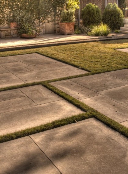
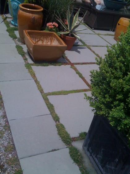
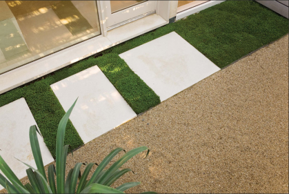
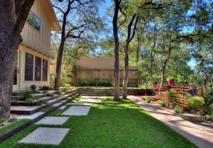
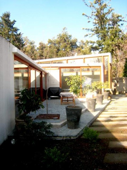
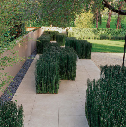
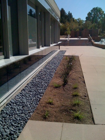
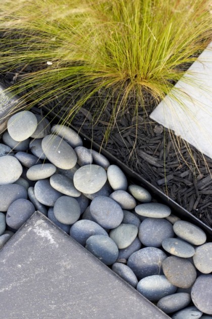
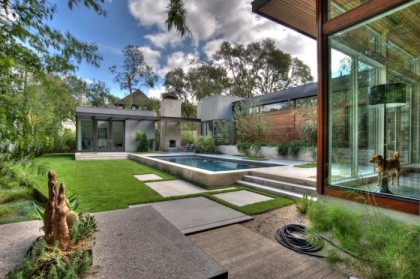
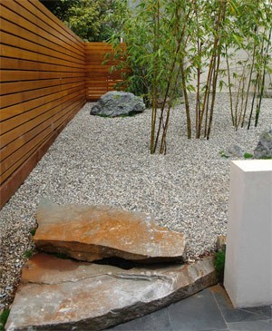
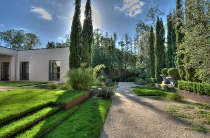
The look we settle on for the driveway we definitely want to carry into our two patio areas — to simplify, surfaces will be done at the same time. That likely means repeating strips or squares of concrete. Additional themes I see in the images I’m most drawn to: irregularity as a part of the pattern, grids and intersecting planes, plantings set into the patio surface, strong delineation of grass or moss/gravel/river rock areas, the interplay of different kinds of surface materials, softening of hard edges by plantings.
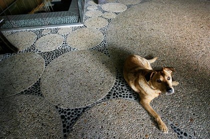
Adding the image below because we might consider a more textured surface…
PATIO COVER
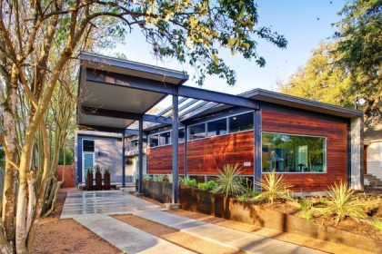
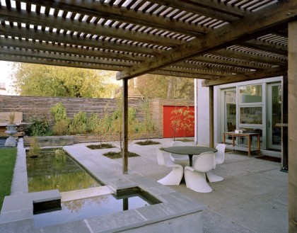
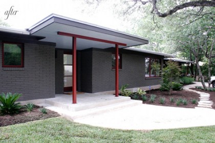
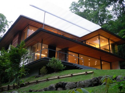
We’re being very conscious about not adding structures that will detract from the original architecture of the house. The patio cover should be functional, not a focal point. Minimal but large enough to keep driving rain and snow from the north off the windows (plus we like to leave the windows open to let the air circulate in season). Preferably not light blocking as it’s on the shady side of the house. The overriding theme: simplicity.
POOL
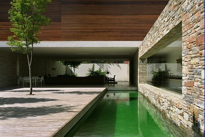
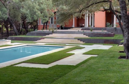
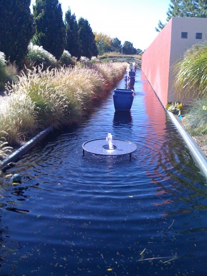
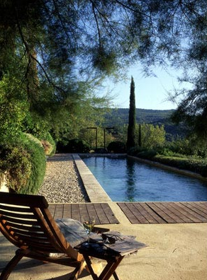
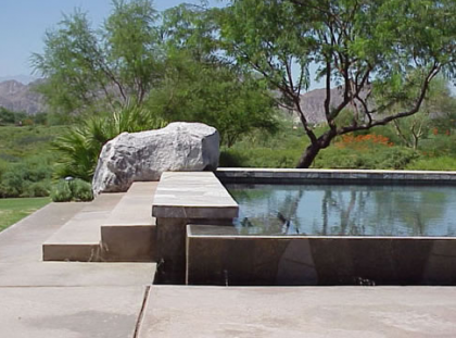
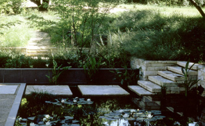
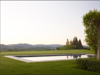
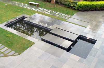
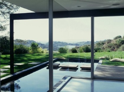
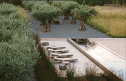
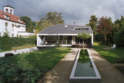
Still debating whether we have fish or not, but we absolutely must have water — no room for a swimming pool, unfortunately. Major theme in these images: a long, rectangular water feature either raised or set into the ground, frequently set off by rectangles or squares of concrete, sometimes grass or gravel. Especially loving floating steps across a pool.
GARDEN
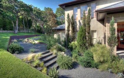
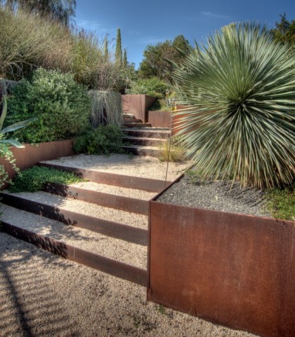
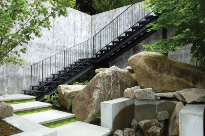
I’m talking hardscape, not plants… Repetitive themes: corten steel steps backfilled with gravel, concrete (or granite) block steps, rogue plants interrupting the steps — there to make you linger, raised beds of corten, variety in the levels of plantings, plants no longer banished to a border but set apart in the landscape for drama, zones of grass amidst the plantings, the satisfying crunch of pea gravel.
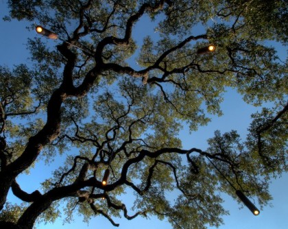
I’ll get to lighting someday, but isn’t this shot of light canisters hanging from the oaks absolutely dreamy?
That brings an end to How Green Is My Brain Week. Except that I’m currently in the garden planning stage so my brain will likely be green for months to come. You’ve been warned.
* * * * *
Bookmarks for this post:
acochran.com The land and sustainability are key to her incredible modern gardens. Genius landscapes. Also worth noting that Andrea Cochran published an amazing book last October.
archdaily.com So many projects from around the world. Great, great stuff here.
contemporist.com I’m absolutely in awe of the architecture this site covers.
d-crain.com Austin, you’re so lucky to have such a progressive landscaping firm. *sigh*
designspongeonline.com My daily virtual commute must. Great inspiration for everything.
eichlernetwork.com A constant source of inspiration for an MCM remodel, even if you don’t live in an Eichler.
houzz.com Home design images from architects, designers and landscapers searchable by style and keyword. Consider it a gateway drug.
levittgoodmanarchitects.com Just really beautiful work, inside and out.
la.curbed.com For the inside scoop on LA’s drooliest real estate.
latimes.com Luuuuuurve their Homes of the Times section. Great style, lots of innovative use of materials and sustainability in action in L.A.
livingetc.com A modern mag with great ideas in their photo gallery.
lutskoassociates.com Landscapes that combine ecology and modernism. Gorgeous.
mcarch.wordpress.com An enviable collection of midcentury architecture photos.
pfs.bc.ca So happy to have stumbled across Vancouver’s Phillips Farevaag Smallenberg landscape architecture. Modern, thoughtful landscapes.
remodelista.com Who doesn’t use this as a style resource? Big fan from the beginning.
sunset.com I don’t live out West but I get the magazine like I do. Love all the home and garden ideas with a green focus.
xtenarchitecture.com Rad L.A. architecture firm. They know modern and sustainable.
