Posts Tagged ‘modern’

an idea starts to come together

Friday, January 18th, 2013

It’s been a while since we went to the bathroom together. David and Joe have been making progress on the built-ins in there, so maybe it’s time for a peek — even if it’s not quite done yet.

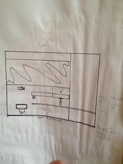
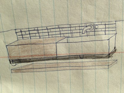
Let’s start at the beginning. A couple of years ago, I handed David a rudimentary scribble of what I pictured for our new bathroom vanity…

my first sink scribble


David drew it mo betta with measurements — I know I’ve shown you this before. This includes the shelf/bench and wall of walnut (to the right of the sink) that I was also hoping for…

layout of sink area


Drawing is SO much easier than building. Here comes the hard part.

First, there was figuring out the complex, irregular curves of an imperfect  sink — not as right-angled as woodworker might hope — in order to get the wood to mate up with it…

figuring out the curves


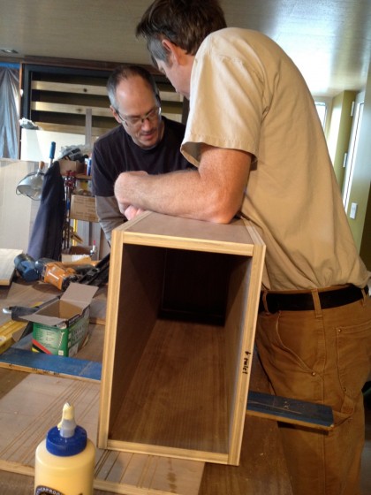
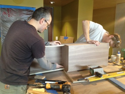
Required some math but they figured it out, as I trusted they would. So they continued on to constructing the vanity box…

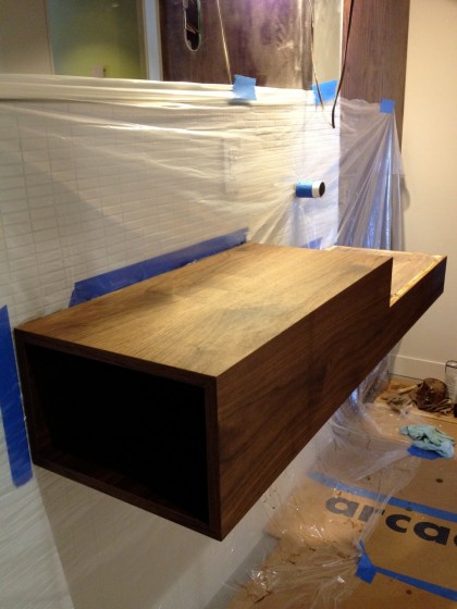
building the vanity box


The open end will face the toilet. That’s where the toilet paper and the occasional book or magazine will hide to keep things from getting messy.

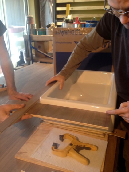
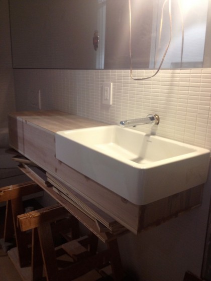
Once that was done, they propped the vanity up on sawhorses and made sure it fit the space as intended with the sink and the faucet roughly in place…

testing the sink on the vanity


There was the tricky veneering stage…

veneering the vanity


And then they secured to the wall and made the necessary tweaks…

making adjustments


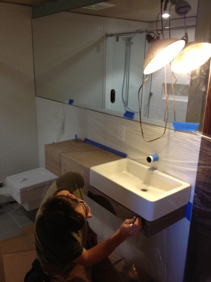
They stained it in place. Here it is with two coats — it still has to be made waterproof (that’s another story)…

hanging the box on the wall


Just to the right of the sink is the walnut panel that will eventually have three hooks on it for hanging up clothes…

walnut panel installed


The bench/shelf that extends from below the sink still needs to be built. But isn’t that gorgeous?!

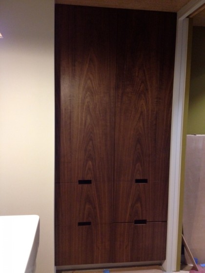
In that same corner there’s now the built-in linen cabinet that David began last June. Just look at that walnut! Love love love.  Just needs a little tweak on that bottom drawer and it’s good to go…

walnut storage wall


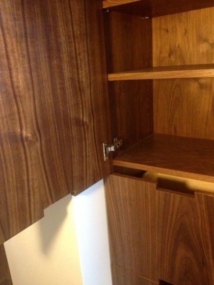
Love how the minimal fingerpulls worked out. Perfect…

fingerpulls


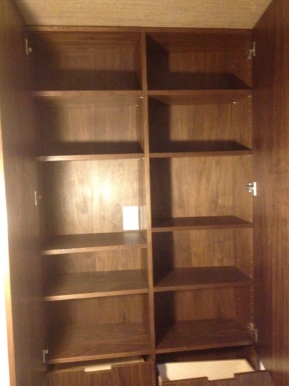
Inside, there’s plenty of room for towels and any bathroom paraphernalia…

a look at the shelves


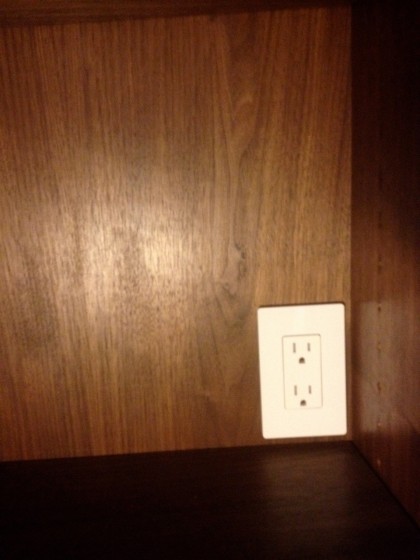
There’s even a recharging station for an electric shaver! So spoiled…

recharging station


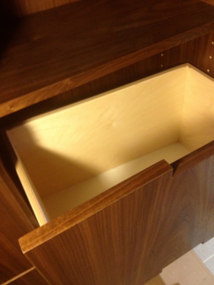
The drawers are nice and deep…

nice deep drawers


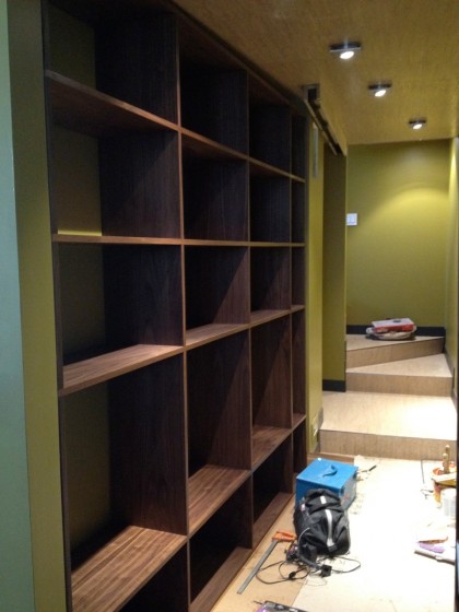
Yes, the back of the cabinet and the drawers are angled to accommodate our angled wall. This should give you a better idea of the wall when you look at the other side. See how the lights are on angle, too?

record storage wall and hallway


Btw, that’s the record storage wall, in progress. More on that another time.

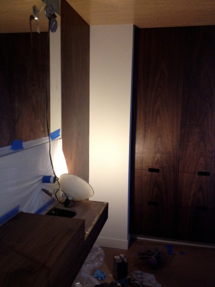
So, back to the bathroom. Here you can begin to get an idea of how the walnut built-ins will look together — in an outage. I need light!

walnut corner


Argh. So impossible to take decent pictures in this tiny bathroom — especially when the lighting isn’t done yet. Oh well.

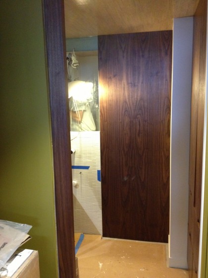
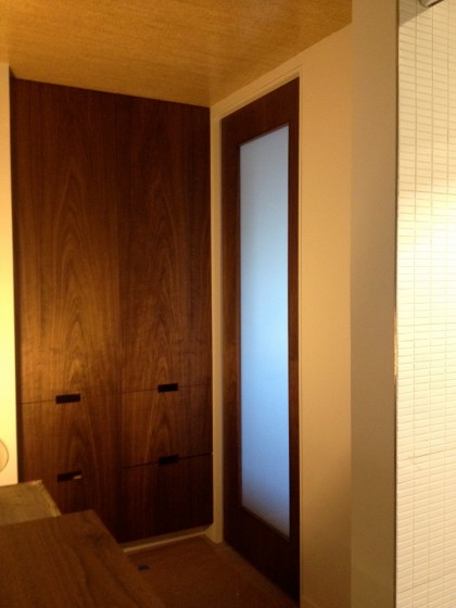
Before I go, take a peek at the fantastic custom pocket door David and Joe designed, built and installed…

custom walnut pocket door


A better look at the door project next week. That’s it for now.


del sol

Wednesday, February 2nd, 2011

Hey, guess what? It’s snowing again! So tired of grey skies. I could use a little something to brighten my day, how about you?

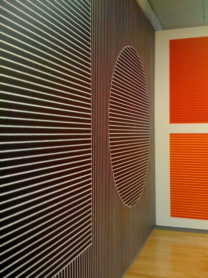
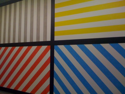
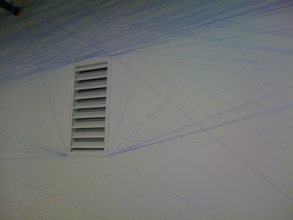
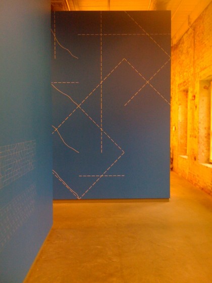
Digging through my snaps for inspiration I came across last fall’s trip to Mass Moca to see the Sol Lewitt retrospective. Was a downpour day so the light was low. Even so, the strong colors and graphics in his conceptual art are really  a pow in the eye socket…

massmoca_entrance

massmoca_wall drawing retrospective

massmoca_1

massmoca_3

massmoca_4

massmoca_5

massmoca_6

massmoca_7

massmoca_9

massmoca_11

massmoca_12

massmoca_15

massmoca_13

massmoca_16

massmoca_10

Thanks, Sharon, for the profile view! Love that shot. All those graphics make me want to take to our walls with a paintbrush.

More info on the Sol Lewitt show and his work…

recently spotted

Tuesday, January 4th, 2011

I seldom go shopping these days, much preferring to order from the comfort of Chez Mess when possible. On Christmas Eve, however, I had to dash into the mall, that temple of mass consumption and hideous carpeting. Last-minute stocking stuffers, ya know.

Snagged some cute vintagey card games for the kid at Restoration Hardware…

classic card games | restorationhardware.com

classic card games | restorationhardware.com

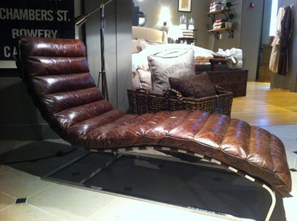
And then I spotted something interesting over in the corner…

oviedo chaise lounge spotted at restoration hardware

lounge tag

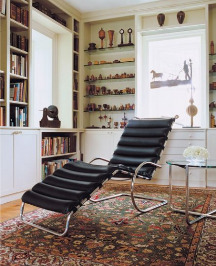
An obvious tribute to Knoll’s MR Chaise Lounge, designed by Mies van der Rohe in 1927…

mr chaise lounge by mies van der rohe for knoll | dwr.com

mr chaise lounge by mies van der rohe for knoll | dwr.com

Far from cheap but much more affordable than the original. Have you seen how much the Knoll goes for? A little history on the original, still in production, here.

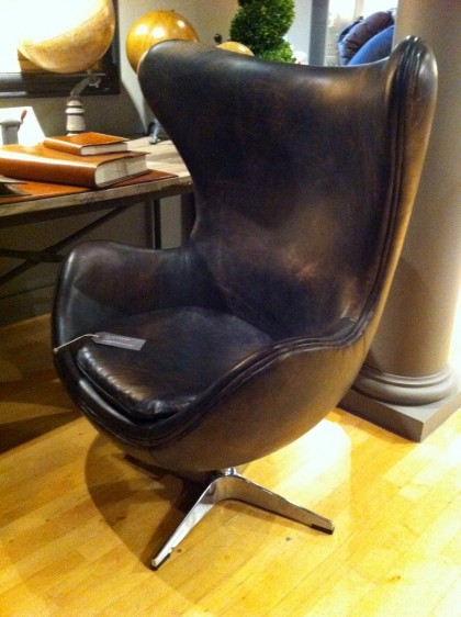
Then a few feet away from the chaise, I spotted this…

1950s copenhagen chair at restoration hardware

chair tag

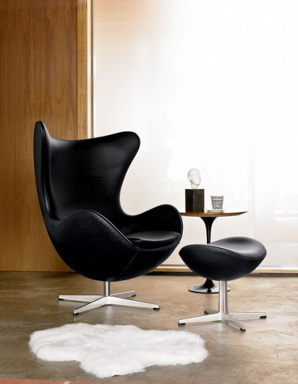
Basically a distressed leather homage to the iconic Egg Chair designed by Arne Jacobsen for Fritz Hansen…

egg chair by arne jacobsen for fritz hansen | dwr.com

egg chair by arne jacobsen for fritz hansen | dwr.com

Gorgeous since 1958 and still going strong. If you’ve ever longed for an Egg of your own, you’re probably well aware of what it costs brand-new. If you don’t require the original, I suppose Restoration’s version isn’t too shabby. The leather gives it a men’s club/smoking lounge kind of a look. Cuba meets Denmark?

Not the sort of thing I expect to see at Restoration Hardware, although they have added a little midcentury modern into their mostly traditional mix in the last few years. Their Modern Collection of bath hardware is about as minimal as they get. Anyway, just thought I’d share.

Still undecided about reproduction/reinterpretation vs original. I mean, I don’t like to think of myself as a total snob, insisting on an original no matter the price. Label hounds can be so irritating. On the other hand, is it asking too much for brands to come up with their own designs rather than profiting from someone else’s design? Granted, finding a way to make expensive things for less is the way of the world — it’s what makes sites like whiteonwhite so wildly popular. And I suppose Restoration Hardware’s whole schtick is “restoring” classic style to home goods. I dunno. What do you think?

patios for the holidays!

Monday, November 29th, 2010

Hope you had a great Thanksgiving holiday. Ours was appropriately gravy-covered and cheerful. So now let’s get back to patios, shall we?

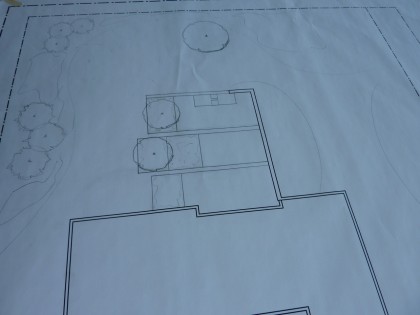
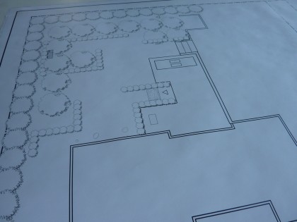
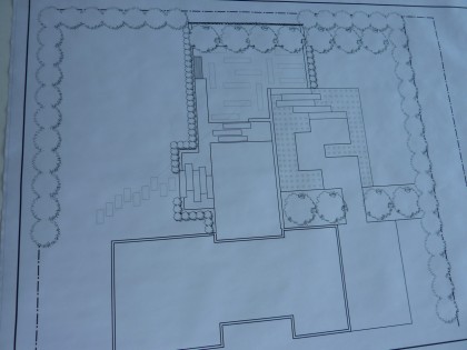
We decided a few weeks back that our partner in crime will be Jim Egan of Land Design Associates in Walpole, MA. He’s psyched to launch into a project with a modern sensibility and has the design chops to withstand our quirkiness. When we shared our patio vision with him, he almost immediately turned around and handed us four patio layouts as a place to start. Impressive. He really took my Andrea Cochran obsession and ran with it! Take a peek…

* click to biggify *

THREE BANDS

This layout features three bands of stone pavers divided by strips of grass. Rectangles of black Mexican beach pebbles and plantings bound the lawn side of the patio. The fish pond is about where we pictured it but a little smaller, with steps across it to the patio…

option #1: 3 strips

PAC MAN

In this layout, the patio breaks from a singular rectangle to include some functional areas — ex., our Phoenix Grill/firepit is the triangle on the left edge of the patio. Again, the pool is about where we pictured it. Strategic lines of plantings move you through the garden (a la Pac Man)…

choice #2: pac man

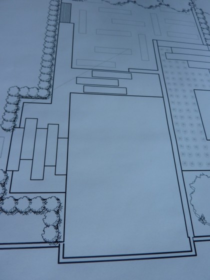
THE ISLAND OF PATIO

Wow. There’s almost too much to look at in this layout to take it all in. How about I simplify things?

choice #3: L pool

If we zoom in on the patio you can see that the pond wraps around two edges, with steps across the pond to the patio in two places. Essentially, the patio is an island. I so want to get stranded there…

patio island closeup

CIRCLE UP!

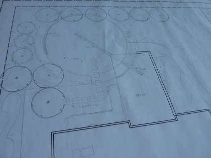
Ooh, this layout has it all. Excitement. Drama. Curves to offset our linear house. Nice. So the rectangular patio is intercepted by a circle, the diameter of which is made up of plantings, pond and (at the far corner of the yard) a curved stone bench…

option #4: circle

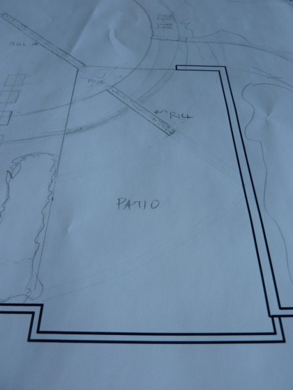
The center of the circle is lawn with a rill of water through it. Love that…

circle closeup

Man, a lot to choose from, right? David and I narrowed it to our favorites — the last two. We met with Jim and came up with a few tweaks. We hemmed. We hawed. Then we had to pull the trigger on one final choice last Wednesday. Can you guess which?

I’ll tell you in my next post. Jim and crew are outside setting the markers for the upper patio right now!

————————–

UPDATE: At least one of you knows how militantly anti-hedge I am. Don’t worry, I’ll not be budged into hedging. Screening, yes. Hedging, never. I thank Jim for his ideas, though. He knew not of my bias. :)

secret source: reclaimed modern

Wednesday, November 17th, 2010

Back to the inside of the house: the kitchen. I’ve been stalking options for ages now. Before Henrybuilt there was Green Demolitions. Their site design is horrendous but they’ve got a great idea: remove remodelers’ perfectly good, cast-off kitchens and sell the works to other remodelers for much less, then put the money into their nonprofit cause.

I’ve trolled GD’s stock fairly regularly over the last three years in search of modern. Not always lucky but you just never know what they’ll have, so I check often. What did I find this past weekend?

What looks to be a brand-new, rift-cut oak kitchen with stainless steel accents, Blum slides and Corian-ish countertops. Nice!

green demos 2

green demos 3

green demos 4

Thank god for rich people who move into a new place and immediately want to redo the kitchen, right?

There’s this crazy contemporary floor model kitchen by Lucci/Orlandini…

green demos modern

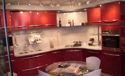
And another Lucci/Orlandini floor model in shiny red metallic…

lucci/orlandini red kitchen | greendemolitions.com

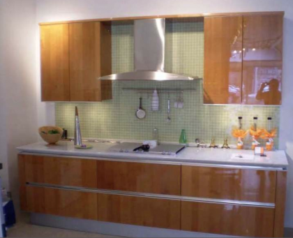
This high-gloss number in cherry…

green demos maple

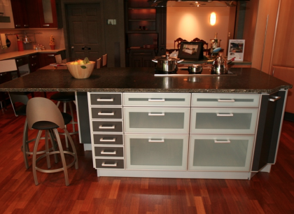
A high-tech Alno island…

green demos 5

green demos island2

green demos island3

green demos island4

green demos 6

Even the all-white trend is represented…

green demos bulthaup

green demos bulthaup 2

There aren’t usually this many modern choices. But if you love traditional, Green Demolitions is da bomb yo. Why is it that when I bring it up in conversation nobody’s heard of it yet?

David and I stopped by the New Canaan showroom about a year and a half ago just to see what the kitchens looks like in person — great prices, decent stock and really, really nice people. Since then, they’ve added more stores and have way more inventory online.

Not sure we’ll ever actually buy anything but I’m all for recycling and a good cause. If you’re into it, there’s a nice article on how Green Demolitions works here. It’s a secret no more.

ooh, we’re “significant”!

Tuesday, September 28th, 2010

A little something to make you chuckle… Just after we moved in at the beginning of 2008, we got a letter from the Providence College Department of Art and History asking if we’d consider adding our house to their “online exhibition” as a “significant example of modern architecture.” Really? Our place?

letter from PC architecture

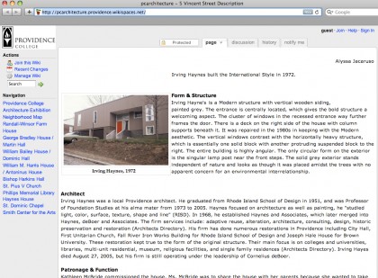
Sure, why not. I guess we do own the only modern in the ’hood after all. So we were visited by a shiny young thing from the architecture class who then did her research, we gave her photos and told her what we knew, and she put together this entry for the PC architecture website. Keep in mind that this was a student project and makes our house sound a little, how you say, highfalutin?

Page 1 (click to biggify)…

PC site | page 1

Page 2 …

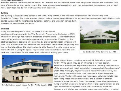
PC site | page 2

Page 3 …

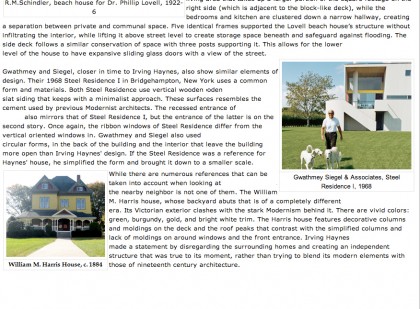
PC site | page 3

I’ve told you what we know about Irving Haynes in previous posts. I wonder what he’d think about being compared to Le Corbusier and Schindler? Flattered? Embarrassed? Which brings me to an unexpected syncronicity…

David’s grandmother, Maria Fenyo McVitty, was an architect who worked in Paris with Le Corbusier right after World War II. No, really! I’m pretty sure she’d laugh off the comparison to Le Corbusier. However, she did give this house her stamp of approval on an all-too-rare visit to Providence the year we moved in — unfortunately also the same year she passed on. Hers is a fascinating story I intend to share with you someday.

Miss you, Ria!

going off the rails…

Monday, September 20th, 2010

… on a crazy train. Thanks, Ozzy. So after weeks of waiting, the galvanized stainless steel cable railing finally went in on the back retaining wall today. Rhode Island Welding pulled up at 7:20 ready to rail. Here’s how it went down.

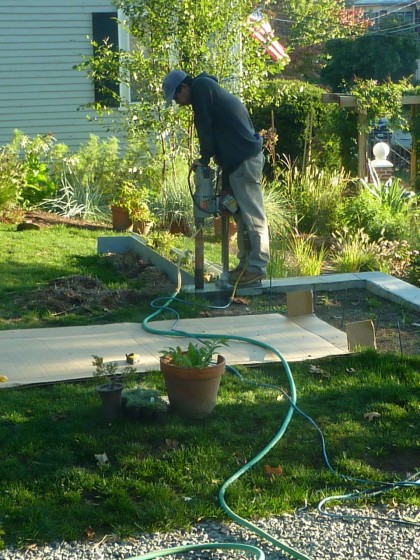
They drilled the holes for the railing posts…

drilling the holes

The railing arrived completely fabricated. They set the posts in place…

set in place

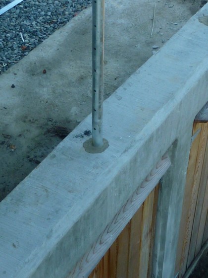
They added concrete to the holes…

concrete added

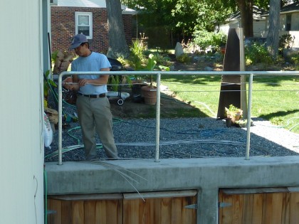
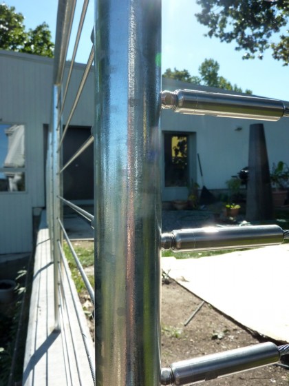
Threaded the cable through the pre-drilled holes…

threading the cable

They attached machine swaged fittings to the ends of the cables and tensioned the entire assembly to prevent sagging…

cable ends tensioned

TA-DAAAAA!

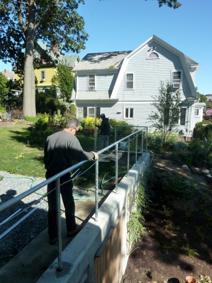
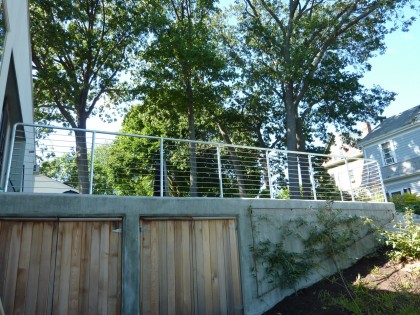
railing as seen from below

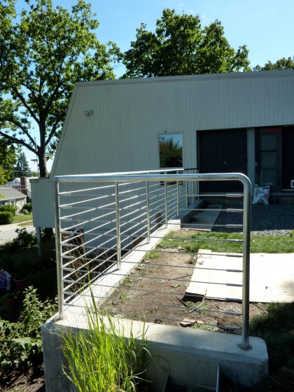
Am mostly pleased. Wishing I had dictated squared posts so that we hadn’t ended up with round. Also wishing there were right angles and no curves…

a side view

Bah. Me being a cable railing snob I guess. What’s done is done. Moving on. The next project: patios!

modern benches at berkshire botanical

Tuesday, August 31st, 2010

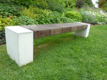
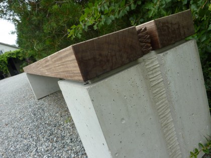
Just spied on my recent getaway to the Berkshires: two drooltastic modern benches at Berkshire Botanical Garden

“baseball” bench at berkshire botanical garden

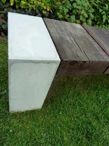
Designed by Douglas Thayer, “Baseball” (as this bench is curiously called) is made of reclaimed Greenheart, reclaimed Ipe and concrete. Looks like it could stand up to a New England Nor’easter. It’s a work of art you can sit on. Have I mentioned lately how much I love concrete?…

closeup on the concrete end piece

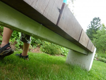
Underneath, there are two metal crosspieces… maybe steel?

view of the metal cross pieces underneath

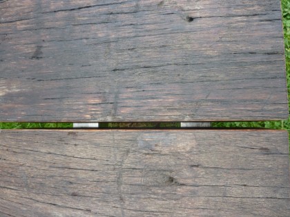
Clearly seen through the wood planks…

view through the slats

No prices on his website. Dare I email him and find out how much such a piece might cost? I’m afraid.

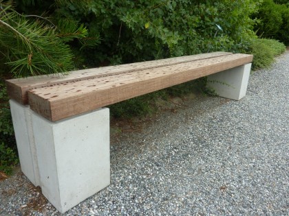
Around the corner from Baseball sits this beauty…

another bench at berkshire botanical garden, same designer

Couldn’t locate a name or description for this one, but it’s obviously another creation by Thayer. Similar minimal aesthetic and concrete + wood design. The spots are raindrops, btw.

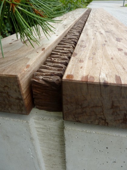
Here’s a closer look at the detail between the planks and on the concrete supports…

a look at the inset detail

detail closeup

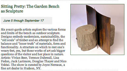
There were lots of benches on display at Berkshire Botanical as part of their Garden Bench as Sculpture show, but those two were my favorites. Simple. Solid. Honest looking. According to their website, the show ends September 17:

info from Berkshire Botanical events calendar

august, undone

Wednesday, August 25th, 2010

This month was a little disappointing. Lots of projects in the works but little actually finished. Or actually started. Let’s see…

THE BENCH, UNDONE

We left off with David taking a weekend welding class in July with the intention of creating a bench for our entryway. Here’s where it stands…
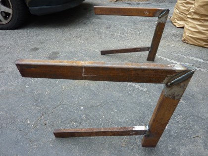
steel legs, welded up but not done

Still to come: the sanding down of the welds for a smooth leg…
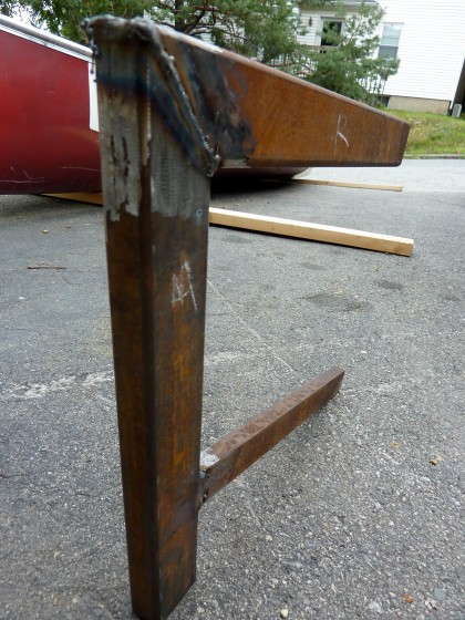
closeup of the weld

Also to come: the powder-coated finish. the wooden bench seat. and the satisfaction of being able to sit down and take off your muck boots at the door.

THE RAILING, UNDONE

The railing for our retaining wall out back is still not a reality. We need to keep people from tumbling over that 7′ drop! Rhode Island Welding helped us with the galvanized steel raised veggie beds and stairs, so we talked to them about the railing….
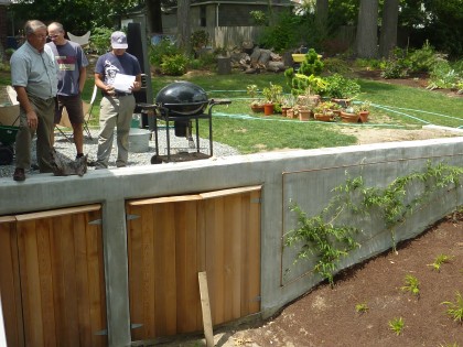
cable railing discussion with Rhode Island Welding

Prior to measuring and drawing up what we wanted, there was much discussion about what kind of railing would work best here. David and I agree that we want something:

  • minimal to complement the simple lines of the house
  • you can see through, as we don’t want to block our view
  • that isn’t the star but fades into the background
  • that is obviously an accessory to the design of the house rather than something that looks like construction — meaning that if it’s solid wood, it begins to look like our wood siding and we don’t want to take away from the original envelope of the house
  • that we can use on our indoor stairway as well — both railings are within viewing distance of each other and should be similar

So several options were up for consideration…
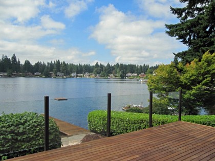
glass | aluminumrailing.com

glass | aluminumrailing.com

Glass, my first choice. And ridiculously, prohibitively expensive. Damn. Definitely my top pick for indoors, as well. Not gonna happen.
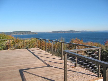
cable | aluminumrailing.com

cable | aluminumrailing.com

Cable railing. Second choice. Much cheaper than glass but still pricey. A very clean look. Zoning regs are very clear on height, necessity of a top rail, distance between cables, etc., so there’s no budging on that. We looked at a lot of cable railing systems in order to find ways to cut costs. Basically comes down to quality and endurance, which is why we ultimately decided to have RI Welding make it right for us.

Also considered…
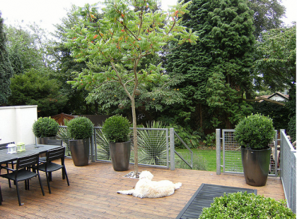
mesh | adesignandbuild.co.uk via flickr www.flickr.com/photos/db-gardendesign/3811605850

mesh | adesignandbuild.co.uk via flickr www.flickr.com/photos/db-gardendesign/3811605850

Galvanized steel mesh railing. Would still require the posts and top rail to be built by Rhode Island Welding (unless we went with wood supports and top rail) but the mesh would save us some cash — cable systems are pricey and cable system installation obviously takes longer. In the end, we decided the mesh grid just wasn’t something we wanted to repeat inside the house.

Wood. After looking at the cable railing price, we opened ourselves up to the possibilities of wood again… maybe slender, horizontal slats wouldn’t be too bad?  or even vertical?…
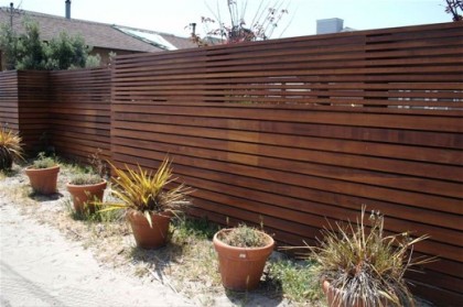
from apartment therapy | www.apartmenttherapy.com/sf/look/look-modern-fence-050175

from apartment therapy | www.apartmenttherapy.com/sf/look/look-modern-fence-050175

Something similar might be a good modern choice. But even a railing-height version would interrupt the view and force you to look at the fence. And it just wouldn’t work inside the house. So nix that. Cable railing it is!

Designs submitted to Rhode Island Welding. Fabrication in progress. Stay tuned.

THE STAIRS, UNDONE

So, the state of the stairs. The set in front, done except for the final addition of pea gravel…
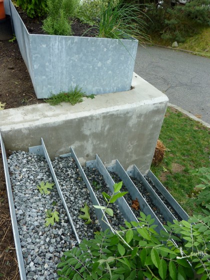
front stairs need pea gravel to top off crushed stone

Back stairs? *sigh* Don’t ask.

When it’s all said and done, they’re supposed to look kinda like this…
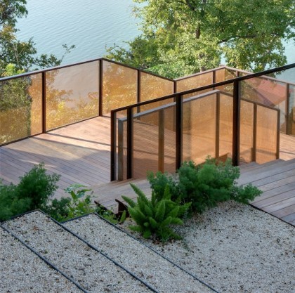
gravel and steel steps by D-Crain | d-crain.com

gravel and steel steps by D-Crain | d-crain.com

THE STORAGE AREA, UNDONE

The doors may be done but the insides of the storage closets aren’t yet outfitted for storing things. This is our current latching solution…
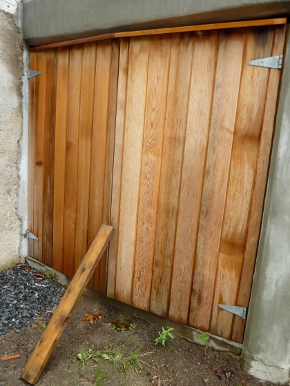
storage area lacks closure, heh heh

I seek closure. Before winter, please.

THE PATHS, UNDONE

The paths are all dug…
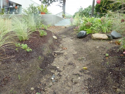
one of our uphill paths

They pretty much look like that, with the dirt washing down the sides of the beds and into the paths every time it rains because none of the plants have grown in enough to hold the soil.

No point in adding pea gravel to the paths until I can solve the constant erosion issue that comes with having a slope. I’ll save the details for another post but suffice it to say that standard edging isn’t tall enough and gabions look like the right solution.

THE STRAIGHT-RUN EDGING, UNDONE

Close to the house, we still need to turn this…
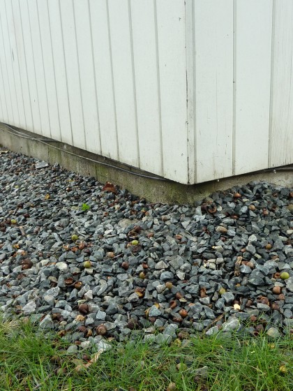
buffer around house needs edging and beach pebbles

… into this — minus the concrete edging and fabulousness of an iconic modernist house, of course.
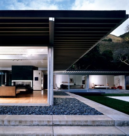
beach pebble buffer at Johnson House, Piere Koenig | eichlernetwork.com

beach pebble buffer at Johnson House, Piere Koenig | eichlernetwork.com

And make this…

path needs edging

… look a little more like this:

steel edging by Andrea Cochran Landscape Architecture | acochran.com

steel edging by Andrea Cochran Landscape Architecture | acochran.com

The 2′ buffer around the house needs edging and topping off with beach pebbles. In the past, we’ve gotten them through Stoneyard in Massachusetts. Their Mexican Beach Pebbles are dark, flat and the classic choice. Their New England pebbles, more irregular and frequently egg-shaped. Blech. In Rhody, Watson Mulch has a nice, small, tumbled pea gravel but their pebbles, not so much.

Have spent an embarrassing amount of time researching edging. Plastic and rubber, yuck. Stone, too pricey, too cottagey. Metal is by far the most minimal. Aluminum looks cheap and insubstantial to me — like it’ll crimp if you breathe on it wrong. Yes, have looked at all the brands out there at various price points and don’t like any of them. Decided since we have steel in the rest of our hardscape, maybe that’s the best choice. I’ll save details for another entry but the best contender so far is Border Guard — it even comes in galvanized steel so it would tie in with the rest of our hardscape. Sold.

THE PATIOS, UNDONE

I won’t waste your time repeating my patio wishes. Let’s just leave it at “it ain’t done yet.” We did, however, manage to meet with Tom Zilion of Madstone Concrete to discuss what all this vision might cost. He’s all about the nuances of finish and color…
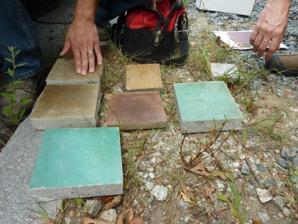
overwhelmed by colors

Any color, including black. And yet we find ourselves drawn to the straight-forward grey…
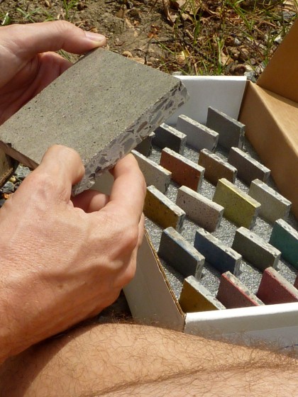
you just can’t go wrong with classic grey

God, we’re boring. But it just makes the most sense when you want the house to be the hero, not the patio. Black would look amazing, but it gets hot in the sun. Not ideal for bare kiddie feet. We’re still discussing possibilities with Tom. He does beautiful work, so expect to hear more about it.

See what you missed while I was out? Nothing. Just project after project, and all of them Undone.
grill porn

Friday, July 9th, 2010

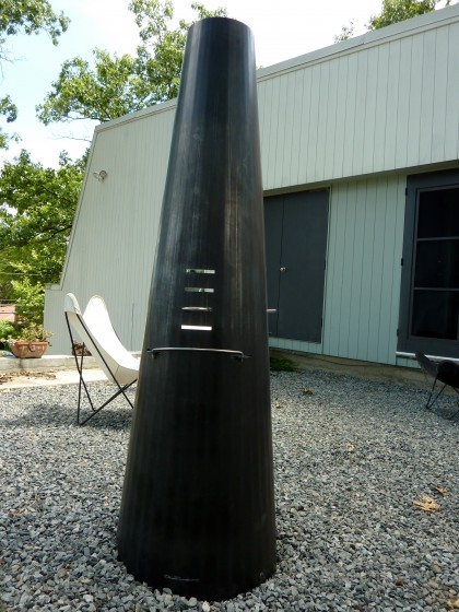
The Phoenix! Picked up yesterday, our new grill/firepit is sitting in its temporary spot on the gravel as we await a patio build. Thought I’d share shots of it because, frankly, the two existing pictures on your site suck, Wittus.

Why not show it off for the true beauty it is? Surely you can hire someone who takes better shots than I did. Here it is in all its increasingly rusticated glory…

it’s here! it’s here!

full view of the back

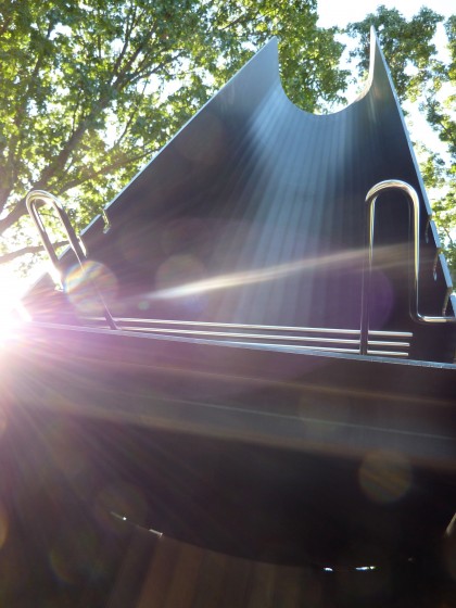
A slender 25″ W x 20″ D x 74″ H and 220 lbs. Does not come with cup holders, thank gawd, although it does come with Stay Cool stainless steel grill rack handles…

view from below

ooh, phoenixy!

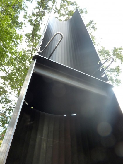
from another angle

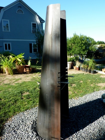
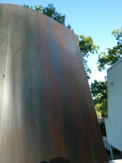
The angle on the walls is very similar to the angle on the house…

nice echo of the house angles

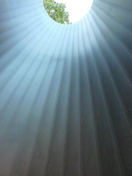
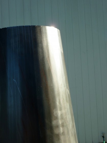
And the lines echo our vertical wood siding…

an echo of the house’s vertical siding

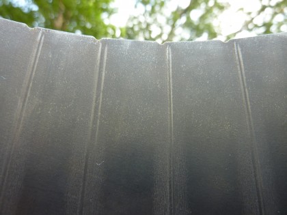
A closeup on the detail on the lip of the chimney…

view of the top lip detail

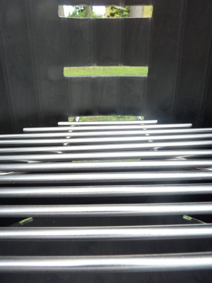
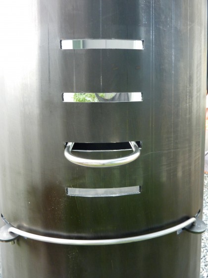
The grill rack is made of stainless steel 5mm rods. Slits in the curved steel wall allow you to adjust the grill rack height….

the grill can be repositioned

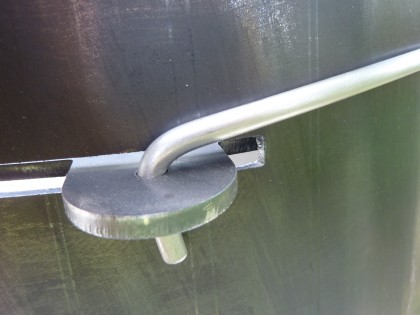
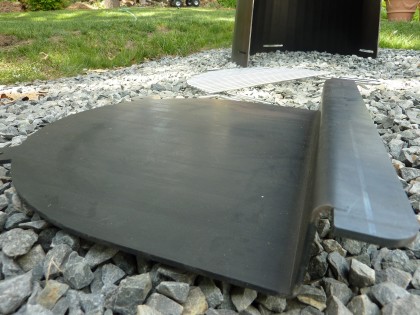
The bar across the back locks the grill pan in place…

shot of the curved rear detail

grill pan attachment detail

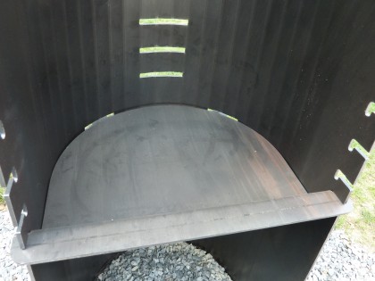
Pull out the bar and you can remove the pan…

a look at the pan with the grilling surface removed

Like so…

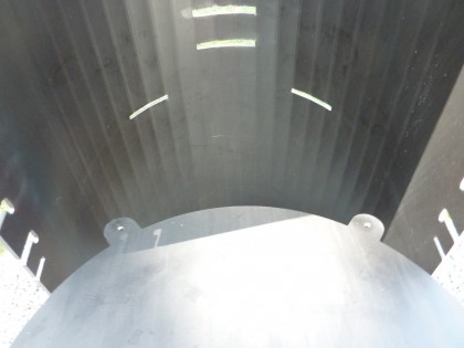
with the bar removed, the pan pulls right out

pan removed

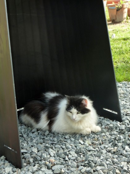
Ooh, and here’s a bonus not mentioned on the Wittus website: also functions as a cat cave!

and it’s also a cat cave!

glamour shot

Why we’ve been ogling this grill/firepit for the last few years:

  • The strong angles echo the modern architecture of the house
  • Multi-functional and multi-seasonal… works as both a charcoal grill and a wood-fired pit
  • The tall chimney is supposed to funnel smoke up and away… we’ll test this out and confirm
  • When not in use, it looks like art… and if something is going to take up valuable space in your smallish entertaining space, shouldn’t it be something you want to look at?
  • Brushed Corten steel, an awesome thing to touch… we share an undying love for it

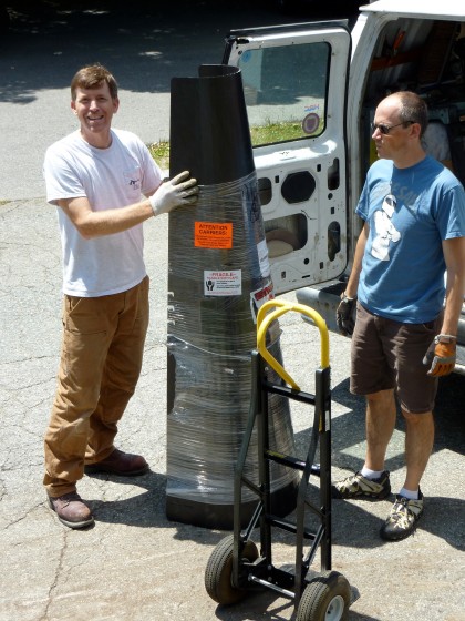
Thanks Joe and David for lugging that sexy thing home. My, my, what the neighbors must think of us now!

thanks to joe and david